
UI/UX Interview Preparation Guide 2026
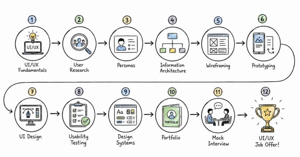
Table of Contents
Part 1: Introduction & 30-Day Study Plan
This first part sets the direction for UI/UX interview preparation in a structured, practical way. It explains what UI/UX interviews usually test, where UI/UX fits in real product work, and how to build a focused 30-day plan that improves both interview answers and portfolio presentation.
What this guide covers
This guide is designed to help you prepare for UI/UX interviews in a layered, interview-first format. It starts with fundamentals and moves into research, information architecture, wireframing, prototyping, UI design, accessibility, usability, product thinking, portfolio discussion, and career strategy.
The goal is not just to help you memorize definitions. The real goal is to help you explain how you think, why you made design decisions, how you validated them, and how your work improved the user experience or business outcome.
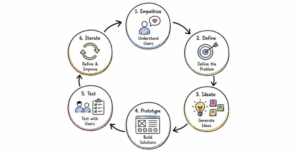
In UI/UX interviews, recruiters and hiring managers often care about your process as much as your final screens. They want to understand how you identify problems, gather insights, prioritize user needs, work with constraints, and communicate your design choices clearly.
Who this guide is for
This guide is useful if you are:
- A fresher preparing for your first UI/UX interview.
- A student building a portfolio for design roles.
- A career switcher moving from development, marketing, graphic design, or content into UI/UX.
- A junior designer who knows the tools but is not yet confident in interviews.
- A candidate who can design screens but struggles to explain research, usability, or design decisions.
The structure is designed to help both beginners and early-career professionals build confidence step by step. It gives you a clear path from foundations to interview execution, while keeping the content practical and highly scannable.
What UI/UX is and why it matters
UX design focuses on solving user problems through research, flows, structure, and interaction decisions, while UI design focuses on the visual layer, including layout, hierarchy, typography, color, and components. In real product teams, these areas often overlap, especially in startup and junior-to-mid-level roles.
UI/UX matters because products succeed when they are both useful and easy to use. Companies invest in design because better usability, clearer flows, and more thoughtful interfaces can improve engagement, reduce friction, and support conversion or retention goals.
A simple way to think about UI/UX is this: it helps turn product goals and user needs into clear, usable digital experiences. Strong designers do not just make screens look better; they make tasks easier, journeys clearer, and decisions more intuitive.
Where UI/UX fits in real work
In real companies, UI/UX work can include:
- Understanding users through interviews, surveys, testing, and observation.
- Defining user flows, task paths, and information architecture.
- Creating wireframes, prototypes, and design concepts.
- Building polished interfaces and reusable design systems.
- Improving accessibility, usability, and consistency across devices.
- Working with product managers, developers, marketers, and stakeholders to ship usable solutions.
This is why UI/UX interviews are rarely only about tools like Figma. Interviewers usually want to see whether you can understand a problem, translate it into a user-centered solution, justify your choices, and collaborate well with teams under time or product constraints.
Common UI/UX role types
UI/UX interviews vary based on role scope. Common role types include:
- UI Designer: visual design, components, hierarchy, layouts, and responsive screens.
- UX Designer: research, user flows, information architecture, testing, and problem-solving.
- Product Designer: broader ownership across UX, UI, product thinking, and business alignment.
- Interaction Designer: behavior, task flow, transitions, and interface logic.
- UX Researcher: interviews, synthesis, validation, and insight generation.
- Junior UI/UX Designer: blended role across wireframes, prototypes, visual design, and cross-functional collaboration.
Understanding the target role early helps you prepare better. A UI-heavy role may focus more on layouts, typography, color systems, and responsiveness, while a UX-heavy role may focus more on research, user journeys, testing, and design rationale.
Common interview process
A typical UI/UX interview process often includes:
- Recruiter or HR screening.
- Portfolio review or introductory case study discussion.
- Technical or design process round.
- Design exercise, whiteboard challenge, or take-home task.
- Stakeholder, hiring manager, or team collaboration round.
- Behavioral or culture fit round.
In many interviews, portfolio presentation is one of the most important stages. Recruiters often scan portfolios quickly, and structured case studies can strongly influence whether a candidate moves forward in the process.
Core skill areas interviewers usually check
Most UI/UX interviews evaluate some combination of these areas:
- UX fundamentals and design thinking.
- User research and problem framing.
- Information architecture and task flows.
- Wireframing and prototyping.
- Visual design and interface quality.
- Accessibility and inclusive design.
- Usability testing and iteration.
- Design systems and consistency.
- Collaboration with developers and stakeholders.
- Portfolio storytelling and communication.
These areas appear repeatedly because they reflect real design work. A strong candidate is not just someone who can use a design tool, but someone who can explain a design decision in the context of users, product goals, constraints, and measurable outcomes.
Why portfolio and process matter so much
In UI/UX hiring, your portfolio is often treated as proof of thinking, not just proof of visuals. Interviewers want to see how you approached the problem, what evidence shaped your decisions, what changed after feedback, and what outcome your work created.
That is why candidates with average screens but strong reasoning can outperform candidates with polished visuals and weak explanation. In many cases, the ability to tell a clear case-study story matters more than using advanced effects or overly decorative layouts.
How to think in UI/UX interviews
A strong UI/UX answer usually follows this structure:
- Define the problem clearly.
- Explain the user need or business context.
- Describe your process or framework.
- Show the decision you made and why.
- Mention trade-offs, constraints, or feedback.
- End with the result, learning, or next step.
For example, if asked how you improved a checkout experience, do not stop at “I redesigned the page.” A stronger answer explains the friction point, the user behavior or data behind the issue, the flow or UI changes made, and how you validated whether the new design worked better.
30-day study plan
A practical 30-day UI/UX interview preparation plan looks like this:
Week 1: Foundations and interview basics
Focus on UI vs UX, design thinking, common terminology, key role types, and the typical interview process. Start reviewing 2 to 3 portfolio projects and rewrite them in a cleaner case-study format.
Study areas for Week 1:
- UI vs UX basics.
- User-centered design.
- Design process stages.
- Role expectations in UI, UX, and product design.
- Common interview rounds.
Week 2: Research, flows, and wireframes
Focus on user research basics, personas, user journeys, problem statements, information architecture, and wireframing. Start speaking out loud about one project from problem definition to first solution direction.
Study areas for Week 2:
- Research methods and synthesis.
- User personas and scenarios.
- Task flows and user journeys.
- Information architecture.
- Low-fidelity wireframes and early prototypes.
Week 3: UI craft, systems, and usability
Move into visual hierarchy, typography, spacing, color, accessibility, responsive thinking, and design systems. Review your case studies for clarity, consistency, and whether each design choice has a clear reason behind it.
Study areas for Week 3:
- Layout and hierarchy.
- Components and consistency.
- Responsive design thinking.
- Accessibility basics.
- Usability review and design iteration.
Week 4: Mock interviews, portfolio polish, and career readiness
Focus on design exercises, portfolio walkthroughs, behavioral questions, resume updates, LinkedIn optimization, and salary preparation. This week should include multiple mock sessions where you practice concise, structured answers under time pressure.
Study areas for Week 4:
- Portfolio presentation practice.
- Design challenge and problem-solving rounds.
- Collaboration and stakeholder communication.
- Behavioral interview preparation.
- Resume, LinkedIn, and salary positioning.
Daily study routine
A practical daily routine can look like this:
- 45 minutes of concept revision.
- 60 minutes of portfolio, wireframe, or prototype practice.
- 30 minutes of spoken interview practice.
- 15 minutes of reflection, notes, or case-study improvement.
If you are a fresher, do not skip the speaking part. Many candidates understand design concepts privately but struggle to explain a portfolio decision, a usability issue, or a research finding clearly in an interview setting.
Salary expectations in India
UI/UX salary in India varies by city, portfolio quality, product thinking, tool fluency, and real project depth. One 2026 salary guide places the overall UI/UX designer range broadly between ₹5 lakh and ₹40 lakh CTC depending on level and company, while another 2026 India-focused career guide gives fresher-to-senior ranges such as roughly ₹3.5–6 LPA in Chennai and ₹4.5–8 LPA in Bangalore for freshers, with higher bands for experienced roles.
The most practical way to present salary in interviews is as directional context, not guaranteed numbers. In UI/UX hiring, compensation is often influenced heavily by portfolio maturity, problem-solving clarity, communication quality, and your ability to show real product impact rather than certificates alone.
How to prepare effectively
The best way to prepare for UI/UX interviews is to build from fundamentals into research, flows, wireframes, UI craft, usability, accessibility, and portfolio storytelling. Start simple, then layer complexity gradually so your answers sound natural instead of memorized.
You should also practice presenting your work like a clear story, not like a gallery tour. In strong UI/UX interviews, the explanation often matters as much as the final design screens.
Revision focus
Revise what UI/UX means, where it fits in real product work, the common role types, the interview process, the core skill areas, the importance of portfolio storytelling, and the 30-day study plan before moving into UI/UX fundamentals.
Part 2: UI/UX Fundamentals
This part builds the foundation for the rest of the UI/UX guide. It covers the core concepts, terminology, design principles, and beginner-level interview topics that interviewers expect you to understand before moving into research, flows, prototyping, UI systems, usability, and product thinking.
Questions 1–40
1. What is UI design?
UI design focuses on the visual interface of a product, including layout, typography, color, buttons, forms, and components. It is concerned with how the product looks and how interface elements are arranged for clarity and usability.
2. What is UX design?
UX design focuses on the overall user experience, including how users move through a product, complete tasks, face friction, and achieve goals. It is more about usefulness, flow, and problem-solving than only visual appearance.
3. What is the difference between UI and UX?
UI is the visual and interactive layer of a product, while UX is the broader experience of using it. A product can look attractive at the UI level but still have weak UX if it is confusing, slow, or hard to use.
4. Why are UI and UX both important?
A strong product needs both clarity and usability. Good UI helps users understand what to do, while good UX helps them do it smoothly and confidently.
5. What is user-centered design?
User-centered design is an approach where design decisions are based on user needs, behaviors, goals, and limitations. It means designing around real people instead of assumptions made only by the team.
6. Why is user-centered design important?
It helps teams create products that are easier to learn, more relevant, and more effective for the intended audience. In interviews, this concept matters because it shows that design is not just decoration but problem-solving based on evidence.
7. What is design thinking?
Design thinking is a problem-solving approach that usually involves understanding users, defining the problem, exploring ideas, prototyping solutions, and testing them. It helps teams move from assumptions to validated design decisions.
8. What are the common stages of the UX design process?
A common UX process includes research, problem definition, ideation, wireframing, prototyping, testing, and iteration. Different teams may name the steps differently, but the general flow remains similar.
9. What is a user persona?
A user persona is a structured representation of a target user segment based on research or realistic patterns. It helps teams design with specific needs, goals, frustrations, and behaviors in mind.
10. Why are personas useful?
Personas help teams avoid designing for themselves. They create a shared picture of the user so features, flows, and content can be evaluated against real needs.
11. What is a user journey map?
A user journey map is a visual representation of the steps a user takes to complete a goal, including actions, thoughts, pain points, and opportunities. It helps identify where the experience breaks down or needs improvement.
12. What is information architecture?
Information architecture is the way content, pages, and features are organized so users can find information and complete tasks easily. It supports navigation clarity and reduces confusion.
13. Why is information architecture important?
Good information architecture makes products easier to understand and navigate. Poor structure increases cognitive effort and often causes users to abandon tasks.
14. What is a user flow?
A user flow is the path a user follows to complete a specific action, such as signing up or purchasing a product. It focuses on steps and decisions in the journey.
15. What is the difference between a journey map and a user flow?
A journey map is broader and often includes emotions, context, and pain points across the experience. A user flow is more task-focused and shows the sequence of screens or decisions needed to complete one goal.
16. What is a wireframe?
A wireframe is a low-detail visual layout that shows the structure of a screen or page. It focuses on content placement, hierarchy, and task flow rather than final visual styling.
17. Why are wireframes important?
Wireframes help teams align on layout and functionality before spending time on polished visuals. They are useful because they make early changes faster and cheaper.
18. What is a prototype?
A prototype is a simulation of a product or interface that helps demonstrate interactions, flow, and behavior. It can range from simple click-through screens to high-fidelity interactive models.
19. What is the difference between a wireframe and a prototype?
A wireframe shows structure, while a prototype shows interaction and behavior. Wireframes are often static, whereas prototypes help teams or users experience how the product might work.
20. What is the difference between low-fidelity and high-fidelity design?
Low-fidelity design is quick, simple, and focused on structure or ideas, while high-fidelity design is polished and closer to the final interface. Low fidelity is useful early, and high fidelity is useful when testing details, visuals, or stakeholder presentation.
21. What is usability?
Usability refers to how easily users can understand and use a product to complete tasks effectively. A usable product is usually clear, efficient, and easy to learn.
22. Why is usability important in UI/UX?
Even visually strong designs fail if users cannot complete tasks without confusion. Usability matters because it directly affects satisfaction, success rate, and product performance.
23. What is accessibility in UI/UX?
Accessibility means designing products so people with different abilities can use them effectively. It includes considerations such as color contrast, keyboard access, readable text, and support for assistive technologies.
24. Why is accessibility important?
Accessibility improves inclusion and makes products usable for a wider range of people. It is also a strong sign that a designer understands responsible, real-world product design.
25. What is inclusive design?
Inclusive design is the practice of creating experiences that consider a broad range of users, contexts, and limitations from the start. It goes beyond compliance and focuses on designing for diversity in real usage conditions.
26. What is heuristic evaluation?
Heuristic evaluation is a method of reviewing an interface against recognized usability principles to identify problems. It is a fast way to find usability issues before or alongside user testing.
27. What are heuristics in UX?
Heuristics are general usability principles used to evaluate interface quality, such as clarity, consistency, feedback, and error prevention. In interviews, they often come up when discussing usability reviews and design critiques.
28. What is visual hierarchy?
Visual hierarchy is the arrangement of elements so users notice the most important information first. It is created through size, spacing, contrast, positioning, and emphasis.
29. Why is visual hierarchy important?
It guides attention and helps users understand what matters most on the screen. Without clear hierarchy, interfaces feel crowded, confusing, or difficult to scan.
30. What is whitespace in UI design?
Whitespace is the empty space between elements, sections, text, and components. It improves readability, focus, and overall clarity rather than being wasted space.
31. What is consistency in design?
Consistency means using similar patterns, styles, labels, and interactions across the product. It helps users learn the interface faster and reduces unnecessary confusion.
32. Why is consistency important?
Consistency reduces cognitive load because users do not need to relearn the interface on every screen. It also improves trust and makes the product feel more professional.
33. What is cognitive load?
Cognitive load is the mental effort required to understand and use an interface. A good design reduces unnecessary complexity so users can focus on the task, not on figuring out the interface.
34. How can a designer reduce cognitive load?
A designer can reduce cognitive load by simplifying choices, grouping related information, using clear labels, maintaining consistency, and revealing information progressively. The goal is to make decision-making easier, not more visually crowded.
35. What is progressive disclosure?
Progressive disclosure is a design approach where only the necessary information is shown first, and additional detail appears when needed. It helps keep interfaces simple while still supporting more advanced actions.
36. What is responsive design?
Responsive design means creating interfaces that adapt well across different screen sizes and devices. It ensures usability and visual clarity whether the user is on mobile, tablet, or desktop.
37. Why is responsive thinking important in interviews?
Because interviewers want designers who understand real product environments, not just static screens. A strong answer shows that you think about layout, hierarchy, and usability across devices and contexts.
38. What makes a good UI/UX designer?
A good UI/UX designer combines empathy, problem-solving, structure, visual clarity, collaboration, and communication. Strong designers do not just create screens; they connect user needs with product goals and explain their decisions well.
39. What is a common beginner mistake in UI/UX?
A common mistake is focusing too much on visual polish before understanding the problem, user flow, or content structure. Another is copying trends without explaining why the design choice helps the user.
40. What is a strong answer for UI/UX fundamentals questions?
A strong answer defines the concept clearly, connects it to user or product impact, and gives a brief practical example when relevant. Interviewers usually prefer clear reasoning over textbook language.
Revision focus
Revise UI vs UX, user-centered design, design thinking, personas, journey maps, information architecture, user flows, wireframes, prototypes, usability, accessibility, inclusive design, heuristics, visual hierarchy, consistency, cognitive load, progressive disclosure, and responsive design before moving to research, discovery, and problem framing.
Part 3: Research, Discovery, and Problem Framing
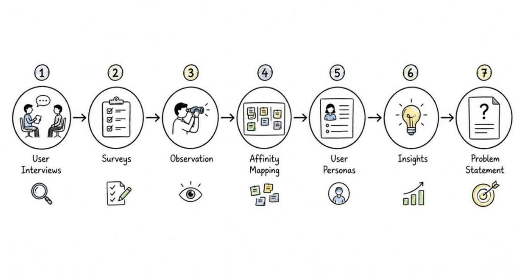
This part covers the discovery layer that makes UI/UX decisions meaningful. It focuses on how designers understand users, validate assumptions, identify pain points, frame the right problem, and turn research into actionable design direction before moving into wireframes and polished interfaces.
Questions 41–80
41. What is UX research?
UX research is the process of studying users, their behaviors, needs, goals, and pain points to inform design decisions. It helps teams design based on evidence instead of internal assumptions.
42. Why is UX research important?
UX research helps teams understand the real problem before trying to solve it. Without research, a team may design a polished solution for the wrong user need.
43. What is discovery in UX?
Discovery is the early stage of the design process where teams explore the problem space, user context, constraints, and opportunities. The goal is to understand what should be solved before discussing how to solve it.
44. What is problem framing?
Problem framing is the process of defining the design challenge clearly so the team works on the right issue. A well-framed problem gives direction, focus, and measurable design intent.
45. What is the difference between research and discovery?
Research is the set of methods used to collect insights, while discovery is the broader phase where teams use those insights to define the problem and opportunity. Research supports discovery, but discovery also includes alignment, assumptions, and business context.
46. What is qualitative research?
Qualitative research focuses on understanding user behavior, motivation, context, and feelings through methods such as interviews and observation. It is useful when you want deeper insight into why users behave a certain way.
47. What is quantitative research?
Quantitative research focuses on measurable patterns using numbers, percentages, and larger sample sizes, often through surveys or analytics. It helps answer questions such as how often something happens or how many users face a certain issue.
48. What is the difference between qualitative and quantitative research?
Qualitative research explains why users behave in certain ways, while quantitative research helps measure how often patterns appear. Strong UX work often combines both to get depth and scale.
49. What is a user interview?
A user interview is a structured conversation with users to understand their needs, behavior, motivations, frustrations, and current workflows. It is one of the most common qualitative research methods in UX.
50. Why are user interviews useful?
User interviews help uncover context that is hard to see in analytics or surveys alone. They are especially useful for discovering pain points, habits, expectations, and hidden workarounds.
51. What makes a good user interview question?
A good user interview question is open-ended, neutral, and focused on past behavior or real experience. Strong questions encourage users to describe what they actually did, not what they think sounds correct.
52. Why should researchers avoid leading questions?
Leading questions push users toward a preferred answer and reduce research quality. Good research should reveal what users really think, even when the answer is uncomfortable for the product team.
53. What kind of questions should you ask in discovery interviews?
Discovery interviews usually focus on current behavior, pain points, goals, tools, workarounds, and task context. Questions like “Tell me about the last time you tried to do this” are usually stronger than opinion-only questions.
54. Why is asking “why” important in UX interviews?
Asking “why” helps move from surface-level answers to real motivation and cause. It is often the follow-up that reveals whether a pain point is minor, emotional, frequent, or business-critical.
55. What is contextual inquiry?
Contextual inquiry is a research method where users are observed and questioned while doing tasks in their real environment. It helps teams understand behavior in context rather than relying only on memory-based answers.
56. What is observation in UX research?
Observation means watching users perform tasks to understand behavior, friction, and context. It is valuable because users do not always describe their actions accurately in interviews.
57. What is a survey in UX research?
A survey is a structured set of questions used to gather input from many users at scale. It is often useful for validating patterns, measuring satisfaction, or collecting broad directional feedback.
58. When should you use a survey instead of an interview?
A survey is useful when you need input from a larger number of users or want measurable patterns quickly. Interviews are better when you need depth, nuance, and context behind the responses.
59. What is competitive analysis in UX?
Competitive analysis is the process of reviewing similar products to understand common patterns, strengths, weaknesses, and market expectations. It helps teams identify opportunities without blindly copying competitors.
60. Why is competitive analysis important?
It helps teams understand the design landscape and user expectations in the category. It is useful for spotting gaps, avoiding obvious mistakes, and building stronger product positioning.
61. What is a pain point in UX?
A pain point is a recurring problem, frustration, or obstacle that prevents users from completing tasks smoothly. Pain points are often the starting point for meaningful design improvement.
62. What is a user need?
A user need is the underlying requirement, goal, or outcome a user is trying to achieve. Good design focuses on solving needs, not just adding screens or features.
63. What is a user goal?
A user goal is the specific outcome a user wants to achieve while using a product or service. Understanding user goals helps teams align features and flows to actual value.
64. What is a research objective?
A research objective is a clear statement of what the study aims to learn. It keeps the research focused and helps teams avoid collecting interesting but irrelevant data.
65. What is a research hypothesis?
A research hypothesis is an assumption that can be explored or validated through research. In UX, it often connects a user problem, a possible cause, and a design opportunity.
66. Why is hypothesis-based research useful?
It gives the study direction while still allowing evidence to challenge assumptions. A strong team uses hypotheses to guide inquiry, not to force the data to support a pre-decided answer.
67. What is synthesis in UX research?
Synthesis is the process of organizing raw research findings into patterns, themes, insights, and opportunities. It turns notes and observations into something the team can act on.
68. What is affinity mapping?
Affinity mapping is a method of grouping observations or quotes into clusters to identify patterns and themes. It is commonly used after interviews or usability sessions to make sense of qualitative data.
69. Why is affinity mapping important?
It helps teams move from scattered notes to structured insight. This process makes it easier to identify recurring pain points, validate assumptions, and prioritize what matters most.
70. What is an insight in UX research?
An insight is a meaningful finding that explains user behavior, need, or friction in a way that can influence design decisions. It is more valuable than a raw observation because it interprets what the pattern means.
71. What is the difference between an observation and an insight?
An observation is something you saw or heard, while an insight explains why it matters. For example, “users skip onboarding” is an observation, but “users skip onboarding because the value is unclear” is an insight.
72. What is a problem statement in UX?
A problem statement is a concise description of the user issue the team is trying to solve. A strong problem statement is clear, focused, and grounded in evidence from research or product signals.
73. What makes a strong problem statement?
A strong problem statement identifies the user, the challenge, and why it matters. It should guide solution thinking without jumping too quickly into interface details.
74. What is a “How Might We” statement?
A “How Might We” statement is a reframing technique used to turn problems into open-ended design opportunities. It encourages ideation while staying anchored to a real user challenge.
75. Why are “How Might We” statements useful?
They help teams move from analysis into solution exploration without assuming one fixed answer. A good “How Might We” statement is broad enough to inspire ideas but focused enough to stay relevant.
76. What is Jobs to Be Done in UX?
Jobs to Be Done is a way of thinking about user behavior based on the task or progress users are trying to achieve. It shifts attention from user type alone to the real outcome they want in a given context.
77. Why is Jobs to Be Done useful?
It helps teams understand why users choose a product or feature in a specific situation. This can produce sharper design decisions than relying only on demographics or assumptions.
78. What is a common mistake in UX research?
A common mistake is jumping into solutions before understanding the problem clearly. Another is collecting research data but failing to synthesize it into useful insights and priorities.
79. What is a strong answer for research questions in interviews?
A strong answer explains the research goal, the method used, the type of users involved, the key insight found, and how that insight influenced the design decision. Interviewers usually care more about reasoning and impact than about naming methods alone.
80. How should you practice research and discovery for interviews?
Practice explaining one project from assumption to insight to design direction. Focus on the problem, the research method, the evidence you found, the pattern you identified, and how that shaped the next design step.
Revision focus
Revise UX research, discovery, problem framing, qualitative versus quantitative research, user interviews, surveys, contextual inquiry, observation, competitive analysis, pain points, user needs, research objectives, hypotheses, synthesis, affinity mapping, insights, problem statements, “How Might We” statements, and Jobs to Be Done before moving into information architecture, wireframing, and prototyping.
Part 4: Wireframing, Prototyping, and Information Architecture
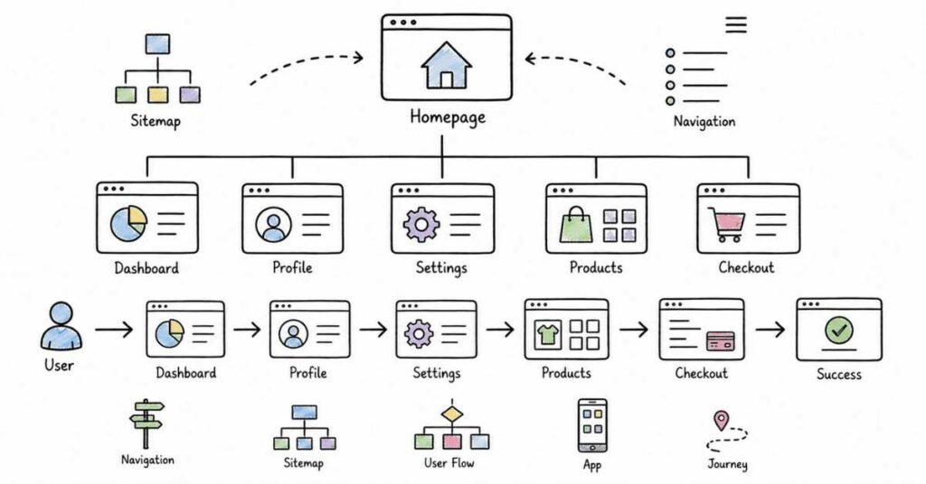
This part covers the structural design layer that turns research insights into usable product flows and screen-level decisions. It focuses on information architecture, navigation, user flows, wireframes, prototypes, interaction thinking, and the practical design choices that help teams move from problem definition to solution direction.
Questions 81–120
81. What is information architecture in UI/UX?
Information architecture is the way content, features, and navigation are organized so users can find what they need easily. It creates the structural foundation for usable digital products.
82. Why is information architecture important?
Good information architecture improves findability, reduces confusion, and helps users complete tasks faster. Weak structure often causes navigation problems even when the interface looks visually polished.
83. What is a sitemap?
A sitemap is a visual representation of the main sections, pages, and relationships within a product or website. It helps designers plan content hierarchy and navigation before detailed screen design begins.
84. What is the purpose of a sitemap?
A sitemap helps teams align on product structure and identify parent-child relationships between pages or sections. It is useful when planning complex products with multiple categories, flows, or content areas.
85. What is a navigation system?
A navigation system is the set of menus, links, tabs, and pathways that help users move through a product. It should support common tasks clearly without making users guess where to go next.
86. What is the difference between global and local navigation?
Global navigation helps users move across major sections of the product, while local navigation helps them explore options within one section. A strong product often needs both, especially at scale.
87. What is a user flow?
A user flow is the sequence of steps a user follows to complete a task such as registration, booking, or checkout. It helps designers map actions, decisions, and possible friction points.
88. Why are user flows important?
User flows help teams see whether a task path is clear, efficient, and realistic before the UI is finalized. They also make it easier to identify unnecessary steps and missing states.
89. What is the difference between a task flow and a user flow?
A task flow usually shows one ideal path for completing a task, while a user flow may include multiple branches, choices, and entry points. User flows are often broader and better for complex scenarios.
90. What is card sorting?
Card sorting is a research method used to understand how users group and label information. It is often used to improve information architecture and navigation design.
91. Why is card sorting useful?
Card sorting helps teams understand users’ mental models instead of relying only on internal assumptions. It is especially helpful when organizing content-heavy websites, apps, or dashboards.
92. What is tree testing?
Tree testing is a method used to check whether users can find information in a proposed navigation structure. It helps validate information architecture before detailed UI work begins.
93. Why is tree testing important?
Tree testing shows whether labels and structure make sense to users. It is useful because a navigation system can seem logical to the team but still fail in real user tasks.
94. What is a wireframe?
A wireframe is a low-detail layout that shows content placement, hierarchy, and key interface elements without final visual styling. It acts as a blueprint for the screen.
95. Why are wireframes important?
Wireframes help teams focus on structure and function before investing time in polished UI. They make early discussions faster and reduce rework later in the design process.
96. What is low-fidelity wireframing?
Low-fidelity wireframing uses simple shapes, placeholders, and rough layouts to explore ideas quickly. It is useful in early-stage ideation and internal alignment.
97. What is high-fidelity wireframing?
High-fidelity wireframing includes more detail, clearer spacing, richer content, and often more realistic interface structure, though it may still stop short of final visual design. It helps teams prepare for prototype creation or stakeholder review.
98. What is the difference between a sketch and a wireframe?
A sketch is usually rougher, faster, and more informal, while a wireframe is more deliberate and structured. Both are useful, but wireframes are easier to share, review, and refine across a team.
99. What is a prototype?
A prototype is an interactive model that simulates how a product or feature works. It allows designers, stakeholders, or users to experience flows and interactions before development starts.
100. Why are prototypes important?
Prototypes help teams test flows, interactions, and assumptions early. They reduce ambiguity by showing behavior, not just screen layouts.
101. What is a clickable prototype?
A clickable prototype is a prototype where users can move through linked screens or states to simulate interaction. It is commonly used for demos, stakeholder review, and usability testing.
102. What is the difference between a wireframe and a prototype?
A wireframe focuses on structure and content placement, while a prototype focuses on interaction and experience flow. In practice, wireframes often come first, and prototypes build on them.
103. What is interaction design?
Interaction design focuses on how users and interfaces behave with each other, including actions, feedback, transitions, and system response. It helps make digital experiences predictable and usable.
104. Why is interaction design important?
Even a visually strong layout can fail if interactions are confusing or inconsistent. Good interaction design helps users understand what is happening, what is clickable, and what happens next.
105. What is a design pattern in UI/UX?
A design pattern is a reusable solution for a common interface problem, such as tabs, dropdowns, pagination, or onboarding sequences. Patterns save time and improve consistency when used thoughtfully.
106. Why are design patterns useful?
Design patterns reduce the learning curve because users recognize familiar interactions. They also help teams design faster and maintain consistency across screens.
107. What is content hierarchy?
Content hierarchy is the ordering and prioritization of information based on user importance and task relevance. It helps users understand what to focus on first.
108. Why is content hierarchy important in wireframing?
Wireframes are not just boxes on a page; they are decisions about what matters most. Strong hierarchy makes screens easier to scan and supports faster task completion.
109. What is a screen state?
A screen state is a specific condition of a screen, such as default, loading, empty, success, error, or disabled. Designing states is important because real products change based on user actions and data conditions.
110. Why are screen states important?
A screen may look fine in the ideal case but fail in real use if error, empty, or loading states are ignored. Good designers think beyond the happy path.
111. What is the happy path in UX?
The happy path is the ideal flow where everything works as expected and the user completes the task without issues. It is useful as a starting point, but it is not enough for real product design.
112. What are edge cases in flows?
Edge cases are less common but important scenarios such as missing data, unusual user behavior, failed actions, or unexpected inputs. Strong designers consider them because real users rarely behave exactly as planned.
113. What is progressive disclosure in interaction design?
Progressive disclosure means showing only the necessary options first and revealing more complexity when needed. It helps keep flows simple without removing important functionality.
114. How do you approach wireframing for a new feature?
Start with the user goal, map the task flow, identify required content and actions, and then create low-fidelity layouts that support the task clearly. After that, refine the structure based on feedback, constraints, and usability considerations.
115. How do you approach prototyping for usability testing?
Focus on the parts of the experience that need validation, such as a key flow, unclear interaction, or risky assumption. The prototype should be realistic enough to test behavior, but not more polished than necessary for the learning goal.
116. What is a common mistake in wireframing?
A common mistake is treating wireframes like incomplete visual designs instead of structural thinking tools. Another is jumping into polished screens before clarifying flow, hierarchy, or content needs.
117. What is a common mistake in information architecture?
A common mistake is organizing content based on internal team structure instead of user mental models. Another is using labels that make sense to the company but not to the user.
118. What is a strong answer for wireframing and IA interview questions?
A strong answer explains the user task, the structural decision made, the reason behind it, and how the team validated or refined the solution. Interviewers want to hear how you think, not just which tool you used.
119. Why do interviewers ask about prototypes and flows?
They want to know whether you can translate research into real product structure and interaction decisions. These questions test practical design thinking, not just terminology.
120. How should you practice this area for interviews?
Practice taking one case study and explaining the sitemap, flow, wireframe logic, key screen states, and prototype decisions clearly. A good exercise is to justify every major layout or navigation choice from the user’s point of view.
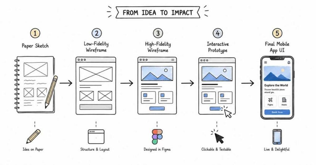
Revision focus
Revise information architecture, sitemaps, navigation systems, user flows, task flows, card sorting, tree testing, wireframes, low-fidelity versus high-fidelity design, prototypes, clickable prototypes, interaction design, content hierarchy, screen states, happy path, edge cases, and progressive disclosure before moving to UI design systems and visual craft.
Part 5: UI Design Systems and Visual Craft
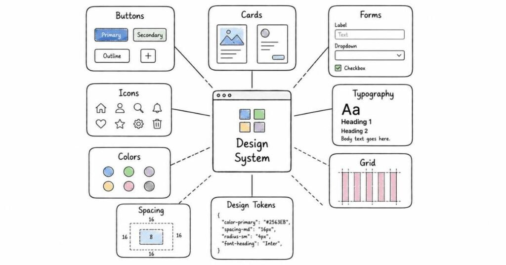
This part covers the visual execution layer that turns structure into polished, usable interfaces. It focuses on layout, typography, spacing, color, components, design systems, responsiveness, and the UI decisions that interviewers often use to test whether a designer can create clean, scalable, and consistent product experiences.
Questions 121–160
121. What is UI design in practical product work?
UI design is the process of shaping the visual and interactive layer of a digital product so users can understand and use it easily. In practice, it involves layout, typography, color, spacing, components, and consistency across screens.
122. Why does visual design matter in UI/UX interviews?
Interviewers ask visual design questions to see whether you can create interfaces that are not only attractive but also clear, usable, and aligned with product goals. Strong visual craft usually signals strong attention to detail and system thinking.
123. What is visual hierarchy?
Visual hierarchy is the arrangement of elements so users notice the most important information first. It is created through size, contrast, spacing, color, placement, and typographic emphasis.
124. Why is visual hierarchy important?
A clear hierarchy helps users scan screens quickly and understand where to focus. Without hierarchy, interfaces often feel crowded, flat, and difficult to use.
125. What is alignment in UI design?
Alignment is the consistent placement of elements along shared edges, grids, or axes. It makes screens feel organized and improves readability and balance.
126. Why is alignment important?
Good alignment creates order and makes relationships between elements easier to understand. Poor alignment can make a product feel messy even if the individual components look fine.
127. What is spacing in UI design?
Spacing is the intentional use of distance between elements, groups, sections, and containers. It helps define relationships, reduce clutter, and improve scanning.
128. Why is spacing important?
Spacing affects readability, focus, and perceived polish. In many interfaces, better spacing improves usability more than adding more visual decoration.
129. What is whitespace?
Whitespace is the empty area around content and interface elements. It gives the design room to breathe and helps users process information more comfortably.
130. What is typography in UI design?
Typography is the use of typefaces, font sizes, weights, line height, and spacing to make content readable, scannable, and visually structured. It plays a major role in both usability and brand expression.
131. Why is typography important in interfaces?
Typography affects readability, clarity, tone, and hierarchy. A strong interface often feels easier to use simply because the text structure is clear and consistent.
132. What is a typographic scale?
A typographic scale is a defined set of text styles for headings, subheadings, body text, captions, and other content levels. It helps maintain consistency and makes the interface easier to scan.
133. Why should designers define text styles early?
Defining text styles early reduces inconsistency and speeds up design work. It also makes developer handoff cleaner because the system is easier to document and reuse.
134. What is color theory in UI design?
Color theory in UI design involves using color intentionally to guide attention, support hierarchy, communicate status, and reinforce brand identity. Good color choices balance aesthetics with usability and accessibility.
135. Why is color important in interfaces?
Color can highlight actions, show feedback, communicate meaning, and influence emotional tone. But color should support the experience, not become a substitute for clarity.
136. What is contrast in UI design?
Contrast is the difference between elements, such as dark versus light, large versus small, or bold versus regular. It helps important content stand out and improves readability.
137. Why is contrast important?
Contrast improves readability, accessibility, and attention guidance. Low-contrast designs may look soft or modern, but they often fail in real-world use.
138. What is a color palette?
A color palette is a defined set of colors used across the interface for primary actions, supporting elements, backgrounds, text, and status states. A controlled palette helps the product feel consistent and intentional.
139. What is a component in UI design?
A component is a reusable interface element such as a button, input field, card, modal, tab, or navigation item. Components help teams design and build products more consistently.
140. Why are reusable components important?
Reusable components improve consistency, speed, and scalability. They also reduce design and development duplication across screens and features.
141. What is a design system?
A design system is a collection of reusable components, patterns, guidelines, and rules that help teams create consistent and scalable products. It acts as a shared source of truth for designers and developers.
142. Why is a design system important?
A design system helps products scale without becoming visually inconsistent. It also improves collaboration because teams can rely on shared standards instead of redesigning the same patterns repeatedly.
143. What is the difference between a style guide and a design system?
A style guide mainly defines visual rules such as colors, typography, and branding, while a design system also includes reusable components, interaction patterns, usage guidance, and implementation logic. A design system is broader and more operational.
144. What are design tokens?
Design tokens are structured values for colors, spacing, typography, radius, and similar properties that help maintain consistency across a system. They make design decisions easier to standardize across tools and codebases.
145. Why are design tokens useful?
Design tokens support scalability, consistency, and easier updates across large products. They are especially useful when teams manage multiple themes, platforms, or products.
146. What is responsiveness in UI design?
Responsiveness means designing interfaces that adapt well across different screen sizes and devices. It requires thinking about layout changes, content priority, spacing, and touch-friendly interactions.
147. Why is responsive design important?
Users interact with products across mobile, tablet, and desktop environments, so interfaces must remain usable and clear in each context. Interviewers often expect designers to think beyond one static artboard.
148. What is a grid system?
A grid system is a structural framework that helps align content and maintain consistent layout behavior across screens. It supports balance, rhythm, and responsive organization.
149. Why are grids useful in UI design?
Grids help designers place content more systematically and make layouts easier to scale. They also improve consistency when multiple designers work on the same product.
150. What is iconography in UI design?
Iconography is the use of icons to communicate meaning, actions, or status visually. Good icon use supports clarity, but icons should not replace understandable labels when labels are needed.
151. What makes a UI feel consistent?
A UI feels consistent when spacing, type styles, colors, components, interactions, and labels follow shared patterns across screens. Consistency reduces confusion and makes the product easier to learn.
152. What is visual balance?
Visual balance is the distribution of elements so the screen feels stable rather than heavy on one side or visually chaotic. It can be symmetrical or asymmetrical, as long as the layout feels intentional.
153. What is a strong CTA in UI design?
A strong call to action is visually distinct, clearly labeled, and placed where it matches the user’s decision point. It should stand out without competing unnecessarily with every other element on the screen.
154. How do you choose colors for a UI?
Choose colors based on brand needs, hierarchy, usability, and accessibility rather than personal taste alone. A strong answer should mention contrast, emphasis, emotional tone, and consistency across actions and states.
155. How do you choose typography for a product?
Choose typography based on readability, hierarchy, tone, and product context. A strong answer should mention text scale, spacing, consistency, and how the type performs across devices.
156. What is a common UI design mistake?
A common mistake is overdesigning the interface with too many styles, colors, shadows, or visual effects. Another is making the UI look polished while ignoring readability, spacing, or action clarity.
157. What is a common design system mistake?
A common mistake is creating components without clear usage rules or naming consistency. Another is treating the design system as a static library instead of something that evolves with product needs.
158. What is a strong answer for visual design interview questions?
A strong answer explains the visual decision, the user or business reason behind it, and how consistency or usability was protected. Interviewers usually respond well to designers who connect aesthetics with function.
159. Why do interviewers ask about design systems?
They want to know whether you can contribute to scalable product design, not just create isolated screens. Questions about systems often test consistency, collaboration, and long-term thinking.
160. How should you practice this area for interviews?
Practice reviewing one of your own screens and explaining the hierarchy, spacing, typography, color, component choices, and responsive logic in simple language. If you can justify each visual choice clearly, your answers will sound much stronger in interviews.
Revision focus
Revise visual hierarchy, alignment, spacing, whitespace, typography, typographic scale, color theory, contrast, palettes, components, design systems, style guides, design tokens, responsiveness, grid systems, iconography, consistency, visual balance, and CTA clarity before moving to usability, accessibility, and evaluation.
Part 6: Usability, Accessibility, and Evaluation
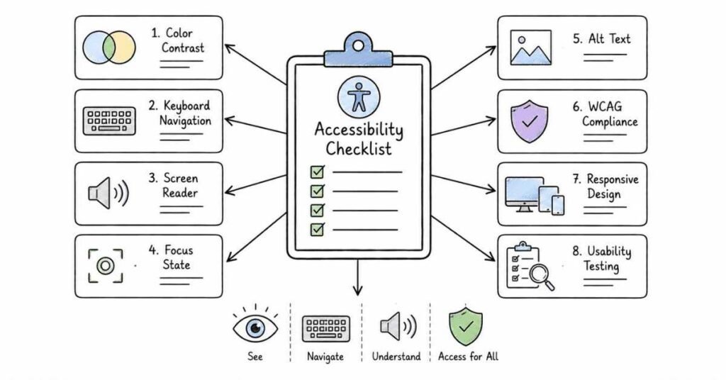
This part covers the evaluation layer that helps designers judge whether an interface is actually working for real users. It focuses on usability principles, heuristic review, accessibility, inclusive design, testing methods, error prevention, and the practical checks interviewers often use to assess whether a designer can improve experiences beyond visual polish.
Questions 161–200
161. What is usability in UI/UX?
Usability is the degree to which users can complete tasks effectively, efficiently, and with reasonable ease in a product. A usable interface helps users reach their goals without confusion, friction, or unnecessary effort.
162. Why is usability important?
Usability matters because even a visually attractive product fails if users cannot understand or use it properly. Good usability improves task success, satisfaction, and product trust.
163. What is accessibility in digital design?
Accessibility is the practice of making digital products usable for people with different abilities, including those who rely on keyboard navigation, screen readers, magnification, captions, or other assistive support. It is a core part of inclusive product design.
164. Why is accessibility important in UI/UX interviews?
Interviewers ask about accessibility because it shows whether a designer thinks beyond the average user and builds for real-world diversity. Accessible design also improves overall usability and broadens who can successfully use the product.
165. What is the difference between usability and accessibility?
Usability focuses on how easy a product is to use, while accessibility focuses on whether people with different abilities can access and use it effectively. A product can be usable for many people but still exclude users with disabilities if accessibility is ignored.
166. What is inclusive design?
Inclusive design is the practice of creating products that consider a wide range of users, abilities, contexts, and constraints from the beginning. It goes beyond minimum compliance and aims to serve more people well.
167. What is a heuristic evaluation?
A heuristic evaluation is a review method where an interface is assessed against recognized usability principles to identify design issues. It is a fast and practical way to find problems before or alongside user testing.
168. Why is heuristic evaluation useful?
It helps teams catch common usability problems early, such as unclear labels, weak feedback, inconsistent patterns, or confusing flows. It is efficient because it does not always require recruiting users for every early review.
169. What are heuristics in UX?
Heuristics are general usability principles used to evaluate interface quality. In interviews, they often appear when discussing how you review an existing product or justify usability improvements.
170. What is usability testing?
Usability testing is a method where real users try to complete tasks with a product while the team observes their behavior, struggles, and reactions. It helps validate whether the design works in practice.
171. Why is usability testing important?
Usability testing reveals issues that teams often miss internally. It is valuable because users frequently behave differently from what designers or stakeholders expect.
172. What is moderated usability testing?
Moderated usability testing involves a facilitator guiding the session, asking follow-up questions, and observing behavior in real time. It is useful when the team needs deeper insight into why users behave a certain way.
173. What is unmoderated usability testing?
Unmoderated usability testing allows users to complete tasks on their own without a live facilitator. It is often faster and easier to scale, though it may provide less context than moderated sessions.
174. What is a usability test task?
A usability test task is a realistic scenario or goal given to a user, such as finding a product, signing up, or editing settings. Good tasks help researchers observe actual behavior rather than collect opinion alone.
175. What makes a good usability test task?
A good task is realistic, clear, and focused on a real user goal without telling the user exactly how to complete it. It should reveal whether the interface supports natural problem-solving.
176. What should designers observe during usability testing?
Designers should observe hesitation, confusion, misclicks, repeated steps, skipped content, verbalized frustration, and how confidently users move through the task. The focus should be on behavior, not only on whether the task was technically completed.
177. What is task success in usability testing?
Task success measures whether users were able to complete the intended action correctly. It is a basic but important signal of whether the design supports the goal.
178. What is time on task?
Time on task measures how long it takes users to complete an activity. It can help reveal friction, inefficiency, or unnecessary complexity in a flow.
179. What is an error in usability evaluation?
An error is a user action that leads to failure, confusion, or an unintended outcome. Errors often indicate unclear labels, weak hierarchy, poor affordance, or missing feedback.
180. What is error prevention in UX?
Error prevention means designing the interface in a way that reduces the likelihood of mistakes before they happen. Good examples include validation, constraints, confirmation for destructive actions, and clear guidance.
181. What is feedback in interface design?
Feedback is the system response that tells users what happened after an action, such as success messages, loading indicators, error states, or progress cues. Good feedback reduces uncertainty and builds trust.
182. Why are empty, loading, and error states important?
Real products do not exist only in perfect conditions. Designers need to handle empty, loading, and error states well so users understand what is happening and what they should do next.
183. What is WCAG?
WCAG stands for Web Content Accessibility Guidelines, which provide widely used standards for making digital content more accessible. In interviews, knowing WCAG usually signals practical accessibility awareness.
184. What are the four WCAG principles?
The four WCAG principles are Perceivable, Operable, Understandable, and Robust. These principles help teams think broadly about whether content can be sensed, used, understood, and supported across technologies.
185. What does Perceivable mean in accessibility?
Perceivable means users must be able to detect and consume content in some form, whether visually, audibly, or through assistive technology. This includes concerns such as contrast, alt text, captions, and clear presentation.
186. What does Operable mean in accessibility?
Operable means users must be able to navigate and interact with the interface using different input methods. This includes keyboard access, clear focus states, and interaction patterns that do not depend only on a mouse.
187. What does Understandable mean in accessibility?
Understandable means the interface and content should be clear, predictable, and easy to comprehend. It includes readable language, consistent behavior, and helpful guidance for forms and errors.
188. What does Robust mean in accessibility?
Robust means content should work reliably across browsers, devices, and assistive technologies. It is about building experiences that remain usable in different technical conditions.
189. What is color contrast in accessibility?
Color contrast is the difference in brightness between text or interface elements and their background. Sufficient contrast helps users with low vision or difficult viewing conditions read and use the interface more easily.
190. What are common WCAG contrast ratios?
One accessibility explanation notes that normal text should typically meet a minimum contrast ratio of 4.5:1, while large text should meet at least 3:1. These are commonly referenced baseline checks in accessibility discussions.
191. Why is keyboard navigation important?
Keyboard navigation matters because some users cannot use a mouse and rely entirely on keyboard interaction. A product should allow users to move through interactive elements in a logical and visible way.
192. What is a focus state?
A focus state is the visible indicator that shows which element is currently selected during keyboard navigation. Without clear focus states, keyboard-only users can easily lose track of where they are.
193. What is a screen reader?
A screen reader is assistive software that reads digital content aloud or presents it in alternative formats for users who are blind or have low vision. Designers should understand how structure, labels, and semantics affect this experience.
194. What is alt text?
Alt text is a text description for an image that helps users understand visual content when they cannot see it or when the image does not load. It should describe the image meaningfully when the image carries information.
195. What is a common accessibility mistake?
A common mistake is treating accessibility as a final checklist instead of designing for it from the beginning. Another is relying only on color to communicate meaning or action status.
196. What is a common usability mistake?
A common usability mistake is assuming users will understand the interface because the team understands it. Another is ignoring friction in forms, navigation, labels, or edge-case states.
197. What is a strong answer for accessibility interview questions?
A strong answer connects accessibility to real user impact and mentions practical checks such as contrast, keyboard access, readable structure, focus visibility, and assistive technology awareness. Interviewers usually respond well to practical thinking over vague claims.
198. What is a strong answer for usability testing questions?
A strong answer explains the goal of the test, the task given to users, what behavior was observed, the issue discovered, and how the design changed based on that evidence. This shows process maturity and learning ability.
199. Why do interviewers ask about evaluation methods?
They want to know whether you can assess design quality after creating a solution rather than assuming the first design is correct. Evaluation questions test humility, rigor, and evidence-based iteration.
200. How should you practice this area for interviews?
Practice reviewing one of your own projects for usability and accessibility issues, then explain what you would test, what heuristics you would use, what barriers you would check for, and how you would improve the experience. That kind of answer usually sounds much stronger than repeating definitions alone.
Revision focus
Revise usability, accessibility, inclusive design, heuristic evaluation, usability testing, moderated versus unmoderated testing, task success, time on task, error prevention, feedback, WCAG, the POUR principles, color contrast, keyboard navigation, focus states, screen readers, alt text, and common usability or accessibility mistakes before moving to product thinking, collaboration, and advanced scenarios.
Part 7: Product Thinking, Collaboration, and Advanced Scenarios
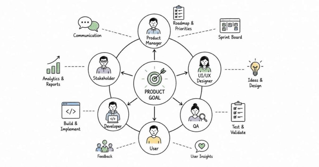
This part covers the strategic layer that separates screen-level execution from stronger product-level design thinking. It focuses on business alignment, prioritization, trade-offs, collaboration, metrics, stakeholder communication, constraints, and scenario-based reasoning that interviewers often use to test whether a designer can operate effectively in real product teams.
Questions 201–240
201. What is product thinking in UI/UX?
Product thinking is the ability to connect user needs with business goals, constraints, and measurable outcomes. It means designing not just for screens, but for product value and long-term impact.
202. Why is product thinking important in interviews?
Interviewers want to know whether you can go beyond visual execution and think about why a feature matters, how success will be measured, and what trade-offs the team must make. Strong product thinking usually signals higher maturity.
203. What is the difference between UX thinking and product thinking?
UX thinking focuses strongly on user needs, flow quality, and interaction clarity, while product thinking also includes business goals, prioritization, adoption, and strategic trade-offs. The two are related, but product thinking is broader in scope.
204. How do you balance user needs and business goals?
Balance starts by treating both as part of the same problem rather than opposite forces. Strong design decisions look for solutions that reduce user friction while also supporting business outcomes such as retention, conversion, or activation.
205. What is a business goal in product design?
A business goal is the company outcome the product aims to support, such as growth, engagement, retention, revenue, or operational efficiency. Designers should understand these goals because they shape priorities and evaluation.
206. Why should designers care about metrics?
Metrics help teams understand whether a design change actually improved the product. In interviews, discussing metrics shows that you think about outcomes, not just deliverables.
207. What are common product metrics designers should understand?
Common metrics include conversion rate, activation, retention, completion rate, drop-off rate, engagement, and task success. The right metric depends on the user goal and the business context of the feature.
208. What is prioritization in product design?
Prioritization is the process of deciding which problems, features, or improvements deserve attention first. It is necessary because teams always work with limited time, budget, and engineering capacity.
209. How do you prioritize design work?
A practical answer usually considers user impact, business value, technical feasibility, urgency, and confidence in the evidence. Good prioritization means not every idea gets equal weight.
210. What is an MVP in product design?
MVP stands for minimum viable product, which is the simplest version of a solution that still delivers core value and allows the team to learn from real use. It is about focus, not about shipping something careless.
211. Why is MVP thinking important?
MVP thinking helps teams test the most important assumption without overbuilding. In interviews, it shows that you understand scope control and practical product delivery.
212. What are trade-offs in design?
Trade-offs are the choices teams make when they cannot optimize everything at once. A design may improve speed but reduce flexibility, or improve depth but increase complexity.
213. Why do interviewers ask about trade-offs?
Trade-off questions reveal whether you can make decisions under real constraints instead of searching for perfect but unrealistic solutions. These questions often separate junior execution from more mature design reasoning.
214. How do you talk about trade-offs in an interview?
Explain the goal, the constraints, the options considered, and why one direction was chosen over another. A strong answer also acknowledges what was intentionally delayed, simplified, or sacrificed.
215. What are constraints in product design?
Constraints are the limits that shape what can be designed or shipped, such as time, engineering effort, legal rules, existing systems, budget, or business deadlines. Good designers work with constraints instead of ignoring them.
216. Why are constraints not always bad?
Constraints can help teams focus on what matters most. In many cases, they force clearer prioritization and stronger product thinking.
217. What is stakeholder management in UI/UX?
Stakeholder management is the practice of aligning with people who influence the product, such as product managers, engineers, marketers, legal teams, leadership, or customer teams. It involves communication, expectation setting, and decision clarity.
218. Why is stakeholder management important?
Even a strong design can fail if stakeholders are not aligned on the problem, scope, or reasoning. Good stakeholder management reduces friction and improves execution quality.
219. How do designers collaborate with product managers?
Designers and product managers usually collaborate on problem definition, prioritization, user needs, success metrics, and rollout decisions. Strong collaboration means sharing context early instead of working in isolated handoffs.
220. How do designers collaborate with engineers?
Designers collaborate with engineers by discussing feasibility, edge cases, technical limits, implementation details, and interaction behavior early in the process. Strong collaboration reduces rework and makes solutions more realistic.
221. Why is early collaboration important?
Early collaboration helps surface constraints, assumptions, and risks before the design is too far along. It also builds shared ownership, which usually leads to better product outcomes.
222. What is cross-functional collaboration?
Cross-functional collaboration means working across disciplines such as design, product, engineering, research, data, and marketing to solve product problems together. It reflects how most real product teams operate.
223. What is design rationale?
Design rationale is the clear explanation behind why a decision was made. It connects user need, product goal, evidence, and practical reasoning into one understandable story.
224. Why is design rationale important in interviews?
Interviewers want to hear why you chose a direction, not just what the final screen looks like. Strong rationale shows structured thinking and confidence without sounding defensive.
225. What is a product critique or app critique round?
A product critique round is an interview exercise where you analyze an existing product, identify strengths and weaknesses, and suggest improvements. It tests observation, prioritization, and communication.
226. How should you approach a product critique?
Start with the product’s likely user and goal, then assess what works, where friction exists, and which improvement would matter most. Strong critiques balance positives, problems, and prioritization rather than listing random opinions.
227. What is a design challenge or whiteboard exercise?
A design challenge is a timed interview task where you solve a product problem live or through a take-home brief. It is used to assess process, prioritization, and communication under time pressure.
228. What are interviewers looking for in design exercises?
They usually care more about how you frame the problem, narrow scope, ask questions, and explain decisions than whether the final output looks perfect. A focused, logical answer often performs better than an overly broad one.
229. What is a 0-to-1 product scenario?
A 0-to-1 scenario involves designing a new product or feature from scratch where there is no existing structure to improve. These scenarios test strategy, prioritization, and first-principles thinking.
230. How do you handle ambiguity in design interviews?
Start by clarifying assumptions, identifying the user and goal, and reducing the problem into a manageable scope. Interviewers usually reward structured thinking under ambiguity more than instant certainty.
231. What is a success metric for a design solution?
A success metric is the measurable indicator that helps the team judge whether the design improved the experience or business outcome. It could be adoption, completion, retention, reduced drop-off, or another context-specific signal.
232. Why should case studies include outcomes?
Case studies with outcomes show that the work had impact beyond visual output. One 2026 product designer guide notes that portfolios without measurable outcomes tend to score lower because they signal weaker business thinking.
233. What if you do not have exact numbers for a portfolio project?
You can still talk about directional outcomes, user feedback, process impact, or the problem eliminated, as long as you are honest about the limits. Estimated or qualitative impact is usually better than no outcome framing at all.
234. What is roadmap influence in design?
Roadmap influence means helping shape what gets built, when it gets built, and why it matters. Designers with stronger product thinking often contribute to prioritization rather than waiting only for assigned screens.
235. What is a strong answer for collaboration questions?
A strong answer explains who you worked with, what tension or challenge existed, how you aligned the team, and what result came from that collaboration. Interviewers often look for clarity, empathy, and ownership in these stories.
236. What is a common mistake in product thinking interviews?
A common mistake is discussing only the interface without mentioning users, business goals, constraints, or outcomes. Another is presenting design choices as personal preference instead of reasoned decisions.
237. What is a common mistake in stakeholder communication?
A common mistake is waiting too long to align with product managers or engineers. Late communication often turns feedback into conflict instead of collaboration.
238. Why do senior-level interviews focus more on strategy?
As design roles become more senior, teams expect stronger ownership of prioritization, influence, and measurable outcomes. Senior interviews often test business reasoning as much as design craft.
239. What is a strong answer for scenario-based product questions?
A strong answer defines the user, the problem, the goal, the scope, the trade-offs, and the success metric before jumping into screens. This structure shows mature thinking even when the problem is unfamiliar.
240. How should you practice this area for interviews?
Practice taking one portfolio project and retelling it through a product lens: the business context, user problem, constraints, trade-offs, cross-functional collaboration, and measurable or directional outcome. That shift makes answers sound much stronger in product-oriented interview loops.
Revision focus
Revise product thinking, business goals, metrics, prioritization, MVP thinking, trade-offs, constraints, stakeholder management, collaboration with PMs and engineers, cross-functional work, design rationale, critique rounds, design challenges, ambiguity handling, success metrics, outcome storytelling, and roadmap influence before moving to the final UI/UX interview Q&A bank.
Part 8: UI/UX Interview Q&A Bank
This part is a practical mixed-question bank designed to simulate the kind of questions that come up across portfolio rounds, design process rounds, app critiques, design challenges, and cross-functional interviews. It combines beginner, intermediate, and advanced interview questions so you can practice giving short, structured, interview-ready answers under pressure.
Questions 241–280
241. Tell me about yourself as a UI/UX designer.
A strong answer should briefly cover your background, the kind of problems you enjoy solving, your process, and the type of role you are targeting. Interviewers usually want a focused professional story, not your full life story.
242. Walk me through one of your recent design projects.
Start with the product context, user problem, your role, your process, key decisions, collaboration, and the outcome. One 2026 interview guide notes that portfolio walkthroughs are stronger when they include business context, trade-offs, and measurable or directional impact, not just final screens.
243. How do you begin a new design project?
A practical answer starts with understanding the problem, users, goals, constraints, and available evidence before moving into flows or interfaces. This shows that you begin with clarity rather than jumping straight into screens.
244. How do you define the problem before designing?
Define the user, the task, the pain point, the business context, and the success criteria. Interviewers usually want to hear that you frame the problem clearly before proposing solutions.
245. How do you conduct user research in a project?
Explain the method, who you spoke with or observed, what you were trying to learn, and how the findings changed the design direction. A strong answer connects research to decisions instead of treating research like a separate checkbox.
246. How do you decide whether to use interviews, surveys, or testing?
Choose the method based on the question you need to answer. Interviews help with depth, surveys help with broader patterns, and usability testing helps validate whether users can actually complete tasks.
247. How do you turn research into design action?
You synthesize findings into themes, identify the key pain points or opportunities, and translate them into problem statements, flows, priorities, or feature decisions. Interviewers want to know whether you can move from insight to action.
248. What do you do when stakeholders want a solution you disagree with?
A strong answer shows calm communication, evidence-based reasoning, and willingness to align on the goal rather than argue from opinion. The best responses show that you can explain trade-offs and suggest ways to validate competing ideas.
249. How do you handle conflicting feedback?
Start by understanding the source and intent of the feedback, then separate personal preference from user need, product goals, or technical constraints. Good designers look for alignment on the problem before debating the interface.
250. How do you prioritize what to design first?
Prioritize based on user impact, business value, urgency, confidence in evidence, and feasibility. Interviewers often use this question to test product thinking rather than pure design craft.
251. How do you approach wireframing?
Start with user goals, content needs, task flow, and screen hierarchy before refining detail. Wireframes should help explore structure and decisions quickly, not become unfinished visual design.
252. How do you decide between low-fidelity and high-fidelity work?
Use low fidelity when exploring structure or multiple options quickly, and use high fidelity when interaction detail, visual clarity, or stakeholder presentation matters. The right level depends on the learning goal and project stage.
253. What is the difference between a wireframe and a prototype?
A wireframe focuses on structure and layout, while a prototype simulates flow and interaction. A clear answer should show that you understand when each is useful in the design process.
254. How do you approach information architecture?
Start by understanding user goals, content groupings, and navigation needs, then test whether the structure matches how users expect to find information. This answer becomes stronger if you mention methods such as card sorting or tree testing.
255. How do you ensure your design is user-friendly?
Explain how you apply hierarchy, clarity, consistency, feedback, and testing to reduce friction. Interviewers usually want practical signs of usability, not just the phrase “user-friendly.”
256. How do you evaluate whether a design works?
You can mention usability testing, heuristic review, metrics, stakeholder feedback, and post-launch signals depending on the stage. Strong answers connect evaluation to actual learning and iteration.
257. How do you measure the success of your designs?
Measure success using metrics linked to the feature goal, such as conversion, completion rate, retention, reduced drop-off, or improved task success. Coursera’s 2026 prep guide specifically highlights this as a common interview theme for UX candidates.
258. How do you design for accessibility?
A strong answer should mention readable hierarchy, color contrast, keyboard access, clear labels, focus visibility, and awareness of assistive technology use. Interviewers usually look for practical habits, not only the word “inclusive.”
259. How do you balance aesthetics and usability?
A strong answer explains that visual quality should support clarity, not compete with it. Good design is not choosing beauty over function or function over beauty; it is making them work together around the user goal.
260. How do you create visual hierarchy in a UI?
Use size, spacing, alignment, contrast, typography, and placement to guide attention toward the most important actions or information. A good answer should sound intentional, not decorative.
261. How do you choose colors and typography for a product?
Base the decision on readability, hierarchy, accessibility, brand tone, and consistency across screens. A strong answer shows that your choices are driven by product needs, not personal taste alone.
262. How do you work with design systems?
Use the design system to maintain consistency, speed up execution, and reduce repeated decisions, while also knowing when the system needs to evolve. Interviewers often ask this to see whether you can work in scalable product environments.
263. What would you do if users are dropping off in a key flow?
Start by identifying where the drop-off happens, gather evidence through analytics or research, and then evaluate whether the issue is about clarity, trust, content, friction, or missing feedback. Strong answers show diagnosis before redesign.
264. How would you improve a signup or checkout flow?
A strong answer would look at reducing unnecessary steps, clarifying value, improving input guidance, handling errors clearly, and testing whether the revised flow improves completion. Interviewers want practical reasoning, not generic claims.
265. How do you approach a design challenge in an interview?
Clarify assumptions, define the user and goal, narrow scope, map a simple flow, and explain trade-offs as you go. Several interview guides emphasize that interviewers care more about structured thinking than polished output in time-boxed exercises.
266. How do you handle ambiguity during a live exercise?
Break the problem into user, goal, context, constraints, and success metric. Structured thinking under uncertainty usually matters more than sounding instantly certain.
267. How do you present your portfolio in an interview?
Lead with context, your role, the problem, your process, key decisions, collaboration, trade-offs, and outcomes. One 2026 product design interview guide recommends keeping the walkthrough focused and leaving space for questions rather than narrating every screen.
268. What should a strong case study include?
A strong case study usually includes the problem, user insight, your role, process, iterations, final direction, collaboration, and measurable or directional outcome. Portfolios without outcomes often appear weaker because they show less product maturity.
269. How long should a portfolio walkthrough be?
One 2026 product designer guide recommends targeting roughly 18 to 22 minutes for a case study walkthrough so there is room for discussion and follow-up questions. That kind of pacing usually works better than overly long presentations.
270. What if your project did not ship?
You can still present the problem, your approach, what you learned, what trade-offs existed, and what would have happened next. Interviewers often care more about reasoning quality than whether every project reached launch.
271. How do you explain your role in a team project?
Be precise about what you owned, where you collaborated, and what decisions were shared. One common portfolio mistake noted in interview guidance is sounding vague about personal contribution in team work.
272. How do you talk about a failed design decision?
A strong answer shows honesty, reflection, and the ability to learn from evidence. Good candidates explain what assumption failed, what they changed, and how the learning improved future decisions.
273. How do you give and receive design feedback?
Good feedback is specific, tied to goals, and focused on improving the work rather than judging the person. Good designers also receive feedback with curiosity and use it to strengthen the solution.
274. How do you collaborate with product managers and developers?
Explain how you align on goals, discuss constraints early, review flows and edge cases together, and stay involved through implementation. Cross-functional collaboration is a repeated theme across modern design interview loops.
275. What do you do when engineering says a design is not feasible?
A strong answer looks for the underlying limitation, explores alternatives, and protects the user goal as much as possible within constraints. This shows flexibility without abandoning design quality.
276. How do you think about edge cases?
Edge cases matter because real users do not always follow the ideal path. Strong answers mention empty states, errors, loading states, unexpected inputs, and unusual behaviors as part of the design process.
277. How do you critique an existing app or screen?
Start by identifying the likely user and purpose, then assess clarity, hierarchy, flow, feedback, and opportunity areas. A strong critique balances what works with what should improve instead of only being negative.
278. What is one mistake candidates make in UI/UX interviews?
A repeated mistake is focusing too much on polished screens and not enough on problem framing, rationale, outcomes, or trade-offs. Several interview guides suggest that explanation quality often matters as much as visual output.
279. What is one thing that makes a candidate stand out?
Candidates stand out when they can explain decisions clearly, show structured thinking, discuss collaboration honestly, and connect their work to user and business outcomes. That combination usually signals maturity more than tool fluency alone.
280. How should you practice this final Q&A bank?
Practice answering out loud in short, structured responses using real projects from your portfolio. The most effective preparation usually combines timed mock interviews, portfolio walkthrough drills, and scenario-based speaking practice.
Revision focus
Revise portfolio storytelling, problem framing, research-to-design translation, prioritization, wireframing, prototyping, accessibility, design systems, metrics, collaboration, trade-offs, design challenges, app critiques, edge cases, and concise answer structure before moving to behavioral preparation, resume optimization, LinkedIn strategy, salary guidance, and follow-up communication.
Part 9: Behavioral, Resume, LinkedIn & Career Strategy
This final part is designed to help candidates move from technical preparation to actual interview conversion. It covers the STAR method, behavioral interview practice, AI self-preparation prompts, resume and LinkedIn optimization, portfolio strategy, salary context in India for 2026, thank-you and follow-up email templates, and a final 30-day execution checklist.
STAR method
The STAR method stands for Situation, Task, Action, and Result, and it is one of the most effective ways to answer behavioral interview questions clearly and persuasively. Multiple 2026 interview prep sources recommend STAR because it helps candidates stay structured, specific, and outcome-oriented in UX and UI interviews.
Use STAR like this:
- Situation: Give the context.
- Task: Explain what you were responsible for.
- Action: Describe what you specifically did.
- Result: End with the outcome, learning, or impact.
A strong behavioral answer is usually concise, specific, and evidence-based. Interviewers typically respond better when candidates explain their role clearly and mention real decisions, tools, constraints, or results instead of speaking in vague generalities.
20 behavioral questions
- Tell me about a time you solved a difficult user problem.
- Tell me about a time you had to defend a design decision.
- Describe a time you received tough feedback on your work.
- Tell me about a project where requirements were unclear.
- Tell me about a time you had to work with difficult stakeholders.
- Describe a time you changed direction after research or testing.
- Tell me about a time a design did not work as expected.
- Describe a time you had to prioritize under tight deadlines.
- Tell me about a time you collaborated closely with developers.
- Describe a time you had to compromise on a design.
- Tell me about a time you improved usability in a product.
- Describe a time you handled conflicting feedback.
- Tell me about a time you influenced a product decision without authority.
- Describe a time you made a mistake and corrected it.
- Tell me about a time you worked on a cross-functional team.
- Describe a time you had to explain design to a non-design audience.
- Tell me about a time you improved a process, not just a screen.
- Describe a time you handled ambiguity well.
- Tell me about a time you used data or research to influence a design choice.
- Describe a time you balanced user needs and business goals.
50 AI self-preparation prompts
Use these prompts with AI tools to rehearse interviews, improve your case studies, and sharpen your thinking. They are most useful when you replace placeholders with your real project details.
- Act as a UX hiring manager and interview me for a junior UI/UX role.
- Ask me 10 UI/UX behavioral questions and grade my answers using STAR.
- Help me rewrite this portfolio project into a stronger case study.
- Ask me one portfolio walkthrough question at a time.
- Challenge my design decisions like a skeptical interviewer.
- Turn my raw project notes into a concise interview story.
- Help me explain this project in under 2 minutes.
- Help me explain this project in under 5 minutes.
- Convert this project into Situation, Task, Action, Result format.
- Identify weak points in my case-study narrative.
- Ask me product critique questions based on a mobile app.
- Simulate a whiteboard challenge for a login or onboarding flow.
- Give me follow-up questions after I explain a design decision.
- Act as a PM and question my prioritization choices.
- Act as an engineer and challenge feasibility in my design.
- Ask me accessibility interview questions for a UI/UX role.
- Ask me usability testing questions and evaluate my answers.
- Ask me design system interview questions.
- Ask me UI visual design questions.
- Ask me research and discovery questions.
- Ask me information architecture questions.
- Ask me scenario-based product design questions.
- Help me answer “Tell me about yourself” for a UI/UX interview.
- Help me answer “Why do you want this role?” for a UX position.
- Help me answer “What are your strengths as a designer?”
- Help me answer “What is your biggest weakness?” professionally.
- Ask me questions based on one portfolio project and increase difficulty gradually.
- Help me identify metrics for this case study.
- Rewrite my resume bullet into an impact-driven UI/UX bullet.
- Suggest stronger UX keywords for my resume.
- Compare my resume summary with a good UX summary and improve it.
- Help me write a LinkedIn headline for a UI/UX role.
- Help me write a LinkedIn About section for a fresher UI/UX designer.
- Review my portfolio project and tell me what recruiters may doubt.
- Ask me collaboration questions about PM and developer alignment.
- Ask me stakeholder management questions.
- Help me answer “How do you handle feedback?” with an example.
- Help me answer “Describe a failed project” without sounding negative.
- Simulate a 20-minute portfolio round.
- Simulate a recruiter screening round.
- Simulate a hiring manager round.
- Simulate a final-round design interview.
- Give me a mock UI critique challenge.
- Give me a mock UX flow critique challenge.
- Score my answer for clarity, confidence, and structure.
- Rewrite my answer to sound more interview-ready.
- Help me shorten my answer while keeping the impact.
- Give me a model answer and then ask me to improve it with my own project details.
- Create 10 follow-up questions from my portfolio walkthrough.
- Build a 7-day mock interview plan for my UI/UX preparation.
Resume optimization
A strong UI/UX resume should show problem-solving, process, tools, and impact rather than listing only responsibilities. Resume consistency across your resume, LinkedIn, and portfolio can also improve recruiter recall and positioning.
Useful UI/UX keywords
- UI Designer.
- UX Designer.
- Product Designer.
- User Research.
- Wireframing.
- Prototyping.
- Information Architecture.
- Usability Testing.
- Accessibility.
- Design Systems.
- Interaction Design.
- Responsive Design.
- Figma.
- User Flows.
- Cross-functional Collaboration.
- Product Thinking.
Resume bullet examples
- Redesigned onboarding flow for a mobile product, simplifying the first-time user journey and improving clarity across key steps.
- Conducted user interviews and synthesized findings into pain points, flows, and wireframe direction for a feature redesign.
- Built interactive prototypes in Figma to validate checkout improvements before development handoff.
- Improved interface consistency by creating reusable components and documenting usage patterns.
- Partnered with product managers and developers to refine requirements, handle constraints, and ship clearer user flows.
- Ran usability testing sessions, identified friction points, and translated findings into practical design iterations.
Resume summary example
UI/UX designer with hands-on experience in user research, wireframing, prototyping, usability testing, and visual interface design. Strong focus on solving user problems, communicating design decisions clearly, and creating usable digital experiences through structured product thinking.
LinkedIn optimization
LinkedIn should position you clearly for the role you want, not just describe what you studied. Consistent phrasing across resume, LinkedIn, and portfolio can help create stronger professional recall.
Headline example
UI/UX Designer | User Research, Wireframing, Prototyping, Usability Testing, Figma, Design Systems
About section example
UI/UX designer focused on building usable, thoughtful digital experiences through research, structure, interaction, and visual clarity. I enjoy solving workflow and usability problems, turning insights into wireframes and prototypes, and collaborating with product and engineering teams to ship practical solutions. My strengths include user-centered design, information architecture, interface consistency, and clear case-study storytelling.
LinkedIn checklist
- Use a clear role title in the headline.
- Add portfolio and project links in Featured.
- Keep About section focused on your strengths and target role.
- Mirror important keywords from your resume and portfolio.
- Use short, scannable project descriptions.
Portfolio strategy
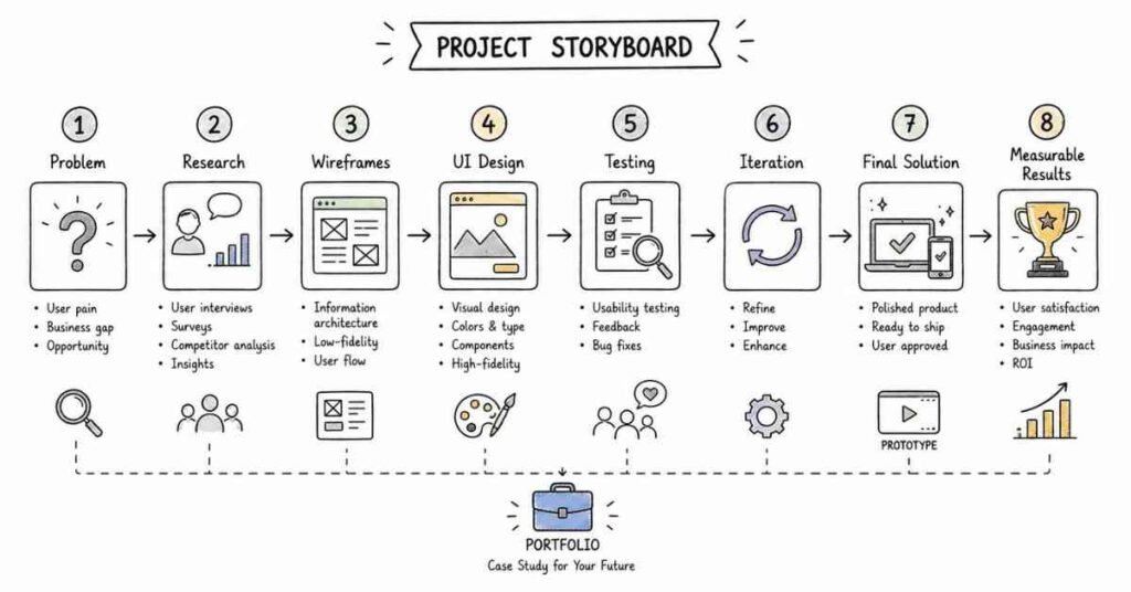
In UI/UX hiring, portfolios are often judged on clarity of thinking more than visual polish alone. Recruiters and hiring teams typically want to see the problem, your role, the process, your decision-making, trade-offs, and the result.
What strong case studies usually include
- Product or business context.
- The user problem.
- Your role and scope.
- Research or inputs used.
- Flow, wireframe, and design decisions.
- Iterations, trade-offs, and collaboration.
- Outcome, learning, or next step.
Portfolio tips
- Show 2 to 4 strong case studies instead of too many weak ones.
- Keep each case study easy to scan.
- Be honest about what you owned.
- Include process, not just final screens.
- Add outcomes where possible, even if directional.
Salary guidance in India 2026
Salary varies widely by city, company type, portfolio quality, role scope, and experience. Multiple 2026 sources suggest using salary figures as directional context rather than as fixed expectations.
Directional salary ranges
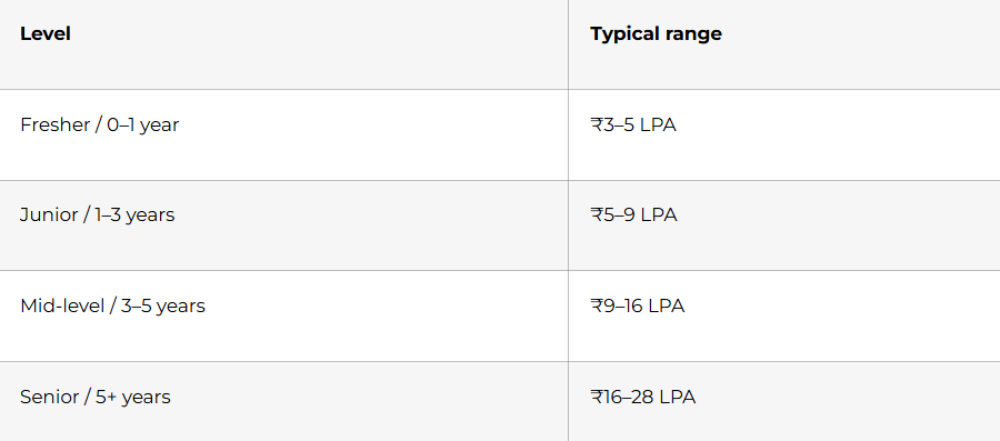
Additional 2026 salary sources report an average UX Designer salary in India of ₹613,241 per year on PayScale and an average UI/UX Designer salary of ₹7,31,800 per year on Jobted, while Indeed lists the average UX/UI Designer base salary in India at ₹2,59,318 per year and highlights higher city-level figures in Bengaluru, Chennai, Noida, Hyderabad, and Pune. These differences show why salary numbers should be treated carefully and interpreted by role definition, sample base, and platform methodology.
For city-level direction, one June 2026 salary guide lists Hyderabad at roughly ₹3.5–22 LPA depending on experience and employer type, while also noting stronger metro premiums in cities like Bangalore and Mumbai. Strong portfolios and product-oriented thinking can materially improve salary outcomes in metro markets.
Thank-you email templates
A post-interview thank-you email should mention something specific from the conversation, reinforce your interest in the team, and remind the interviewer why you are a good fit. One UX-focused LinkedIn post specifically recommends sending individual emails with personalized takeaways rather than relying only on one group note through the recruiter.
Template 1: After portfolio round
Subject: Thank you for today’s conversation
Hi [Interviewer Name],
Thank you for taking the time to speak with me today about the UI/UX Designer role. I especially enjoyed our discussion about [specific topic from the interview], and it gave me a clearer picture of the team’s product challenges and design priorities.
Our conversation reinforced my interest in the role, especially because of the opportunity to contribute through user-centered thinking, structured design decisions, and close cross-functional collaboration. I believe my experience in [specific strength] would allow me to contribute meaningfully to the team.
Thank you again for your time and consideration.
Best regards,
[Your Name]
Template 2: After final round
Subject: Thank you for the interview
Hi [Interviewer Name],
Thank you again for the opportunity to meet with the team. I appreciated hearing more about [team vision, product area, workflow, or challenge], and the discussion made me even more excited about the role.
I would be glad to contribute my strengths in research-driven design, interface clarity, collaboration, and portfolio-level problem solving to help the team build thoughtful user experiences.
Thank you for your time, and I appreciate your consideration.
Best regards,
[Your Name]
Follow-up email template
If you have not heard back after a reasonable waiting period, a short and polite follow-up is appropriate.
Subject: Following up on UI/UX Designer interview
Hi [Interviewer Name],
I hope you are doing well. I wanted to follow up regarding the UI/UX Designer role and thank you again for the opportunity to interview. I remain very interested in the position and appreciated the chance to learn more about the team and product.
I would be grateful for any update you can share regarding the hiring timeline.
Best regards,
[Your Name]
Final 30-day checklist
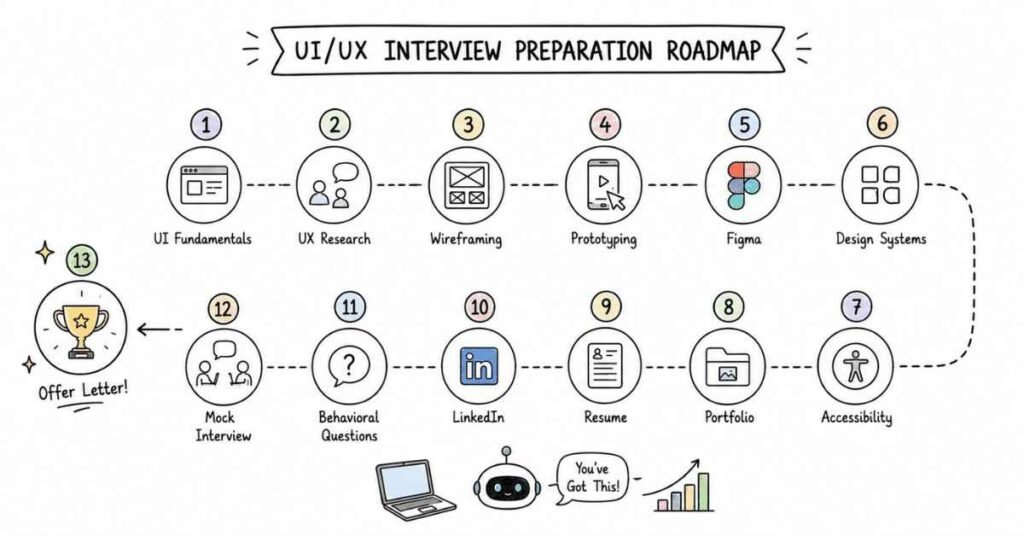
Use this checklist in the last 30 days before interviews:
- Finalize 2 to 4 portfolio case studies with clear problem, process, and result.
- Prepare a 60-second and 2-minute self-introduction.
- Practice at least 20 behavioral questions using STAR.
- Rehearse one portfolio walkthrough daily.
- Practice design challenge structure: user, goal, scope, flow, trade-off, metric.
- Update resume with impact-driven bullets and relevant UI/UX keywords.
- Update LinkedIn headline, About, Featured section, and project links.
- Review accessibility, usability, and design system concepts.
- Practice explaining one collaboration story with PMs or developers.
- Prepare salary expectations using directional India 2026 benchmarks.
- Draft thank-you and follow-up emails before interviews start.
- Run at least 3 mock interviews with spoken answers, not silent review.
Revision focus
Revise the STAR method, 20 behavioral questions, AI practice prompts, resume keywords, impact-based bullet writing, LinkedIn positioning, portfolio storytelling, salary framing for India in 2026, thank-you emails, follow-up email structure, and the final 30-day checklist before publishing the full guide.