90-Day AI-Powered Data Analyst Course Roadmap: From Zero to Job-Ready
Table of Contents
This is a structured, day-by-day 90-day roadmap to become a job-ready Data Analyst covering Advanced Excel, Statistics, SQL, Power BI, Python (Pandas, NumPy, Matplotlib, Seaborn), and AI tools including ChatGPT, Microsoft Copilot, and Google Gemini integrated across every module. Built on Frontlines Edutech’s AI-Powered Data Analyst course curriculum, this plan is designed for students, freshers, and working professionals across India who want to break into one of the highest-demand careers in Indian tech even with zero prior data experience. Data Analyst freshers in Hyderabad earn ₹5.3–6.5 LPA, and the national average sits at ₹6–9 LPA for professionals with one to three years of experience. By Day 90, you’ll have a portfolio of live dashboards, SQL case studies, and Python EDA projects plus the interview confidence to crack roles at TCS, Infosys, Deloitte, HDFC, and hundreds of data-first companies across Hyderabad, Bangalore, and beyond.
Why Data Analytics Is the Career to Be In Right Now
Every company from a Hyderabad startup to a multinational bank is drowning in data and desperately needs someone to make sense of it. That’s exactly the gap a trained Data Analyst fills.
- India’s data analytics market is growing at 26% annually — demand is structural, not a trend
- AI created more analyst jobs, not fewer — companies now need people who can work WITH AI tools, not be replaced by them.
- Entry-level salaries start at ₹5.3 LPA in Hyderabad — one of the highest fresher pay rates across all non-developer tech roles.
- 5 tools that appear in every job posting: Excel, SQL, Power BI, Python, and now AI all covered in this roadmap.
- Industries actively hiring: BFSI (banking, financial services, insurance), e-commerce, healthcare, FMCG, IT services, edtech, and consulting every sector needs data analysts
The honest truth: a well-trained Data Analyst from Hyderabad with a portfolio of real dashboards competes with candidates from any metro in India and this 90-day roadmap is exactly how you build that edge.
Start Your Data Analytics Journey Today, Explore Data Analytics Courses →
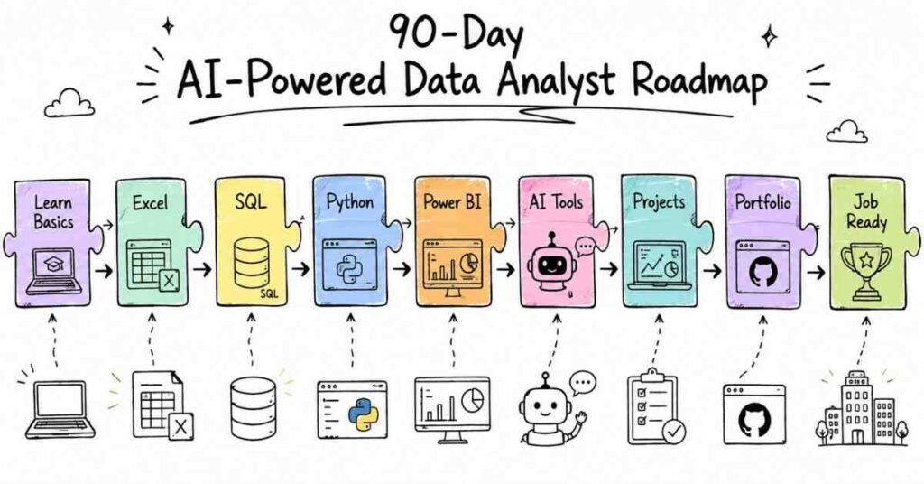
The 3-Month Learning Structure at a Glance
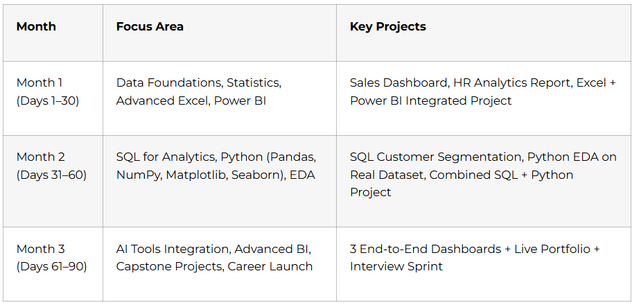
Month 1: Foundations, Excel & Power BI (Days 1–30)
Every senior data analyst uses Excel every day. Every manager you’ll ever present to knows Excel. Month 1 builds the foundation that everything else sits on and adds Power BI on top, which is the most in-demand BI tool in India right now.
Week 1: Data Analytics Fundamentals & Statistics (Days 1–7)
Days 1–2: What Data Analytics Actually Means
- Types of analytics: Descriptive (what happened?), Diagnostic (why did it happen?), Predictive (what will happen?), Prescriptive (what should we do?)
- The Data Analytics process: Business Understanding → Data Collection → Cleaning → Analysis → Visualisation → Decision
- Data Analyst vs. Data Scientist vs. Data Engineer the differences that matter for your job search
- KPIs and metrics: revenue, conversion rate, churn, customer lifetime value how businesses actually measure performance
- Introduction to AI in analytics: how ChatGPT, Copilot, and Gemini are changing the analyst’s daily workflow
Days 3–5: Statistics Fundamentals — The Language of Data
You can’t do data analytics without statistics. These concepts come up in every interview and every analysis you’ll ever run.
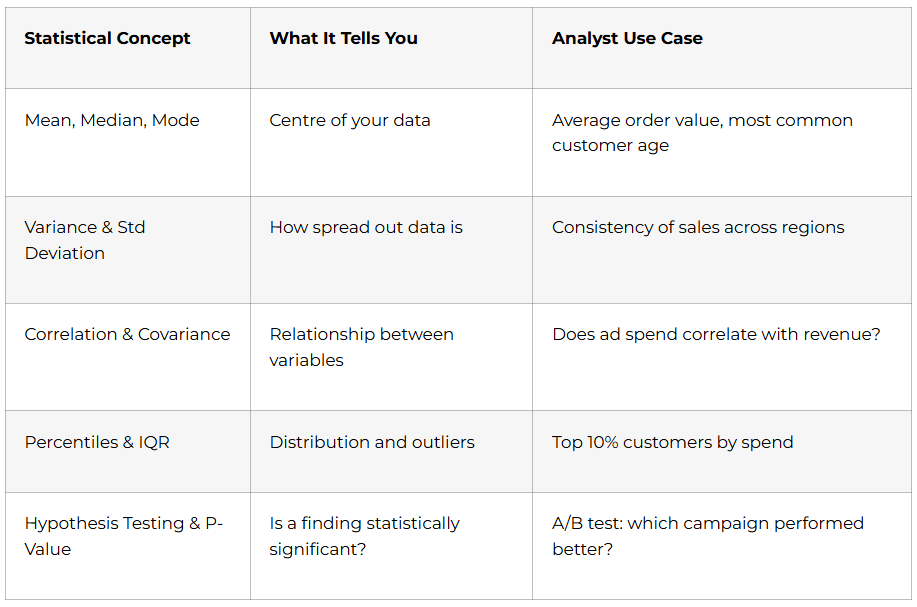
Days 6–7: Statistics Part 2 — Probability & Regression
- Probability basics: events, independent vs. dependent, Bayes’ theorem intuition
- Normal distribution: Z-scores, standard normal curve why 68-95-99.7 matters
- Linear regression: the concept (not the math) using trendlines to predict future values
- Confidence intervals: reporting findings with uncertainty ranges, not false precision
💡 AI Tip (Day 2): Use ChatGPT to explain any statistics concept in plain language. Prompt: “Explain standard deviation to me like I’m presenting to a non-technical business team.” This is exactly how you’ll need to explain findings in your job.
Week 2: Advanced Excel for Data Analytics (Days 8–14)
Excel is not “basic.” Every data analyst at every level uses Excel daily. Mastering it in Week 2 makes every other tool easier.
Days 8–9: Excel Foundations & Data Cleaning
- Excel interface, keyboard shortcuts that save hours, data types and formatting
- Data cleaning: removing duplicates, handling blanks, Text-to-Columns, Flash Fill
- Sorting and filtering: multi-level sort, custom filters, advanced filter to another range
- Conditional formatting: highlight rules, data bars, colour scales make data visual instantly
Days 10–11: Excel Analysis Functions
- VLOOKUP vs. XLOOKUP: find and merge data from multiple sheets XLOOKUP is the modern standard
- IF, IFS, COUNTIF, SUMIF, AVERAGEIF: conditional calculations for business logic
- INDEX-MATCH: the flexible alternative to VLOOKUP for complex lookups
- DATE functions: DATEDIF, EOMONTH, NETWORKDAYS time-based calculations for reporting
Days 12–13: Pivot Tables & Dashboards
- PivotTables from scratch: drag-and-drop data summarisation in minutes
- Calculated fields and items: add metrics directly inside PivotTables
- PivotCharts: visually communicate your pivot data
- Dashboard design: slicers, timelines, linked charts one slicer controls the whole dashboard
- Power Query: connect to external data sources, clean and transform data without formulas
Day 14: Week 2 Project
Sales Performance Dashboard — raw sales data with 1,000+ rows cleaned using Power Query, analysed with PivotTables, visualised with 5 chart types, and presented as an interactive Excel dashboard with slicers. Document with before/after screenshots.

Week 3: Microsoft Copilot for Excel + Power BI Foundations (Days 15–21)
Days 15–16: Microsoft Copilot in Excel
AI doesn’t replace Excel skills it multiplies them. Analysts who know both are hired first.
- Enable Copilot in Microsoft 365 Excel
- Copilot for data analysis: “Summarise the trends in this sales data” → instant insights paragraph
- Copilot for formula generation: describe what you want in plain English → get the formula
- Copilot for data cleaning: identify inconsistencies, suggest fixes, auto-format columns
- Copilot for chart suggestions: “What’s the best way to visualise this data?” → contextual recommendations
- Prompt engineering for Excel: how to write specific, structured prompts that get usable outputs
Days 17–19: Power BI Fundamentals
Power BI is the most requested BI tool in Indian data analyst job postings.
- Power BI Desktop interface: Query Editor, Data Model view, Report view, Service publishing
- Connecting to data sources: Excel, CSV, SQL database, SharePoint, Google Sheets
- Power Query in Power BI: same M language as Excel data cleaning and transformation
- Building visuals: bar, line, pie, donut, map, matrix, card, KPI visual
- Slicers and filters: page-level, visual-level, and report-level filtering
- Data model relationships: one-to-many, many-to-many, bidirectional and why it matters
Days 20–21: DAX — Power BI’s Formula Language
- Measures vs. Calculated Columns: understand when each is appropriate (this is tested in interviews)
- Essential DAX functions: SUM, AVERAGE, COUNT, CALCULATE, FILTER, ALL, RELATED
- Time intelligence: TOTALYTD, SAMEPERIODLASTYEAR, DATEADD — build YoY comparison measures
- RANKX: rank products, regions, or salespeople dynamically in a table
Week 4: Advanced Power BI + Month 1 Capstone (Days 22–30)
- Days 22–23 — Advanced DAX: SWITCH, DIVIDE (safe division), SELECTEDVALUE, dynamic titles that change with slicer selection
- Day 24 — Row-Level Security (RLS): restrict data visibility by user role a skill that enterprise companies specifically require
- Days 25–26 — Power BI Service: publish reports to the cloud, schedule data refresh, share dashboards, manage workspaces
- Day 27 — Bookmarks and drill-throughs: page navigation, detail drill-down pages, interactive storytelling with data
- Days 28–29 — Month 1 Capstone: HR Analytics Dashboard
Multi-page Power BI report: headcount by department and location, attrition rate trends, salary distribution analysis, hire vs. exit timeline. Data sourced from Excel, cleaned in Power Query, modelled with DAX measures, and published to Power BI Service. Document as Portfolio Project #1 on GitHub with live screenshot. - Day 30 — Power BI + Copilot integration: use Copilot inside Power BI Service to auto-generate report summaries and insights.
🏆 Month 1 Milestone: You build professional Excel dashboards and Power BI reports that impress stakeholders. You use AI to work faster. You are a BI professional.
Month 2: SQL & Python for Data Analytics (Days 31–60)
Month 2 adds the two skills that take you from “report builder” to “data analyst” — SQL for database querying and Python for advanced data manipulation and analysis.
Week 5: SQL for Data Analytics (Days 31–37)
SQL is required in over 70% of Indian data analyst job postings. This week gives you every query pattern you’ll need.
Days 31–32: SQL Essentials
- SELECT, FROM, WHERE, ORDER BY, LIMIT — the core 80% of daily SQL
- Filtering: AND, OR, NOT, BETWEEN, IN, LIKE, IS NULL
- Aggregate functions: COUNT, SUM, AVG, MIN, MAX
- GROUP BY + HAVING: summarise and filter grouped results
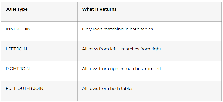
Days 33–34: JOINs — The Most Important SQL Skill
Days 35–36: Advanced SQL for Analytics
- Subqueries: filter with results from another query
- CTEs (Common Table Expressions): write clean, readable multi-step logic
- Window functions: RANK(), ROW_NUMBER(), LAG(), LEAD(), running totals — the most tested advanced topic in data analyst interviews
- Views: save complex analytical queries as reusable virtual tables
Day 37: ChatGPT for SQL
- Prompt: “Write a SQL query to find the top 5 customers by revenue in each region using a window function”
- Learn to verify AI-generated SQL understand what it wrote, test it, fix errors
- ChatGPT for query optimisation: explain slow queries, suggest indexes
Week 5 Project: Customer Segmentation SQL Analysis
Using a retail database, write 15 analytical queries: revenue by region and category, customer purchase frequency, top products by margin, monthly churn rate, cohort retention. Documented as a SQL case study with business context for each query.
Week 6: Python for Data Analysis — Pandas & NumPy (Days 38–46)
Days 38–39: Python Foundations (Fast Track)
- Variables, data types, conditionals, loops, functions compressed fast-track for analysts
- Lists, dictionaries, and list comprehensions the Python structures analysts use daily
- Installing Anaconda, Jupyter Notebooks the analyst’s development environment
Days 40–42: NumPy — The Mathematics Layer
- NumPy arrays vs. Python lists: why arrays are faster for data operations
- Array indexing, slicing, boolean masking filter datasets with conditions
- Mathematical operations: element-wise arithmetic, aggregation, broadcasting
- np.where(): apply conditional logic across an entire column vectorised IF statement
Days 43–46: Pandas — The Data Analyst’s Primary Tool
Pandas DataFrames are how Python analysts interact with data. Every EDA project uses Pandas.
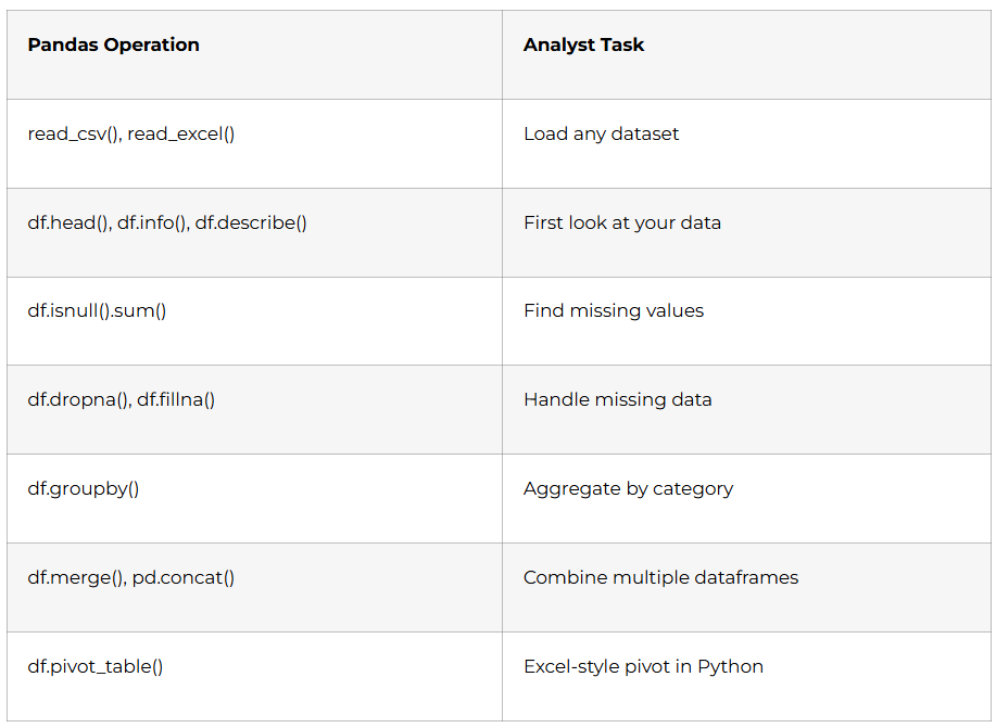
- Day 43 — Loading and inspecting data: shape, dtypes, basic statistics
- Day 44 — Data cleaning: missing values, duplicates, type conversion, string operations with .str
- Day 45 — GroupBy aggregation: multi-level grouping, custom aggregation functions, transform()
- Day 46 — Merging and reshaping: merge on keys, pivot and melt, multi-index DataFrames
Week 7: Data Visualisation with Matplotlib & Seaborn (Days 47–53)
Visual communication is the final and most important step of every analysis. A correct insight nobody can understand is worthless.
Days 47–49: Matplotlib — Full Control
- Figure and Axes objects: understand the two-layer plotting architecture
- Line charts: revenue over time, trend comparison between two years
- Bar charts: category comparison, grouped bars for multi-series
- Histograms: distribution visualisation, bin size selection
- Scatter plots: correlation exploration with regression lines
- Subplots: multiple charts in one figure for comparison reports
Days 50–52: Seaborn — Statistical Visualisation
- Heatmaps: correlation matrices which variables move together
- Boxplots: distribution, quartiles, and outlier detection at a glance
- Pairplots: explore all variable combinations in one command
- Violin plots: compare distributions across categories (gender, region, product)
- FacetGrid: create small multiples same chart type across many categories simultaneously
Day 53: Week 7 Project — Python EDA Report
Full Exploratory Data Analysis on a Kaggle dataset (e-commerce or FMCG): load and clean data with Pandas, statistical summary, 10+ visualisations with Matplotlib and Seaborn, written narrative conclusions for each chart. Export as a Jupyter Notebook with all outputs visible.
Want to Become a Professional Data Analyst? Read the Complete Career Guide →
Week 8: Month 2 Capstone (Days 54–60)
Days 54–56: Connecting the Stack — SQL + Python Integration
- sqlalchemy and pymysql: connect Python to MySQL database query a database directly into a Pandas DataFrame
- Automate repetitive reporting: Python script that queries SQL, cleans with Pandas, saves output as formatted Excel report
- Schedule with Python: automated weekly report generation without touching Excel
Days 57–60: Month 2 Capstone — FinTech Analytics Dashboard
End-to-end project spanning all Month 2 tools:
- SQL queries extract transaction data from a banking database (loan performance, customer risk scoring, branch revenue)
- Python (Pandas) cleans and transforms the data; Seaborn produces distribution and correlation charts
- Power BI connects to the SQL database directly, with custom DAX measures and a multi-page interactive dashboard
- Entire project documented as Portfolio Project #2 on GitHub README with business problem, methodology, key findings, and live dashboard screenshot
🏆 Month 2 Milestone: You query databases like a professional, manipulate data with Python, create publication-quality visualisations, and build Power BI dashboards connected to live SQL data.
Month 3: AI Integration, Capstone Projects & Career Launch (Days 61–90)
The final month integrates AI tools across every skill you’ve learned, builds your three showcase projects, and launches your job search with a structured career sprint.
Week 9: AI Tools for Data Analysts (Days 61–67)
AI is not replacing data analysts it’s making skilled analysts dramatically faster and more valuable. Companies now specifically look for analysts who know how to use AI tools.
Days 61–62: ChatGPT for Analysts
- Prompt engineering fundamentals: role-setting, context-providing, output-specifying
- ChatGPT for data cleaning: “Here is my dataset schema what cleaning steps should I apply before analysis?”
- ChatGPT for SQL generation: describe the query in plain English → get production-ready SQL → verify and optimise
- ChatGPT for Python debugging: paste error messages → get explanation + fix + prevention advice
- ChatGPT for insights narration: “Here are my analysis findings write a professional executive summary”
Days 63–64: Microsoft Copilot Across the Stack
- Copilot in Excel: formula generation, data analysis, chart creation (already covered in Week 3 advanced usage now)
- Copilot in Power BI: natural language queries on published datasets (“Show me revenue by region for Q3”)
- Copilot for report summaries: auto-generate written insights from dashboard data
Days 65–66: Google Gemini & AI Automation Workflows
- Gemini in Google Sheets: AI-assisted pivot tables, formula suggestions, data insights
- AI for data storytelling: structure your findings as a narrative, not a data dump
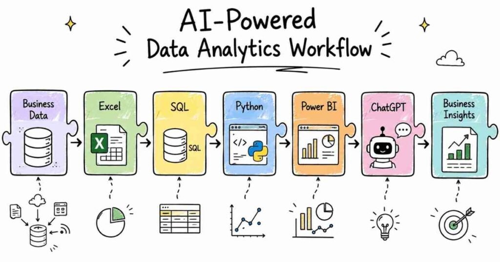
- Building AI-assisted workflows: ChatGPT for analysis → Pandas for processing → Power BI for visualisation → Copilot for summary the modern analyst’s pipeline
Day 67: AI Ethics and Data Analyst Responsibility
- Hallucination risks: why you must always verify AI-generated SQL, formulas, and insights
- Data privacy: never paste personally identifiable information (PII) into ChatGPT know your company’s AI policy
- Presenting AI-assisted work: disclose appropriately, maintain ownership of the analysis
Week 10: Advanced Power BI & Tableau Introduction (Days 68–74)
Days 68–70: Advanced Power BI — Production-Ready Reports
- Performance Analyser: identify slow visuals and optimise DAX calculations
- Composite models: combine DirectQuery (live data) with Import mode data sources
- Power BI Embedded: understand how reports are integrated into internal company applications
- Incremental refresh: configure automatic partial data refresh for large datasets
Days 71–73: Tableau — India’s #2 BI Tool
Tableau appears in a significant share of Indian analytics job postings alongside Power BI. A week of Tableau makes you considerably more hireable.
- Tableau Desktop interface: connecting to data, dimensions vs. measures, continuous vs. discrete
- Building charts: bar, line, scatter, map, heatmap Tableau’s drag-and-drop is faster than Power BI for quick exploration
- Filters and parameters: context filters, parameter-driven dynamic calculations
- Dashboard and story: create a Tableau dashboard, publish to Tableau Public — free portfolio hosting
Day 74: Week 10 Mini-Project
Rebuild one Power BI dashboard in Tableau compare the experience, note the differences, publish to Tableau Public for your portfolio.
Week 11: Three Capstone Projects (Days 75–84)
Build three end-to-end projects that demonstrate your complete analyst skillset. These are the portfolio pieces that get you hired.
Project 1: Sales Analytics Dashboard (Days 75–77)
- Dataset: retail sales data (10,000+ rows) with regions, products, channels, and time
- Excel: clean and prepare data with Power Query
- SQL: extract product performance and regional queries
- Python: Pandas GroupBy analysis + Matplotlib revenue trend charts
- Power BI: multi-page interactive dashboard monthly revenue, regional breakdown, product performance, YoY comparison
- Deliverable: Power BI file + GitHub README with business insights
Project 2: E-Commerce Analytics Dashboard (Days 78–80)
- Dataset: customer orders, product catalogue, returns, and reviews
- SQL: customer lifetime value query, basket analysis (which products are bought together), return rate by category
- Python: cohort analysis with Pandas, customer segmentation by RFM (Recency, Frequency, Monetary value)
- Power BI: customer journey dashboard, RFM segment distribution, return rate monitoring
- AI: use ChatGPT to generate the executive summary for the final report
Project 3: A/B Testing Analytics Project (Days 81–84)
- Dataset: website experiment data two versions of a landing page, conversion rates, session duration
- Python + Statistics: hypothesis testing (t-test), p-value calculation, confidence intervals
- Matplotlib: visualise conversion rate distributions, statistical significance chart
- Excel: summary report formatted for a non-technical marketing team
- Deliverable: Jupyter Notebook + professional PowerPoint report with narrative conclusions
Week 12: Career Launch Sprint (Days 85–90)
Days 85–86: GitHub Portfolio & Professional Profiles
- 3 pinned GitHub repositories (one per capstone project) with full READMEs
- Each README must include: business problem, tools used, key findings (with numbers), dashboard screenshot, how-to-run instructions
- Tableau Public profile: at least one published dashboard
- LinkedIn Featured section: link to GitHub, Power BI screenshots, and any published Tableau dashboard
Day 87: LinkedIn + Resume Optimisation
- LinkedIn Headline: “Data Analyst | Excel | SQL | Power BI | Python | AI Tools | Open to Opportunities in Hyderabad”
- ATS-ready resume structure: Summary → Technical Skills → Projects → Certifications → Education
- Quantify everything: “Built Power BI dashboard tracking ₹12Cr in monthly revenue across 6 regional offices” or “Performed RFM segmentation on 50,000 customer records, identifying 3 high-value cohorts for targeted campaigns”
- Skills keywords recruiters search for: Data Analysis, Power BI, SQL, Python, Pandas, Tableau, Excel, DAX, Statistics, ChatGPT, Copilot
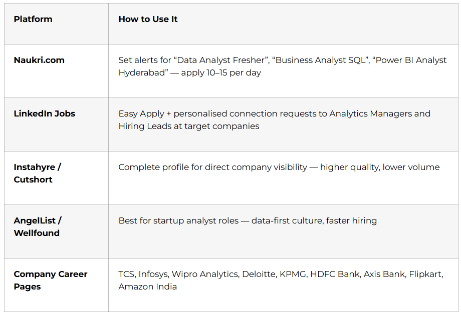
Day 88: Job Search Strategy
Days 89–90: Mock Interviews + Certification Day
The most-tested data analyst interview topics in Indian companies:
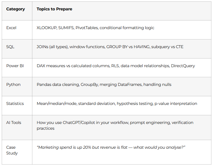
Full mock interview: 20-minute technical round + case study round + behavioural (STAR method). Recorded for self-review. Frontlines Edutech course completion certificate issued.
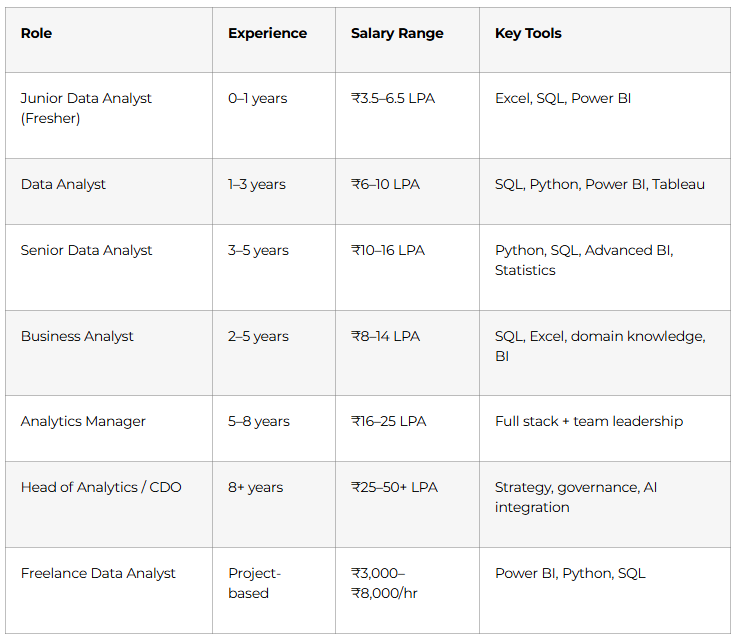
Data Analyst Career Paths & Salary Guide (India 2025)
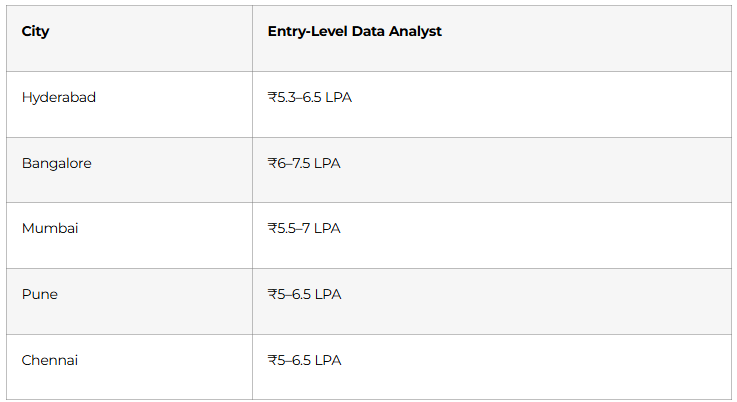
City-wise fresher salaries:
Top hiring companies: TCS, Infosys, Wipro Analytics, Accenture, Capgemini, Deloitte, KPMG, EY, HDFC Bank, ICICI Bank, Axis Bank, Flipkart, Amazon, Swiggy, Zomato, and thousands of D2C brands and analytics consulting firms.
🎯 Prepare for Your Data Analyst Interviews, Access Interview Preparation Guide →
Why Choose Frontlines Edutech for Your Data Analyst Course?
Frontlines Edutech is headquartered in Somajiguda, Hyderabad and has helped thousands of students across Telangana and Andhra Pradesh launch technology careers including commerce graduates, arts students, IT professionals upgrading skills, and complete career changers.
- 5 tools in one course — Excel, SQL, Power BI, Python, and AI tools all integrated in a single structured program
- AI-first curriculum — ChatGPT, Microsoft Copilot, and Gemini are woven throughout every module, not treated as an afterthought
- 3 live portfolio projects — Sales Dashboard, E-Commerce Analytics, and A/B Testing Project all documented on GitHub
- Telugu-friendly teaching — DAX formulas, window functions, and Pandas GroupBy explained in the language you think in
- Industry-aligned content — built from real job descriptions at TCS, Infosys, Deloitte, and Hyderabad analytics firms
- Career support until placed — resume, LinkedIn, mock interviews, and active job referrals from 200+ hiring partners
Frequently Asked Questions
Q1: Do I need programming experience to start this Data Analyst course?
No. This roadmap starts from Day 1 with Excel — no prior coding, mathematics, or IT background is required. Python is introduced in Month 2 with a fast-track foundation week before advancing to Pandas and data visualisation. Students from B.Com, BBA, B.Sc, and arts backgrounds complete this course and land analyst roles regularly.
Q2: What is the salary for a Data Analyst fresher in Hyderabad?
Entry-level Data Analysts in Hyderabad earn between ₹5.3 and ₹6.5 LPA depending on skills, portfolio strength, and the type of company. Candidates with strong Power BI and SQL skills plus a live portfolio of real dashboards consistently land offers at the higher end of this range.
Q3: What tools are covered in this AI-powered Data Analyst course?
The complete tool stack: Microsoft Excel (Advanced + Power Query), Power BI (Desktop + Service + DAX), SQL / MySQL, Python (Pandas, NumPy, Matplotlib, Seaborn), Tableau (introduction), and AI tools — ChatGPT, Microsoft Copilot, and Google Gemini — integrated throughout every module.
Q4: Is Power BI enough to get a Data Analyst job in India?
Power BI alone is not sufficient. Indian data analyst job postings consistently require SQL + Excel + Power BI at a minimum. Adding Python (Pandas) and AI tool proficiency puts you in the top 20% of applicants for fresh graduate positions. This roadmap covers all five.
Q5: What is the difference between a Data Analyst and a Data Scientist?
A Data Analyst works with existing data to answer specific business questions — using Excel, SQL, Power BI, and Python. A Data Scientist builds predictive models and machine learning systems. Most companies hire 10 Data Analysts for every 1 Data Scientist, making the analyst role far more accessible and faster to land for freshers.
Q6: Will I build real projects during this 90-day course?
Yes. You’ll complete 3 end-to-end capstone projects a Sales Analytics Dashboard (Excel + SQL + Python + Power BI), an E-Commerce Analytics Dashboard (SQL + Python + Power BI with RFM segmentation), and an A/B Testing project (Python + Statistics + Excel reporting) all documented on GitHub with live screenshots.
Q7: How are AI tools like ChatGPT and Copilot used in this course?
AI tools are integrated throughout, not added as a separate module. You’ll use ChatGPT to generate and verify SQL queries, debug Python code, and write executive summaries. Microsoft Copilot is used inside Excel and Power BI for formula generation and report narration. Google Gemini is covered for Google Sheets workflows. You’ll also learn prompt engineering specifically for analytics tasks.
Q8: Does Frontlines Edutech provide placement support after the Data Analyst course?
Yes. Placement support includes resume building with quantified project highlights, LinkedIn and GitHub profile optimisation, full mock interview preparation (technical + case study + behavioural), and active job referrals from 200+ partner companies across Hyderabad, Bangalore, and pan-India. Support continues until you land your first role.
Published by Frontlines Edutech | blog.frontlinesedutech.com
For enrollments: +91-83330 77727 | support@frontlinesedutech.com