Graphic Design Interview Questions Preparation Guide
✅ Module 1: 210+ Technical Interview Questions & Answers
✅ Module 2: 50 Self-Preparation Prompts Using ChatGPT
✅ Module 3: Communication Skills and Behavioral Interview Preparation
✅ Module 4: Additional Preparation Elements (Pre-Interview, During, Post-Interview, Resume Tips, Common Mistakes)
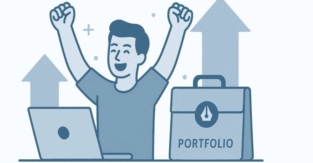
 Start your creative journey the smart way!
Follow our Graphic Design Career Roadmap to learn tools, trends & interview skills step-by-step.
Module 1: 210+ Technical Interview Questions & Answers
- Introduction to Graphic Design (20 questions)
- Adobe Photoshop Basics & Advanced (50 questions)
- Canva Fundamentals (30 questions)
- Adobe Premiere Pro Basics & Advanced (50 questions)
- Adobe Audition Basics (25 questions)
- Integrated Design & Branding (25 questions)
- Career & Industry Knowledge (10 questions)
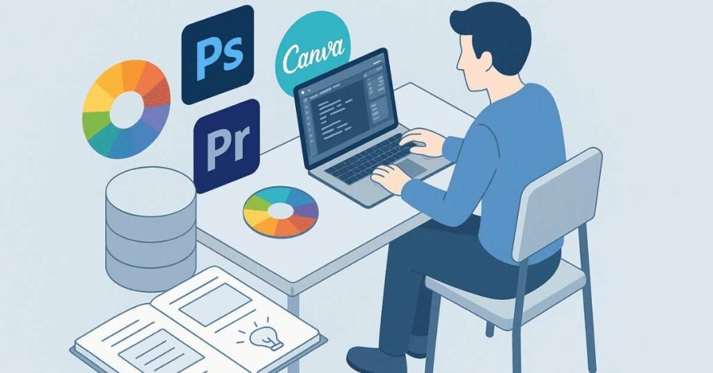
🖌️ Want to master design principles hands-on?
Join our Graphic Design Foundations Course with live examples & projects.
Section A: Introduction to Graphic Design (20 Questions)
Q1. What is graphic design?
A: Graphic design is the process of creating visual content to communicate messages and ideas. It combines images, text, colors, and layouts to solve problems and connect with specific audiences. Think of it as visual storytelling that helps brands talk to their customers.
Q2. Why are design principles important?
A: Design principles act as guidelines that help create visually appealing and effective designs. They ensure your work looks professional, communicates clearly, and grabs attention in the right way. Without these principles, designs can look messy or confusing.
Q3. What are the core design principles you follow?
A: The main principles include balance (distributing visual weight), (making elements stand out), alignment (organizing elements neatly), repetition (creating consistency), proximity (grouping related items), and hierarchy (showing what’s most important first).
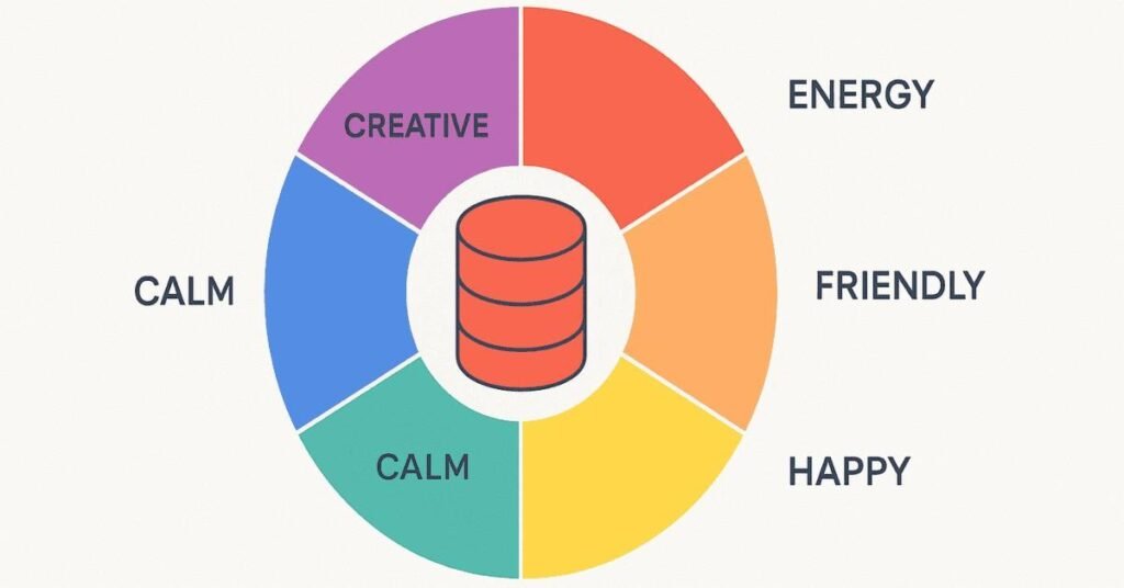
Q4. Can you explain what color theory is?
A: Color theory is the science and art of using colors effectively. It includes understanding primary colors (red, blue, yellow), secondary colors (mixing primaries), and how colors work together or clash. Colors create emotions—blue feels calm, red feels energetic—so choosing the right palette matters a lot.
Q5. What is the difference between RGB and CMYK?
A: RGB stands for Red, Green, Blue and is used for digital screens like phones and computers. CMYK stands for Cyan, Magenta, Yellow, Black and is used for printing on paper. If you design something in RGB and print it without converting to CMYK, the colors might look different.

Q6. What does typography mean in design?
A: Typography is the art of arranging text to make it readable, attractive, and impactful. It involves choosing fonts, setting font sizes, adjusting spacing between letters and lines, and making sure the text matches the overall design mood.
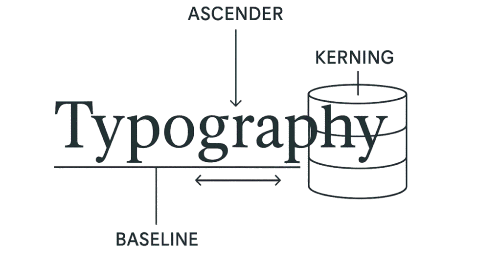
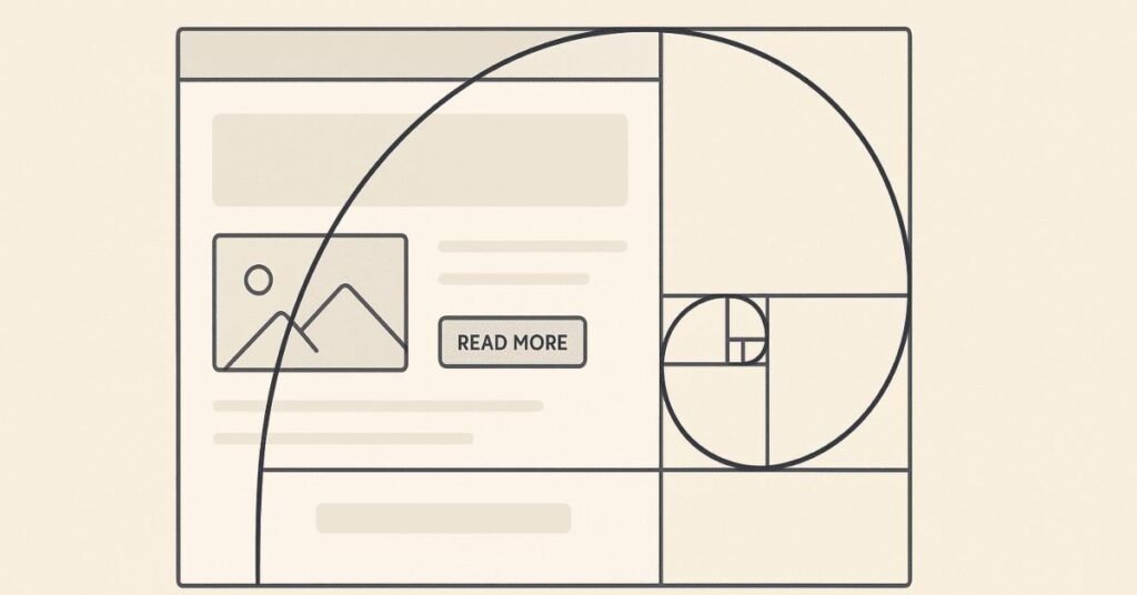
Q7. What’s the golden ratio in design?
A: The golden ratio is approximately 1.618 and is found in nature and art. In design, it helps create balanced, aesthetically pleasing layouts. For example, you might make one section 1.618 times larger than another to achieve natural-looking proportions.
Q8. How would you define visual hierarchy?
A: Visual hierarchy is arranging design elements so viewers know what to look at first, second, and third. You create it using size (bigger = more important), color (bright colors attract attention), position (top elements are seen first), and contrast.

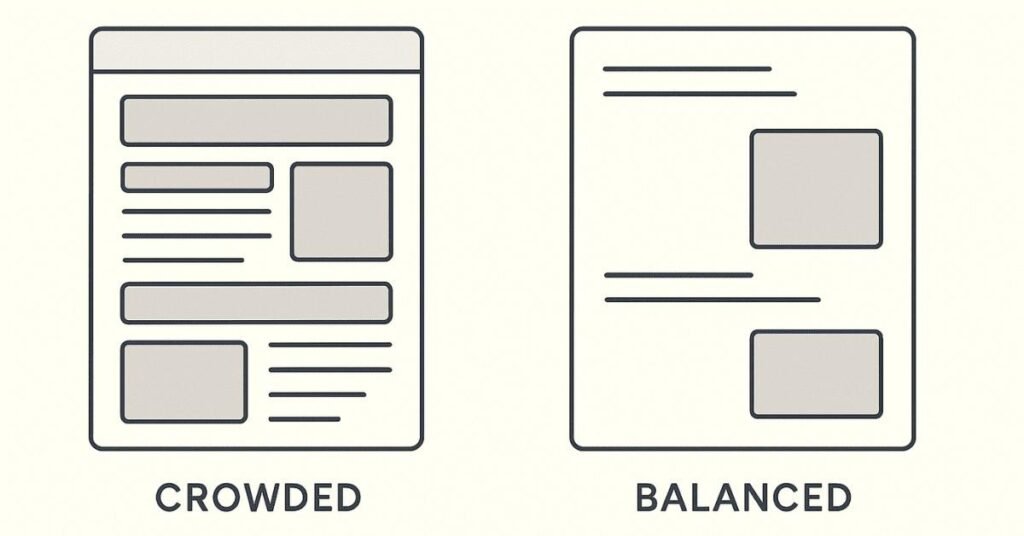
Q9. What is white space and why does it matter?
A: White space (also called negative space) is the empty area around design elements. It’s not wasted space—it gives your design breathing room, makes it easier to read, and helps important elements stand out. Too much clutter overwhelms viewers.
Q10. What are the main components of graphic design?
A: The main components include images, typography, colors, shapes, lines, texture, and space. Each component plays a specific role in conveying your message and creating visual interest.
Q11. What’s the difference between vector and raster images?
A: Vector images use mathematical formulas to create shapes, so they can be scaled infinitely without losing quality (great for logos). Raster images are made of pixels, like photos, and get blurry when enlarged too much.

Q12. When would you use JPEG vs PNG file formats?
A: Use JPEG for photographs because it compresses file size well but loses some quality. Use PNG for graphics with transparent backgrounds or when you need crisp edges on text and logos, as PNG maintains better quality.
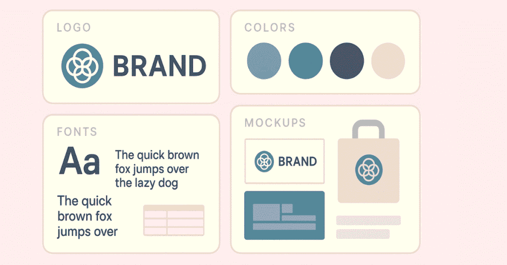
Q13. What is branding in graphic design?
A: Branding is creating a unique visual identity for a company or product. It includes logos, color schemes, fonts, and design styles that make the brand recognizable and memorable. Good branding makes people instantly know which company they’re looking at.
Q14. How do user experience (UX) and graphic design differ?
A: Graphic design focuses on making things look beautiful and communicate messages visually. UX design focuses on how users interact with products and making that experience smooth and enjoyable. Graphic designers create the visuals; UX designers plan the user journey.
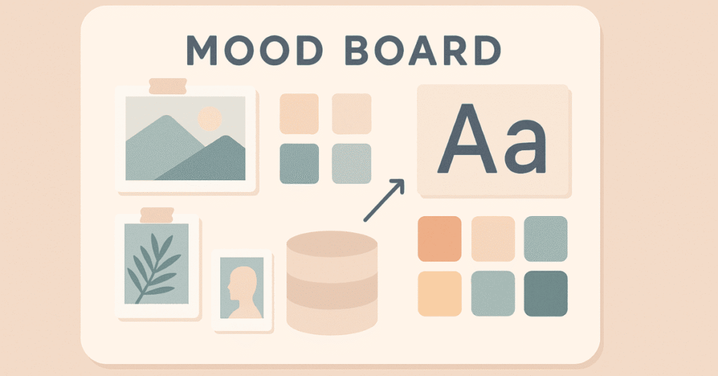
Q15. What are mood boards and why do designers use them?
A: Mood boards are collections of images, colors, textures, and fonts that represent the feeling or style you want to achieve in a project. They help communicate your creative vision to clients and team members before you start designing.
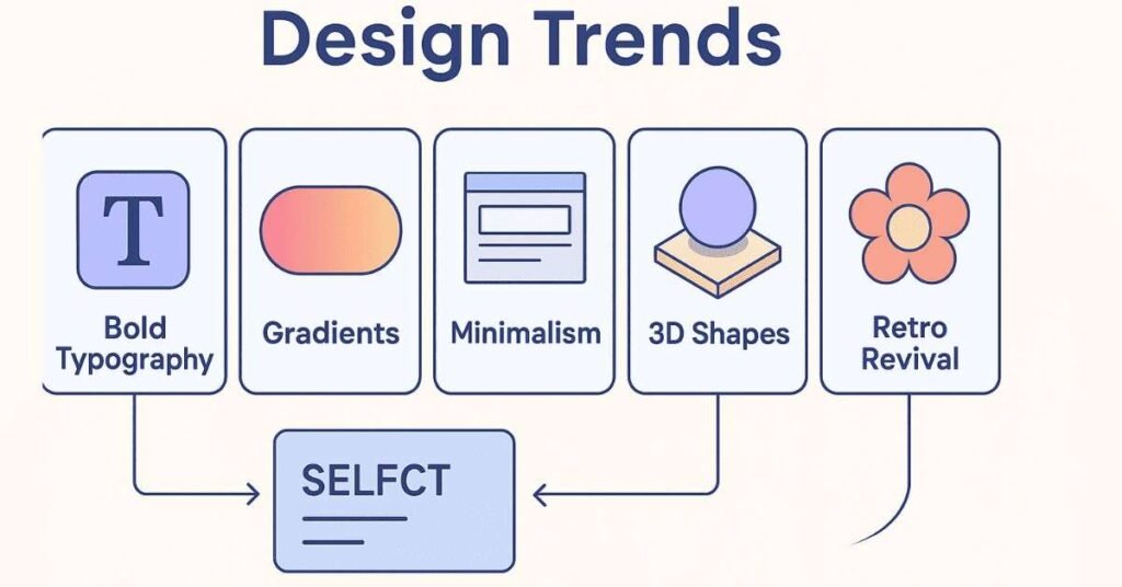
Q16. What current design trends have you noticed?
A: Recent trends include minimalist designs with lots of white space, bold typography that makes statements, gradient colors, 3D elements, retro styles making comebacks, and designs that work seamlessly across mobile and desktop.
Q17. How do you stay updated with design trends?
A: I regularly follow design blogs like Behance and Dribbble, watch design YouTube channels, follow talented designers on Instagram, attend webinars, and study brands I admire to see how they evolve their visual language.
Q18. What makes a logo memorable?
A: A memorable logo is simple enough to recognize quickly, unique enough to stand out from competitors, relevant to what the brand does, versatile enough to work in different sizes, and timeless so it doesn’t look dated after a few years.
Q19. What are the basic composition laws graphic designers follow?
A: Key composition laws include the rule of thirds (dividing space into a 3×3 grid), symmetry and asymmetry (balanced or dynamic layouts), leading lines (guiding the eye), and framing (using elements to focus attention on subjects).
Q20. What should be a graphic designer’s priority while creating a design?
A: The top priority is understanding the audience and the message you need to communicate. A beautiful design that doesn’t speak to the right people or convey the right message has failed its purpose. Always design with the end user in mind.
🎨 Apply Photoshop like a pro!
Access Free Design Templates, Mockups & Resources to boost your practice.
Section B: Adobe Photoshop Basics & Advanced (50 Questions)
Q21. What is Adobe Photoshop?
A: Photoshop is professional image editing software used for retouching photos, creating digital artwork, designing graphics, and manipulating images. It’s the industry standard for photographers, designers, and digital artists.
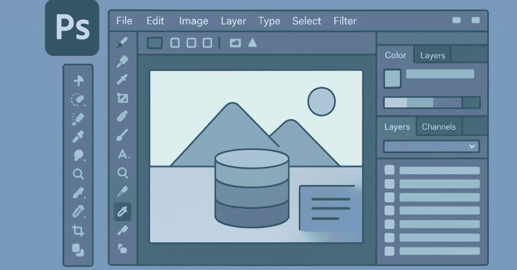
Q22. Describe the Photoshop workspace.
A: The workspace includes the menu bar at top, toolbox on the left with selection and editing tools, panels on the right (like layers and properties), and the main canvas in the center where you work on your image.
Q23. What are layers in Photoshop?
A: Layers are like transparent sheets stacked on top of each other. Each layer can contain different elements—text, images, shapes—and you can edit them independently without affecting other layers. This gives you flexibility and control.
Q24. Why are layers important?
A: Layers let you work non-destructively, meaning you can make changes without permanently altering the original image. You can rearrange, hide, or modify individual elements easily, and experiment without fear of ruining your work.
Q25. What is the difference between the magic wand and quick selection tool?
A: The magic wand selects areas based on similar colors when you click once. The quick selection tool lets you “paint” over areas you want to select, automatically detecting edges. Quick selection works better for complex selections.
Q26. Explain the pen tool and when you’d use it.
A: The pen tool creates precise paths and selections by placing anchor points that you connect. It’s perfect for cutting out objects with smooth curves or straight edges, like products for e-commerce sites or logo elements.
Q27. What is the purpose of the crop tool?
A: The crop tool removes unwanted outer areas of an image to improve composition, change aspect ratio, or focus attention on the main subject. You can also use it to straighten tilted photos.
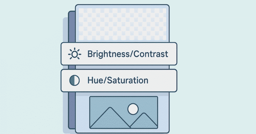
Q28. What are adjustment layers?
A: Adjustment layers let you change colors, brightness, and other properties without permanently changing the original pixels. You can toggle them on and off, adjust their intensity, and delete them if needed.
Q29. What is the clone stamp tool used for?
A: The clone stamp copies pixels from one area of an image and paints them onto another area. It’s commonly used for removing unwanted objects, fixing blemishes, or duplicating elements in a photo.
Q30. How does the healing brush differ from the clone stamp?
A: The healing brush not only copies pixels but also blends them with the surrounding area’s texture, lighting, and shading. This makes it better for retouching skin or removing imperfections naturally.
Q31. What is masking in Photoshop?
A: Masking hides parts of a layer without deleting them permanently. Black areas on a mask are hidden, white areas are visible, and gray areas are partially transparent. It’s perfect for blending images or creating complex compositions.
Q32. Explain the difference between layer masks and clipping masks.
A: Layer masks control which parts of a single layer are visible. Clipping masks use one layer’s shape to define the visible area of the layer above it—like putting a photo inside text or a shape.
Q33. What are smart objects?
A: Smart objects are layers that preserve an image’s original data, so you can scale, rotate, or transform them multiple times without losing quality. They’re especially useful for logos and elements you might need to resize.
Q34. What is the liquify filter?
A: The liquify filter lets you push, pull, rotate, or distort parts of an image as if they were liquid. It’s often used for subtle reshaping in portrait retouching or creating artistic distortions.
Q35. How do you remove red-eye from photos?
A: Use the red-eye tool by selecting it from the toolbox, then clicking on the red area in each eye. Photoshop automatically detects and corrects the red-eye effect caused by camera flash.
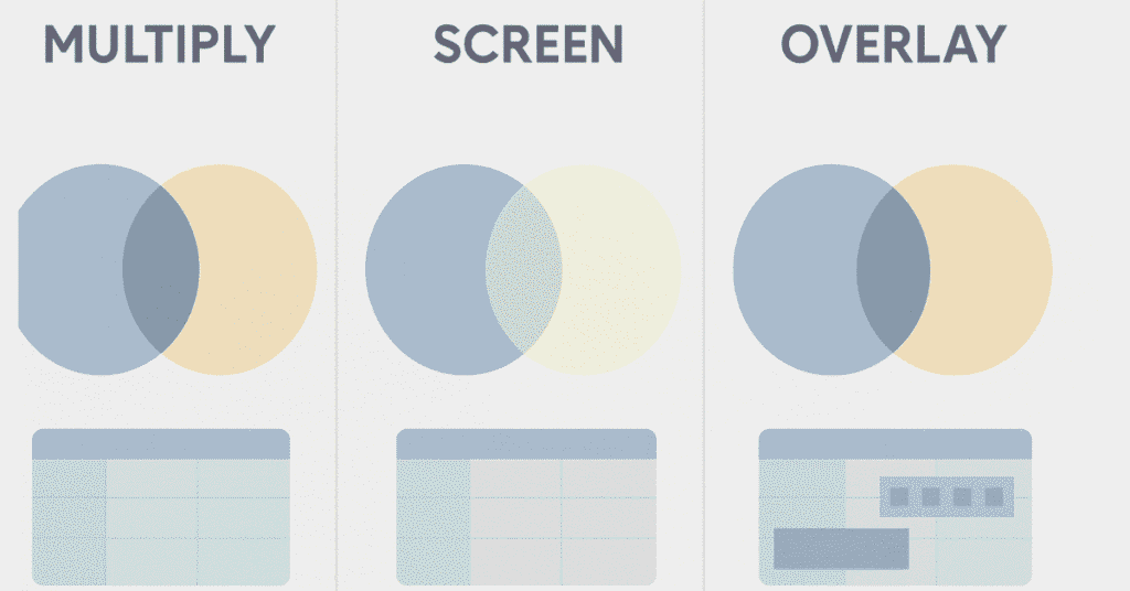
Q36. What are blending modes?
A: Blending modes determine how a layer interacts with layers below it. Options like Multiply darken, Screen lightens, Overlay adds contrast, and there are many others for creating different effects without permanently merging layers.
Q37. Explain the difference between foreground and background colors.
A: Foreground color is the primary color you paint or draw with, shown in the front square of the color picker. Background color is shown behind it and is used for gradients, erasing, and filling. Press X to swap them.
Q38. What is the gradient tool?
A: The gradient tool creates smooth color transitions from one color to another. You can create linear, radial, angle, reflected, or diamond gradients for backgrounds, lighting effects, or adding depth to designs.
Q39. How do you create a drop shadow effect?
A: Go to Layer > Layer Style > Drop Shadow, then adjust the angle, distance, spread, and size to control how the shadow looks. This adds depth and makes elements appear to float above the background.
Q40. What is the purpose of the history panel?
A: The history panel shows a list of recent actions you’ve taken, letting you step backward to undo multiple changes. You can click on any previous state to return to that point in your editing process.
Q41. What is compositing in Photoshop?
A: Compositing is combining multiple images, elements, or layers into a single cohesive image. It involves blending photos together, matching colors and lighting, and making everything look like it naturally belongs together.
Q42. How do you match colors between different photos?
A: Use adjustment layers like Color Balance, Hue/Saturation, or Curves to shift colors. You can also use Image > Adjustments > Match Color to automatically match one image’s color tone to another’s.
Q43. What are Photoshop actions?
A: Actions are recorded sequences of steps that you can replay on other images to automate repetitive tasks. For example, you could record resizing and sharpening steps, then apply them to hundreds of photos instantly.
Q44. Explain content-aware fill.
A: Content-aware fill intelligently removes objects by analyzing surrounding pixels and filling the selected area with similar textures and patterns. It’s like magic for removing unwanted elements from photos.
Q45. What is the difference between bitmap and vector in Photoshop?
A: Photoshop primarily works with bitmap (raster) images made of pixels. While you can create vector shapes using the pen and shape tools, these are rasterized when exported unless saved as specific formats.
Q46. How do you create text effects in Photoshop?
A: Use the Type tool to add text, then apply Layer Styles like bevel, emboss, gradient overlay, stroke, and inner shadow. You can also use blending modes, masks, and filters for creative typography effects.
Q47. What is the difference between saving as PSD vs JPEG?
A: PSD is Photoshop’s native format that preserves all layers, masks, and effects so you can continue editing later. JPEG flattens everything into one layer and compresses the file, which is great for sharing but removes editing flexibility.
Q48. How do you optimize images for web use?
A: Go to File > Export > Save for Web (Legacy), then choose the file format (usually JPEG or PNG), adjust quality settings to balance file size and appearance, and preview how it will look before saving.
Q49. What is the purpose of channels in Photoshop?
A: Channels store color information (Red, Green, Blue for RGB images) and can be used for advanced selections, masking, and effects. You can also create alpha channels to save complex selections.
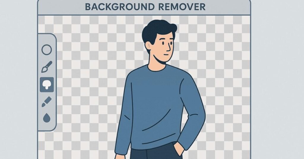
Q50. How would you remove a background from an image?
A: Use the Quick Selection or Magic Wand tool to select the background, then delete it or add a layer mask. For complex backgrounds, use Select > Select and Mask to refine edges, or use the Pen tool for precise cutouts.
Q51. What is the burn tool used for?
A: The burn tool darkens specific areas of an image, useful for adding shadows, creating depth, or emphasizing certain parts. It mimics the traditional darkroom technique of giving more exposure to parts of a print.
Q52. What does the dodge tool do?
A: The dodge tool lightens areas of an image, perfect for highlighting features, brightening underexposed sections, or adding dimension. It’s the opposite of the burn tool.
Q53. Explain the difference between resolution and image size.
A: Image size is the physical dimensions (width and height in pixels). Resolution is pixel density measured in PPI (pixels per inch)—higher resolution means more detail. A 72 PPI image looks fine on screens; prints need 300 PPI.
Q54. What is a clipping path?
A: A clipping path is a vector outline used to isolate an object from its background. It’s commonly used in product photography to create clean cutouts with smooth edges that can be placed on any background.
Q55. How do you create a mockup in Photoshop?
A: Use smart objects to place your design onto photos of real-world items. Create perspective transformations to match the angles, add shadows and highlights for realism, and adjust blending modes to make designs look naturally placed.
Q56. What are filters in Photoshop?
A: Filters apply special effects and modifications to images or layers. Examples include blur (softening), sharpen (enhancing detail), artistic effects (like oil painting), and distortions (like waves or twists).
Q57. What is the purpose of the curves adjustment?
A: Curves give precise control over tonal ranges—highlights, midtones, and shadows. You can adjust the curve to brighten, darken, or increase in specific parts of the tonal range for professional color grading.
Q58. How do you create a double exposure effect?
A: Layer two images, change the top layer’s blending mode to Screen or Multiply, add a layer mask to blend them selectively, and adjust opacity. This creates artistic images where two photos merge together.
Q59. What is the patch tool?
A: The patch tool selects an area, then you drag it to another area to sample texture from. It blends the sampled texture into the target area, making it great for fixing large problem areas in photos.
Q60. What keyboard shortcut opens a new layer?
A: Ctrl+Shift+N (Windows) or Cmd+Shift+N (Mac) opens the New Layer dialog box where you can name the layer and set options before creating it.
Q61. How do you create a vignette effect?
A: Create a new layer, use the Elliptical Marquee tool to select the center, invert the selection, fill with black, then blur and reduce opacity. This darkens edges and draws focus to the center of your image.
Q62. What is the difference between sharpen and clarity?
A: Sharpen enhances edge making details crisper, best used subtly in final edits. Clarity (in Camera for a more defined, textured look without over-sharpening edges.
Q63. How would you create a realistic shadow?
A: Duplicate the object layer, convert to black, transform and distort to match the light source direction, apply Gaussian Blur, reduce opacity, and use layer masks to fade the shadow naturally where it would be lighter.
Q64. What is Camera Raw and when do you use it?
A: Camera Raw is a plugin for processing RAW image files from cameras. It offers more editing control than JPEG because RAW files contain unprocessed data. You can also use it as a filter on regular images for powerful adjustments.
Q65. How do you create a duotone effect?
A: Convert the image to grayscale, then go to Image > Mode > Duotone. Choose two colors to create the duotone effect. Alternatively, use Gradient Map adjustment layer to map grayscale tones to two colors.
Q66. What are the selection tools available in Photoshop?
A: Main selection tools include Marquee (rectangular/elliptical), Lasso (freehand), Polygonal Lasso (straight edges), Magnetic Lasso (edge-detection), Magic Wand (color-based), Quick Selection, and Object Selection tools.
Q67. How do you resize an image without losing quality?
A: For enlarging, convert to a smart object first, then transform. Use Image > Image Size with “Preserve Details 2.0” resampling method. However, significant enlargement always reduces quality—working with larger source images is best.
Q68. What is the difference between opacity and fill?
A: Opacity affects the entire layer including effects like drop shadows. Fill only affects the layer’s contents, keeping effects at full visibility. This lets you create transparent shapes that still show their shadows and strokes.
Q69. How do you create a panorama in Photoshop?
A: Go to File > Automate > Photomerge, select your images, choose a layout (usually Auto), and let Photoshop stitch them together. Then crop and touch up any visible seams for a seamless wide-angle image.
Q70. What is the difference between TIFF and PNG formats?
A: Both support transparency and high quality. TIFF files are larger and used professionally for print, supporting layers when saved from Photoshop. PNG compresses better, is web-friendly, but doesn’t support layers.
💡 Design stunning visuals effortlessly!
Explore our How-to Guides for Canva shortcuts, templates & brand kits.
Section C: Canva Fundamentals (30 Questions)
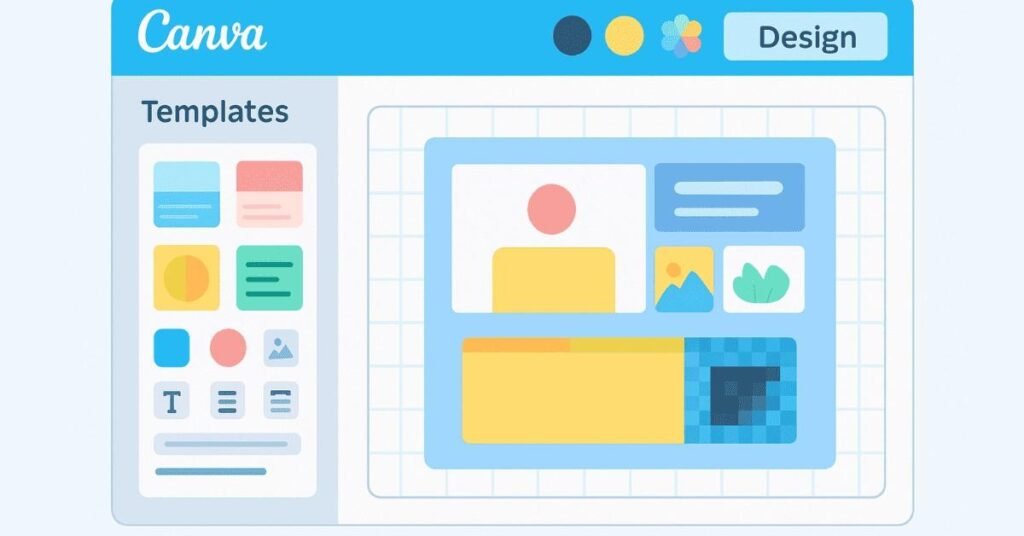
Q71. What is Canva?
A: Canva is a web-based design platform that makes graphic design accessible to everyone. It offers drag-and-drop tools, thousands of templates, stock photos, and design elements for creating social media graphics, presentations, posters, and more.
Q72. Who is Canva designed for?
A: Canva is designed for both beginners with no design experience and professionals who need to create designs quickly. It’s especially popular among social media managers, small business owners, teachers, and content creators.
Q73. What are Canva templates?
A: Templates are pre-designed layouts for specific purposes like Instagram posts, business cards, or presentations. They include placeholder text and images you can replace with your own content, saving time and providing design inspiration.
Q74. How do you maintain brand consistency in Canva?
A: Use Canva’s Brand Kit feature to store your brand colors, fonts, and logos in one place. Every design you create can instantly access these elements, ensuring your brand looks consistent across all materials.
Q75. What file formats can you export from Canva?
A: You can export designs as PNG (for images with transparency), JPEG (for photos), PDF (for printing or digital documents), MP4 (for videos), and GIF (for simple animations). Choose based on your intended use.
Q76. What is the difference between Canva Free and Canva Pro?
A: Canva Free offers basic features and limited templates. Canva Pro includes premium templates, brand kit, background remover, resize magic, more storage, access to millions of premium images, and team collaboration features.
Q77. How do you create social media graphics in Canva?
A: Select the social media platform (Instagram Post, Facebook Cover, etc.) which automatically sets correct dimensions. Choose a template or start blank, add text and images, customize colors and fonts, then download in appropriate format.
Q78. What are Canva elements?
A: Elements are design assets including lines, shapes, illustrations, icons, stickers, charts, frames, and gradients that you can add to designs. They’re organized by category and searchable, making it easy to find what you need.
Q79. How do you remove backgrounds in Canva?
A: Upload your image, select it, click “Edit image” in the toolbar, then choose “Background Remover.” Canva’s AI automatically detects and removes the background in seconds. This feature requires Canva Pro.
Q80. What is Magic Resize in Canva?
A: Magic Resize is a Canva Pro feature that automatically reformats your design for different platforms with one click. Create one Instagram post, then resize it to Facebook cover, Twitter post, or story format instantly.
Q81. How do you collaborate with team members in Canva?
A: Share your design by clicking the Share button, then invite team members via email. They can view or edit depending on permissions you set. You can leave comments, tag teammates, and see changes in real-time.
Q82. What are Canva folders and how do you use them?
A: Folders help organize your designs by project, client, or category. Create folders on your home page, then drag designs into them. This keeps your workspace tidy and makes finding specific designs easier.
Q83. How do you create animations in Canva?
A: Select an element or text, click “Animate” in the toolbar, then choose an animation style like Rise, Pan, or Breathe. You can apply different animations to different elements for dynamic presentations or social media content.
Q84. What is the Canva photo editor?
A: The photo editor lets you adjust brightness, saturation, blur, vignette, and more. You can also apply filters, crop images, flip them, and make color adjustments without leaving Canva.
Q85. How do you create a logo in Canva?
A: Start with a logo template or blank canvas, add text with your business name using clean, readable fonts, include an icon or graphic element that represents your brand, choose 2-3 brand colors, then export as PNG with transparent background.
Q86. What are Canva grids and frames?
A: Grids let you combine multiple images in organized layouts. Frames are shapes you drag images into, and the image automatically fills the frame. Both help create professional photo collages and layouts quickly.
Q87. How do you create custom dimensions in Canva?
A: Click “Create a design,” then choose “Custom size.” Enter your desired width and height in pixels, inches, or millimeters. This is useful for specific print sizes or non-standard digital formats.
Q88. What is the Canva color palette generator?
A: Upload an image or photo, and Canva extracts the main colors to create a color palette. This helps you design graphics that complement a photo or maintain consistent colors from your brand photography.
Q89. How do you create a presentation in Canva?
A: Choose “Presentation” from templates, select a theme, add slides using the plus button, include text, images, and elements on each slide, apply consistent fonts and colors, then present directly from Canva or download as PDF/PowerPoint.
Q90. What are Canva charts and when would you use them?
A: Canva offers bar charts, line graphs, pie charts, and more for visualizing data. Use them in presentations, reports, or infographics when you need to show statistics, trends, or comparisons in an easy-to-understand visual format.
Q91. How do you lock elements in Canva?
A: Select the element you want to lock, click the lock icon in the toolbar above the editor. Locked elements can’t be moved or edited accidentally, which is helpful when you have background elements you don’t want to disturb.
Q92. What is the difference between PNG and JPG exports from Canva?
A: PNG supports transparent backgrounds and maintains quality, better for logos and graphics with text. JPG creates smaller file sizes and is better for photographs and designs with solid backgrounds for social media and web use.
Q93. How do you add your own fonts to Canva?
A: With Canva Pro, go to Brand Kit and click “Upload a font.” Upload your font file (OTF or TTF), and it becomes available in all your designs. This lets you maintain complete brand consistency with custom typefaces.
Q94. What are Canva design sets?
A: Design sets are coordinated templates with consistent styles—like a social media set with post, story, and banner templates all matching. They help create cohesive visual campaigns across multiple platforms.
Q95. How do you create Instagram story templates in Canva?
A: Choose “Instagram Story” (1080×1920 pixels), design with large text for mobile viewing, use bright colors, add stickers or GIFs, leave space for interactive elements like polls, and save as templates for future use.
Q96. What is content planner in Canva?
A: Content Planner (Canva Pro) lets you schedule social media posts directly to platforms like Facebook, Instagram, Twitter, LinkedIn, and Pinterest. Design and schedule your content calendar all in one place.
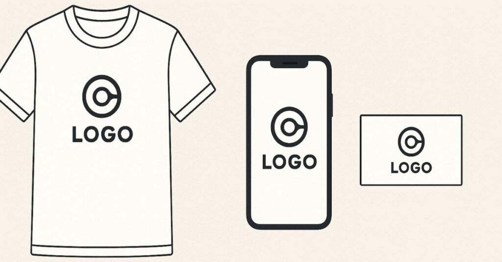
Q97. How do you create a mockup in Canva?
A: Search for mockup templates (phone screens, t-shirts, business cards), select one, use Smartmockups feature to add your design into the template, adjust positioning, and download. Mockups help visualize how designs look in real contexts.
Q98. What are Canva video features?
A: Canva lets you create videos by combining images, video clips, text, and music. You can add transitions, animations, trim clips, adjust timing, and export as MP4. It’s perfect for simple social media videos and presentations.
Q99. How do you ensure your Canva designs are print-ready?
A: Use templates with “Print” label, set to CMYK color mode if available, ensure minimum 300 DPI resolution, add bleed area if required by printer, and export as PDF (print quality) with crop marks if needed.
Q100. What is the difference between duplicating a page vs. a design in Canva?
A: Duplicating a page creates another page within the same design file (useful for presentations or multi-page documents). Duplicating a design creates a completely separate design file you can edit independently.
🎬 Level up your motion design skills!
Follow our Motion Graphics & Video Editing Roadmap.
Section D: Adobe Premiere Pro Basics & Advanced (50 Questions)

Q101. What is Adobe Premiere Pro?
A: Premiere Pro is professional video editing software used to import, organize, edit, and export video footage. It’s the industry standard for film editors, YouTubers, and content creators working with high-quality video projects.
Q102. What are the main panels in Premiere Pro?
A: The four main panels are Project panel (stores imported media), Source Monitor (preview clips before editing), Timeline (where you arrange clips), and Program Monitor (shows your edited sequence). Each plays a specific role in the editing workflow.
Q103. What is the purpose of the Project panel?
A: The Project panel organizes all imported media files including video clips, audio, images, and sequences. You can create bins (folders) to keep projects organized by type, scene, or any system that works for you.
Q104. Explain what a timeline is in video editing.
A: The timeline is where you arrange video clips, audio, graphics, and effects in sequence. It shows your project chronologically with multiple tracks stacked vertically, allowing you to layer elements and see how they interact.
Q105. What is the difference between Source and Program monitors?
A: Source Monitor shows raw footage before it’s edited—you mark in and out points here to select portions to use. Program Monitor shows your edited sequence as it will appear in the final video after all edits are applied.
Q106. How do you import footage into Premiere Pro?
A: Double-click in the Project panel or go to File > Import, navigate to your files, select them, and click Import. You can also drag files directly from folders into the Project panel.
Q107. What are in and out points?
A: In points mark where you want a clip to start, out points mark where it should end. Setting these in the Source Monitor lets you use only the specific portion of footage you need, ignoring the rest.
Q108. Explain what a sequence is.
A: A sequence is a timeline containing your edited clips arranged in order. You can have multiple sequences in one project for different versions, scenes, or sections that you later combine into your final edit.
Q109. How do you create a new sequence?
A: Go to File > New > Sequence, choose a preset matching your footage specifications (resolution, frame rate), or drag your first clip to the timeline and let Premiere create a matching sequence automatically.
Q110. What is the razor tool used for?
A: The razor tool (keyboard shortcut C) cuts clips at specific points on the timeline. Click where you want to cut, and it splits the clip into two separate pieces you can then move, delete, or edit independently.
Q111. What are transitions in video editing?
A: Transitions are effects that blend one clip into the next, like cross dissolve (gradual fade), dip to black, wipe, or slide. They smooth the visual flow between shots or indicate time/location changes.
Q112. How do you add a transition between clips?
A: Go to the Effects panel, expand Video Transitions, choose a transition type (like Cross Dissolve), drag it between two clips on the timeline. You can adjust duration by dragging its edges.
Q113. What is the ripple delete function?
A: Ripple delete removes a selected clip and automatically closes the gap by shifting all following clips forward in time. This keeps your edit tight without empty spaces. Use Shift+Delete on selected clips.
Q114. Explain the difference between cutting and trimming.
A: Cutting (razor tool) splits a clip into separate pieces. Trimming adjusts a clip’s in or out point to make it longer or shorter without creating multiple clips. Both help refine timing and pacing.
Q115. What are adjustment layers?
A: Adjustment layers are transparent layers you place above other clips. Any effects applied to an adjustment layer affect all clips beneath it, perfect for color grading or effects that should apply to multiple clips consistently.
Q116. How do you speed up or slow down footage?
A: Right-click a clip, select Speed/Duration, enter a percentage (50% = half speed, 200% = double speed), or use Rate Stretch tool to drag clip edges. Check “Maintain Audio Pitch” if applicable.
Q117. What is color grading?
A: Color grading is adjusting colors, and tones to create a specific mood or consistent look across all footage. It’s done after color correction (fixing technical issues) using panels like Lumetri Color.
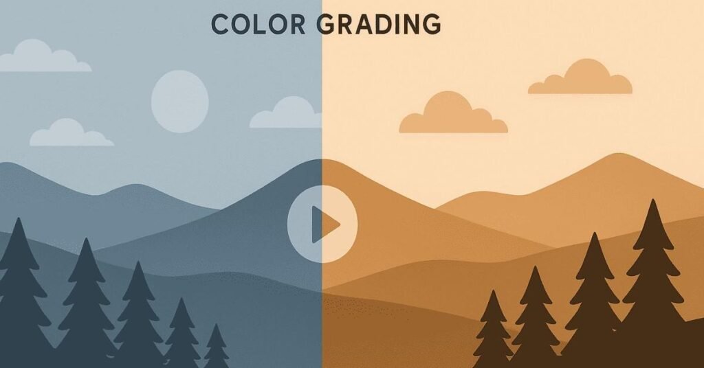
Q118. What is the difference between color correction and color grading?
A: Color correction fixes technical problems like white balance, exposure, and making footage look natural. Color grading is creative work that establishes mood and style, like making scenes look warm, cool, dramatic, or nostalgic.
Q119. How do you add text and titles in Premiere Pro?
A: Go to Graphics workspace, use Type tool to create text directly in Program Monitor, or drag title templates from Essential Graphics panel. Adjust font, size, color, position, and add animations from Effect Controls panel.
Q120. What are keyframes?
A: Keyframes mark specific values of properties at specific times. The software interpolates between keyframes to create animation. For example, set position keyframes to make text move across the screen smoothly.
Q121. How do you create a fade-in or fade-out effect?
A: Expand the clip’s audio or video track, drag opacity or volume line down at the beginning (fade in) or end (fade out), or use Cross Dissolve transition from clip edge to black video track.
Q122. What is nesting in Premiere Pro?
A: Nesting puts a sequence inside another sequence, treating multiple clips as one. This helps organize complex edits, apply effects to multiple clips at once, or reuse sections across different parts of your project.
Q123. How do you stabilize shaky footage?
A: Apply the Warp Stabilizer effect from Effects panel to shaky clips. Premiere analyzes camera movement and smooths it out automatically. Adjust smoothness and method settings if needed for better results.
Q124. What are video formats and codecs?
A: Formats are file containers (MP4, MOV, AVI) that hold video data. Codecs (H.264, ProRes, HEVC) compress and decompress that data. You need the right codec to play or edit certain formats.
Q125. What is the difference between frame rate and resolution?
A: Frame rate is how many still images display per second (24fps = film look, 30fps = standard video, 60fps = smooth motion). Resolution is image dimensions (1920×1080 = Full HD, 3840×2160 = 4K).
Q126. How do you export a video from Premiere Pro?
A: Go to File > Export > Media (Ctrl/Cmd+M), choose a preset like H.264 for web or ProRes for high quality, adjust settings if needed, choose destination folder, and click Export. Monitor progress in queue.
Q127. What export settings should you use for YouTube?
A: Use H.264 format, MP4 container, match source resolution (1080p or 4K), use VBR 2 pass encoding, bitrate 8-12 Mbps for 1080p, AAC audio at 320 kbps, and render at maximum depth.
Q128. What is the purpose of proxies?
A: Proxies are lower-resolution copies of your footage that edit smoothly on slower computers. You edit with proxies, then Premiere automatically uses full-resolution files when exporting for full quality.
Q129. How do you create proxies in Premiere Pro?
A: Right-click clips in Project panel, select Proxy > Create Proxies, choose preset or format, pick destination folder. Premiere creates smaller files you can toggle on/off with the “Toggle Proxies” button.
Q130. What are essential graphics?
A: Essential Graphics are customizable motion graphics templates with editable text, colors, and elements. They’re created in After Effects or Premiere and let you add professional-looking graphics without creating them from scratch.
Q131. How do you add music or sound effects?
A: Import audio files to Project panel, drag them to an audio track on timeline, position where needed. Adjust volume using audio level line on the clip or in Effect Controls panel.
Q132. What is audio mixing?
A: Audio mixing balances levels between dialogue, music, and sound effects so everything is audible without competing. Use Audio Track Mixer panel to adjust volume, pan (left/right), and apply audio effects.
Q133. How do you remove background noise from audio?
A: Use the Essential Sound panel, select audio clip, classify as Dialogue, expand Repair section, enable “Reduce Noise,” adjust amount slider. For better results, use Adobe Audition with more advanced noise reduction.
Q134. What is J-cut and L-cut?
A: J-cut is when audio from the next scene starts before the video changes (audio leads). L-cut is when audio from the previous scene continues while video changes (audio lags). Both create smoother scene transitions.
Q135. How do you sync audio and video?
A: Select clips, right-click, choose Synchronize, select synchronization point (audio waveforms usually), Premiere aligns them. Or manually align by matching waveforms visually on the timeline.
Q136. What are multicam sequences?
A: Multicam editing syncs footage from multiple cameras of the same event, letting you switch between angles while playing. It’s used for interviews, concerts, or events shot with several cameras.
Q137. How do you create slow-motion footage?
A: Shoot at higher frame rates (60fps or 120fps), then slow down in editing (interpret footage to 24fps), or use Time Interpolation > Optical Flow when slowing standard 24/30fps footage for smoother results.
Q138. What are video effects in Premiere Pro?
A: Effects modify clip appearance or behavior—blur, sharpening, distortion, color changes, transforms. Apply from Effects panel by dragging onto clips, then adjust parameters in Effect Controls panel.
Q139. What is the difference between Effects Controls and Essential Graphics?
A: Effects Controls shows all parameters for effects applied to selected clips, letting you adjust and animate them. Essential Graphics panel is for adding and customizing text and motion graphics templates.
Q140. How do you create a picture-in-picture effect?
A: Place one video clip on a track above another, select the top clip, go to Effect Controls, adjust Scale and Position to make it smaller and move it to a corner. Add a border using Drop Shadow effect if desired.
Q141. What is rendering and when is it needed?
A: Rendering processes effects and transitions so they play smoothly in real-time. Red bars above timeline indicate unrendered sections. Press Enter to render. You must render before final export for best quality.
Q142. What are markers and how are they useful?
A: Markers are notes or flags you place on the timeline to mark important moments, sync points, beat drops in music, or spots needing work later. Press M to add markers, which help organize complex edits.
Q143. How do you match clip colors for consistency?
A: Use Lumetri Color panel with Color Match tool—select a reference frame from one clip, then apply to others. Or manually adjust highlights, shadows, and midtones until clips look consistent.
Q144. What is the difference between track and clip effects?
A: Clip effects apply to individual clips and move with them. Track effects apply to entire tracks, affecting all clips on that track. Use track effects for consistent processing like audio compression.
Q145. How do you reverse a video clip?
A: Right-click the clip, select Speed/Duration, check “Reverse Speed.” The clip plays backward. This can create interesting effects or help fix a shot that was recorded in the wrong direction.
Q146. What is the rolling shutter effect?
A: Rolling shutter is a distortion causing vertical lines to appear slanted when panning quickly, caused by how camera sensors capture images. Use Rolling Shutter Repair effect to fix it in Premiere Pro.
Q147. How do you create a freeze frame?
A: Position playhead where you want to freeze, click Add Frame Hold button or right-click clip and choose Add Frame Hold. The video pauses on that frame for the duration you specify.
Q148. What is the difference between MP4 and MOV formats?
A: MP4 is more universally compatible across devices and platforms, smaller file sizes, great for web. MOV is Apple’s format, handles high-quality video better, preferred for professional editing but larger files.
Q149. How do you organize bins in Premiere Pro?
A: Create bins (folders) for different categories like Video Footage, Audio, Graphics, Sequences. Right-click Project panel, select New Bin, name it, drag files in. Use color labels for visual organization.
Q150. What is the difference between VBR and CBR encoding?
A: VBR (Variable Bit Rate) adjusts quality based on scene complexity—more bits for complex scenes, less for simple ones, resulting in better quality at similar file sizes. CBR (Constant Bit Rate) maintains steady bitrate, more predictable file sizes.
Section E: Adobe Audition Basics (25 Questions)
Q151. What is Adobe Audition?
A: Audition is professional audio editing software for recording, editing, mixing, and mastering sound. It’s used for podcasts, music production, audio cleanup, and sound design for video projects.
Q152. What is the difference between waveform and multitrack views?
A: Waveform view is for detailed editing of single audio files—cutting, effects, noise reduction. Multitrack view is for mixing multiple audio sources together—like combining dialogue, music, and sound effects in layers.
Q153. How do you remove background noise in Audition?
A: In waveform view, select a portion with only noise (no speech), go to Effects > Noise Reduction/Restoration > Capture Noise Print. Then select entire audio, apply Noise Reduction, adjust settings until clean.
Q154. What is normalization?
A: Normalization increases audio volume to a target level without causing distortion. It finds the loudest point and boosts everything proportionally, ensuring your audio reaches optimal levels for mixing or export.
Q155. How do you remove clicks and pops from audio?
A: Use Effects > Noise Reduction/Restoration > DeClicker for small clicks (like vinyl records) or DeCrackle for larger pops. Adjust sensitivity and threshold until artifacts are removed without affecting desired audio.
Q156. What is compression in audio editing?
A: Compression reduces the dynamic range between loud and quiet parts, making volume more consistent. It makes quiet parts louder and prevents loud parts from distorting, essential for professional-sounding audio.
Q157. How do you fade audio in or out?
A: Select the beginning (fade in) or end (fade out) of the audio clip, go to Effects > Amplitude and Compression > Fade Envelope or drag fade handles on the waveform edges. Adjust curve for smooth transitions.
Q158. What is EQ (equalization)?
A: EQ adjusts different frequency ranges to enhance or reduce specific sounds. Boost low frequencies for bass, cut mid frequencies to reduce muddiness, or enhance high frequencies for clarity and brightness.
Q159. How do you remove reverb or echo from audio?
A: Use Effects > Noise Reduction/Restoration > Dereverb. Select processed audio containing reverb, adjust reduction amount carefully—too much makes audio sound unnatural. Preview before applying to entire track.
Q160. What is the difference between mono and stereo audio?
A: Mono is single-channel audio that sounds the same from all speakers. Stereo is two-channel audio with left and right channels creating spatial width and depth. Stereo sounds more immersive and realistic.
Q161. How do you export audio from Audition?
A: Go to File > Export > File, choose format (WAV for uncompressed, MP3 for compressed), select sample rate (44.1kHz standard, 48kHz for video), bit depth (16-bit or 24-bit), choose destination, and export.
Q162. What are markers used for in audio editing?
A: Markers flag important moments in audio—like where music should change, where sound effects go, or problem areas needing attention. They help navigate long recordings and coordinate audio with video.
Q163. How do you match loudness standards for different platforms?
A: Use Match Loudness effect, select target like -16 LUFS for Spotify, -14 LUFS for YouTube, or -23 LUFS for broadcast. Audition automatically adjusts audio to meet platform requirements.
Q164. What is spectral frequency display?
A: Spectral display shows audio as colors representing frequency and amplitude over time. It lets you visually identify and remove specific unwanted sounds like buzzes, hums, or mouth clicks by selecting and deleting them.
Q165. How do you edit out mistakes or pauses in speech?
A: In waveform view, zoom in on waveform, select unwanted sections (long pauses, mouth clicks, “ums”), delete them. Use healing or crossfade to smooth transitions between remaining parts for natural flow.
Q166. What is panning in audio mixing?
A: Panning positions audio in the stereo field from left to right. Center pan means equal volume in both speakers. Pan instruments and effects to different positions to create space and prevent muddy mixes.
Q167. How do you create podcast intro music mixing?
A: Import music and voiceover to multitrack view, place them on separate tracks, reduce music volume when voice starts (ducking), adjust levels so both are clear, add fade transitions, and apply EQ to prevent frequency clashing.
Q168. What is amplitude?
A: Amplitude is the strength or intensity of an audio signal, perceived as loudness. Higher amplitude means louder sound. Amplitude is measured in decibels (dB), with 0 dB being the maximum before distortion.
Q169. How do you repair clipped audio?
A: Use Effects > Amplitude and Compression > DeClipper. Audition attempts to reconstruct distorted peaks. However, severe clipping cannot be fully fixed—prevention through proper recording levels is essential.
Q170. What file formats does Audition support?
A: Audition supports WAV, MP3, AIFF, FLAC, OGG, AAC, M4A, WMA, and many more audio formats. WAV and AIFF are uncompressed (highest quality), while MP3 and AAC are compressed for smaller file sizes.
Q171. How do you add sound effects in Audition?
A: Import sound effect file, drag it to multitrack view on an empty track, position where needed in timeline, adjust volume to blend with other audio, apply effects if needed, and ensure it doesn’t overpower dialogue.
Q172. What is sample rate?
A: Sample rate is how many times per second audio is measured (44.1kHz = 44,100 times per second). Higher sample rates capture more detail. Use 48kHz for video projects, 44.1kHz for music, 96kHz+ for professional recording.
Q173. What is bit depth?
A: Bit depth determines dynamic range and audio detail—16-bit is CD quality (96dB range), 24-bit is professional standard (144dB range). Higher bit depth means more subtle volume differences can be captured.
Q174. How do you extract audio from video files?
A: File > Import > File, select video file, Audition imports audio track automatically. Edit the audio, then export and replace audio in your video editor. This workflow helps when video editors have limited audio tools.
Q175. What is the purpose of audio restoration tools?
A: Restoration tools fix common audio problems—hums from electrical interference, hiss from recordings, clicks from digital issues, clipping from overloading. They clean up audio that would otherwise be unusable.
🧭 Design brands that tell stories!
Read our Branding How-to Guides on mood boards, color psychology, and logo systems.
Section F: Integrated Design & Branding (25 Questions)

Q176. What is visual identity in branding?
A: Visual identity is all the visual elements representing a brand—logo, colors, fonts, imagery style, graphics—that work together to create a recognizable and consistent look across all touchpoints.
Q177. Why is consistency important in branding?
A: Consistency builds recognition and trust. When people see the same colors, fonts, and style repeatedly, they start associating those elements with your brand. Inconsistent branding confuses audiences and weakens brand memory.
Q178. How do you choose brand colors?
A: Consider color psychology (blue = trust, red = excitement), industry norms (green for eco), target audience preferences, competitor colors (be different), and cultural associations. Choose 2-3 main colors and a few accent colors.
Q179. What makes an effective brand logo?
A: Effective logos are simple (easily recognized), memorable (distinctive), versatile (works at any size), appropriate (matches brand personality), and timeless (won’t look dated quickly). They should work in black and white too.
Q180. How do typography choices affect branding?
A: Fonts convey personality—serif fonts feel traditional and trustworthy, sans-serif feels modern and clean, script feels elegant or creative. Your font choices should match your brand’s character and remain readable across all uses.
Q181. What is a brand style guide?
A: A style guide documents all visual brand elements—logo usage rules, color codes, fonts with sizes, image style, tone of voice—ensuring anyone creating branded materials maintains consistency. It’s the brand’s visual rulebook.
Q182. How do you adapt branding for different platforms?
A: Keep core elements consistent (colors, fonts, logo) but adjust layouts for each platform’s requirements. Instagram needs square visuals, LinkedIn needs professional tone, TikTok needs dynamic content. Same brand, different expressions.
Q183. What is the difference between logo design and branding?
A: A logo is one visual mark representing a brand. Branding is the complete experience—visual identity, messaging, values, customer experience, reputation. The logo is a symbol; branding is the entire story.
Q184. How do you create cohesive brand visuals across media?
A: Use consistent color palette, typography, imagery style, design elements, and layout principles. Create templates for common formats. Document everything in a style guide. This ensures every piece feels like part of the same family.
Q185. What role does graphic design play in marketing?
A: Graphic design communicates marketing messages visually, attracts attention in crowded spaces, builds brand recognition, makes complex information digestible, and influences purchasing decisions through visual appeal and professional presentation.
Q186. How do you design for social media campaigns?
A: Research platform requirements (dimensions, file types), understand audience behavior on each platform, create eye-catching visuals that stop scrolling, use consistent branding, include clear calls-to-action, and test different approaches.
Q187. What is the purpose of brand templates?
A: Templates save time, ensure consistency, empower non-designers to create branded content, maintain quality standards, and make scaling content production easier. They’re pre-designed frameworks that just need content swapped in.
Q188. How do you combine graphics and audio for video branding?
A: Match visual and audio styles to brand personality, sync graphic animations with music beats, use consistent sound effects, maintain volume balance so graphics don’t distract from audio messages, and create memorable audio-visual signatures.
Q189. What is a brand mood board?
A: A mood board is a collection of images, colors, textures, and fonts that visually represents a brand’s desired feel and direction before creating actual designs. It helps align team vision and get client approval.
Q190. How do you ensure brand accessibility?
A: Use sufficient color contrast for readability, choose legible fonts at various sizes, avoid relying only on color to convey information, provide alt text for images, design for different devices, and consider various audiences’ needs.
Q191. What is the difference between logo variations?
A: Primary logo is the main version used most often. Secondary versions might include horizontal, stacked, icon-only, black-and-white, or reversed (for dark backgrounds) versions to maintain recognition across all applications.
Q192. How do you design promotional videos for brands?
A: Start with clear message and target audience, match visual style to brand guidelines, use branded colors and fonts, keep videos short and engaging, include logo and call-to-action, and optimize for platform where it’ll be shared.
Q193. What is brand recognition and how does design build it?
A: Brand recognition is when people instantly identify your brand from visual cues alone. Build it through consistent use of distinctive colors, unique logo, characteristic design style, and repeated exposure across touchpoints.
Q194. How do you create branded presentation templates?
A: Design slide masters with branded colors, fonts, and logo placement, create layouts for different content types (title, content, image), include branded graphics and icons, ensure readability, and make templates easy to customize.
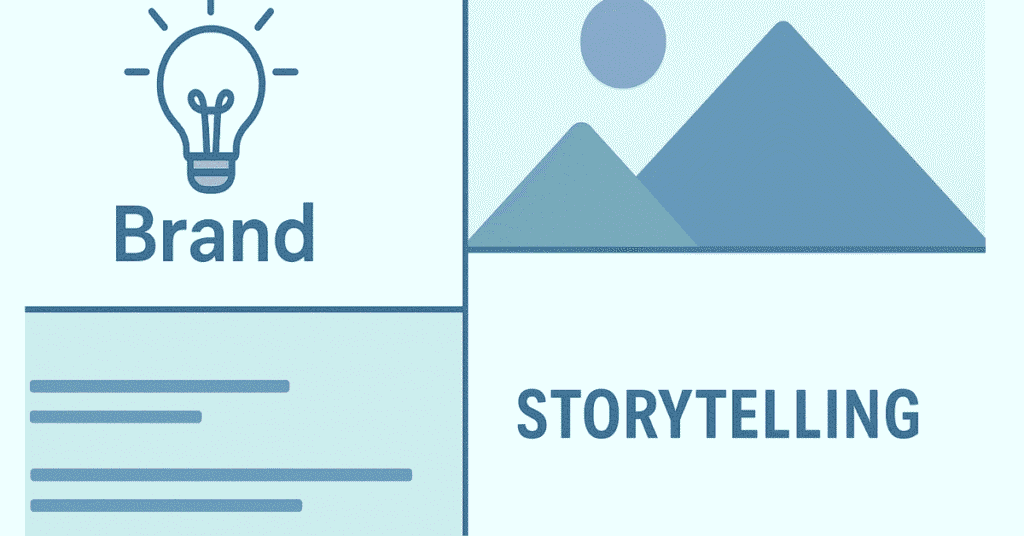
Q195. What is visual storytelling?
A: Visual storytelling uses images, graphics, colors, and design to communicate narratives that engage emotions and create connections. It turns information into compelling stories that people remember better than text alone.
Q196. How do you design brand assets for print vs. digital?
A: Print requires CMYK colors, higher resolution (300 DPI), bleed areas, and consideration of paper texture. Digital uses RGB colors, lower resolution (72 DPI), screen dimensions, and can include animations and interactivity.
Q197. What makes a successful social media campaign design?
A: Success comes from understanding platform audiences, creating scroll-stopping visuals, maintaining brand consistency, including clear calls-to-action, optimizing for mobile viewing, and testing variations to see what resonates.
Q198. How do you create a multimedia portfolio?
A: Showcase your best diverse work—graphics, videos, branding projects—with case studies explaining your process, problems solved, and results. Use clean layout, include before/after comparisons, and make navigation intuitive.
Q199. What is the role of sound design in brand videos?
A: Sound creates emotional impact, reinforces brand personality (upbeat, calm, energetic), improves retention, makes content more engaging, and can become as recognizable as visual elements (like brand jingles or signature sounds).
Q200. How do you measure graphic design effectiveness?
A: Track engagement metrics (clicks, shares, likes), conversion rates (did design drive actions), brand recognition surveys, A/B testing different designs, client feedback, and whether design solved the original problem or met goals.
🚀 Ready for your first design job?
Follow our Career & Placement Roadmap to build portfolio, resume & interview skills.
Section G: Career & Industry Knowledge (10 Questions)
Q201. What graphic design skills are most in demand?
A: Top skills include UI/UX design, motion graphics and video editing, branding and logo design, social media content creation, Adobe Creative Suite expertise, typography, understanding of design principles, and ability to work with client feedback.
Q202. Which industries hire the most graphic designers?
A: Key industries include advertising and marketing agencies, tech companies (for UI/UX), media and entertainment, e-commerce brands, publishing, education, healthcare, nonprofit organizations, and in-house creative departments of corporations.
Q203. What’s the difference between in-house and agency designers?
A: In-house designers work for one company, developing deep brand knowledge and long-term projects. Agency designers work with multiple clients, gain diverse experience quickly, face tighter deadlines, and handle varied design challenges across different industries.
Q204. How do you handle design criticism and feedback?
A: Listen without getting defensive, ask clarifying questions to understand the concern, separate personal feelings from professional work, focus on solving the problem, propose solutions, and remember that feedback helps create better designs that meet client needs.
Q205. What questions should you ask before starting a design project?
A: Ask about target audience, project goals, brand guidelines, preferred style, competitors, budget, timeline, deliverable formats, revision rounds, and how success will be measured. Understanding requirements upfront prevents miscommunication later.
Q206. How do you stay creative and avoid burnout?
A: Take regular breaks, seek inspiration outside design (nature, art, music), work on personal passion projects, learn new techniques, connect with other designers, set boundaries between work and personal time, and don’t compare yourself constantly to others.
Q207. What design software should beginners focus on learning?
A: Start with Adobe Photoshop for image editing, Canva for quick designs, then progress to Adobe Illustrator for vector work and Premiere Pro for video. Learning Figma for UI/UX and basic After Effects for motion graphics also opens opportunities.
Q208. How has graphic design evolved with technology?
A: Design has moved from print-focused to digital-first, AI tools assist with repetitive tasks, 3D design is more accessible, collaboration happens globally in real-time, mobile-first design is standard, and designers now need video and interactive skills alongside traditional graphics.
Q209. What are common mistakes new designers make?
A: Using too many fonts, ignoring white space, following trends blindly, not understanding the target audience, poor typography hierarchy, not asking enough questions, being afraid of feedback, and not saving work properly with version control.
Q210. How do you build a strong design portfolio?
A: Show 8-12 diverse best projects, include case studies explaining your process and results, display before/after comparisons, organize by project type or industry, keep it updated, ensure fast loading, make navigation intuitive, and include contact information prominently
Module 2: 50 Self-Preparation Prompts Using ChatGPT
Part 2: 50 Self-Preparation Prompts Using ChatGPT
These prompts help you practice explaining concepts, prepare for specific interview scenarios, build confidence, and deepen your understanding of graphic design principles. Copy these prompts into ChatGPT exactly as written, and customize the bracketed sections with your specific information.
🤖 Train like a pro with AI-powered prompts!
Access 100+ Design & Interview Practice Resources curated for creatives.
Category A: Technical Knowledge Practice (10 Prompts)
Prompt 1: Explaining Design Concepts Simply
Act as someone who knows nothing about design. I will explain [color theory/typography/composition] to you in simple terms. Ask me follow-up questions if anything is unclear, and tell me if my explanation was easy to understand. This will help me practice explaining technical concepts during interviews.
Purpose: Helps you practice breaking down complex design concepts into simple language that clients and non-designers understand.
Prompt 2: Software Features Deep Dive
I’m preparing for a graphic design interview. Quiz me on [Adobe Photoshop/Canva/Premiere Pro/Audition] features and tools. Ask me one question at a time about what specific tools do, when to use them, and their keyboard shortcuts. Wait for my answer before asking the next question.
Purpose: Tests your technical knowledge of design software covered in your Frontlines Edutech course and identifies weak areas.
Prompt 3: Design Problem Solving
Give me a common design problem that graphic designers face (like mismatched colors, poor readability, or cluttered layout). I’ll explain how I would solve it step-by-step. Then provide feedback on whether my solution is practical and professional.
Purpose: Prepares you to demonstrate problem-solving skills that interviewers look for in candidates.
Prompt 4: File Format Decisions
Create scenarios where I need to choose the correct file format for different situations. For example, “You’re designing a logo that needs to be printed on business cards and used on a website – what formats do you use and why?” Ask me 5 different scenarios.
Purpose: Tests your understanding of when to use PNG, JPEG, PDF, MP4, and other formats based on project requirements.
Prompt 5: Design Terminology Quiz
Test my knowledge of graphic design terminology. Give me a design term (like kerning, leading, bleed, resolution, aspect ratio) and ask me to define it and explain when it’s important. Do this for 10 terms, one at a time.
Purpose: Ensures you can confidently use industry terminology during interviews without hesitation.
Prompt 6: Troubleshooting Common Issues
I’m a graphic design student. Give me common technical problems designers face in [Photoshop/Premiere Pro/Audition] like “image looks pixelated when enlarged” or “colors look different when printed.” I’ll explain what causes the problem and how to fix it.
Purpose: Demonstrates your practical knowledge and ability to handle real-world technical challenges.
Prompt 7: Design Principles Application
Describe a poorly designed poster/social media graphic/video thumbnail to me. I will identify which design principles are being violated (balance, contrast, hierarchy, etc.) and suggest specific improvements. Then tell me if my analysis is correct.
Purpose: Shows you can analyze designs critically and apply theoretical principles to practical situations.
Prompt 8: Software Comparison Understanding
Ask me to compare two similar tools or software (like Photoshop vs Canva, or Premiere Pro vs Final Cut Pro). I’ll explain the key differences, advantages of each, and which situations call for which tool.
Purpose: Proves you understand the design ecosystem and can make informed tool choices based on project needs.
Prompt 9: Workflow Explanation Practice
I need to explain my design workflow to an interviewer. Ask me to walk you through my complete process from receiving a project brief to delivering final files for [logo design/social media graphics/video editing/audio editing]. Point out any important steps I might be missing.
Purpose: Helps you articulate your systematic approach to projects, showing you’re organized and professional.
Prompt 10: Best Practices Recall
Quiz me on best practices for [web graphics/print design/video editing/audio mastering]. Ask specific questions like “What resolution should you use for Instagram posts?” or “What’s the standard frame rate for YouTube videos?” Give me 8 questions total.
Purpose: Reinforces technical standards you learned in your course that employers expect you to know.
Category B: Portfolio & Project Discussion (10 Prompts)
Prompt 11: Portfolio Project Storytelling
I’m going to describe one project from my portfolio: [briefly describe a project you completed]. Help me create a compelling 2-minute explanation that covers: the challenge, my design process, tools I used, obstacles I overcame, and the final result. Make it sound professional but conversational.
Purpose: Prepares you to present your portfolio projects confidently with engaging narratives that highlight your skills.
Prompt 12: Design Decision Justification
Act as an interviewer asking me: “Why did you choose these specific colors/fonts/layouts in your project?” I’ll practice justifying my design decisions with reasoning beyond “it looks good.” Challenge my answers if they’re not strong enough.
Purpose: Teaches you to back up creative choices with solid reasoning like brand psychology, target audience, or design principles.
Prompt 13: Project Challenge Discussion
Every project has challenges. Help me articulate what went wrong or what was difficult in [specific project], how I overcame it, and what I learned. Frame it positively to show problem-solving skills rather than complaining.
Purpose: Prepares you to discuss failures or difficulties honestly while demonstrating growth and resilience.
Prompt 14: Identifying Portfolio Gaps
Based on typical graphic designer job requirements, analyze whether my portfolio has good variety. I have projects in: [list your project types like logos, social media graphics, videos, etc.]. Tell me what types of projects I should add to make my portfolio stronger.
Purpose: Helps you identify missing project types that would make your portfolio more competitive and well-rounded.
Prompt 15: Before and After Explanations
I’m showing a before-and-after of a design I improved. The original had [describe issues]. Help me explain what specific changes I made and why each change improved the design. Make my explanation sound professional and detailed.
Purpose: Practices articulating your design improvements with technical precision that impresses interviewers.
Prompt 16: Client Brief Interpretation
Generate a realistic client brief for [logo design/social media campaign/promotional video]. I’ll explain how I would interpret the requirements, what questions I’d ask the client, and what my initial design approach would be.
Purpose: Shows you can understand client needs, ask clarifying questions, and plan strategic approaches to projects.
Prompt 17: Portfolio Diversity Showcase
Help me create a 1-minute explanation of how my portfolio demonstrates versatility across different design styles, industries, and mediums. My projects include: [list 4-5 diverse projects]. Make it sound impressive but genuine.
Purpose: Prepares you to position yourself as a versatile designer who can handle various client needs.
Prompt 18: Time Management Discussion
An interviewer asks: “How long did this project take and how did you manage your time?” Help me create honest, professional answers for different types of projects that show I’m efficient but thorough. Include how I balanced multiple projects.
Purpose: Demonstrates you can manage time effectively and meet deadlines, which is crucial for employers.
Prompt 19: Receiving Feedback Scenarios
Role-play as a client who doesn’t like my initial design and wants major changes. I’ll practice responding professionally, asking clarifying questions about their concerns, and proposing solutions without getting defensive.
Purpose: Prepares you for the reality of client revisions and shows emotional maturity in handling criticism.
Prompt 20: Personal Project Passion
Help me talk about a personal design project I created outside of coursework that shows my passion for design. Make my explanation show initiative, creativity, and genuine interest in graphic design beyond just assignments.
Purpose: Distinguishes you from candidates who only have course projects by showing intrinsic motivation and passion.
Category C: Behavioral Interview Preparation (10 Prompts)
Prompt 21: “Tell Me About Yourself” Practice
I’m a graphic design student from Frontlines Edutech with skills in [list your skills]. Help me craft a compelling 90-second “Tell me about yourself” answer that covers my background, why I chose graphic design, key strengths, and what I’m looking for in my first role.
Purpose: Creates your interview opening statement that sets a positive tone and highlights your strongest attributes.
Prompt 22: Strengths and Weaknesses Framing
My strengths as a designer are [list 2-3 strengths]. My weaknesses are [list 1-2 honest weaknesses]. Help me articulate these in an interview-appropriate way, where weaknesses show self-awareness and I explain how I’m working to improve them.
Purpose: Prepares honest yet strategic answers that show self-awareness without undermining your candidacy.
Prompt 23: Why Graphic Design Career
Help me create a genuine, passionate answer to “Why did you choose graphic design as a career?” that goes beyond “I like being creative” and includes specific moments, realizations, or projects that confirmed this was the right path for me.
Purpose: Shows authentic passion for the field that resonates with interviewers looking for committed candidates.
Prompt 24: Why This Company Specifically
I’m interviewing at [company name/type of company]. They [describe what the company does]. Help me create a specific answer to “Why do you want to work here?” that references their actual work, values, or projects rather than generic reasons.
Purpose: Demonstrates you researched the company and have genuine interest rather than just applying everywhere.
Prompt 25: Teamwork Experience Storytelling
During my course at Frontlines Edutech, I worked on [describe a group project]. Help me tell this story using the STAR method (Situation, Task, Action, Result) to show my teamwork and collaboration skills effectively.
Purpose: Structures your teamwork examples in a professional format that clearly demonstrates collaborative abilities.
Prompt 26: Handling Tight Deadlines
Create a strong answer for “Tell me about a time you had to meet a tight deadline.” Help me describe a real situation where I managed my time, prioritized tasks, and successfully delivered quality work under pressure.
Purpose: Shows you can handle the fast-paced nature of design work and don’t crumble under time pressure.
Prompt 27: Accepting and Implementing Feedback
Help me craft a story about a time I received critical feedback on my design work, how I initially felt, how I processed it professionally, what changes I made, and what the final outcome was. Make it show growth and maturity.
Purpose: Demonstrates emotional intelligence and ability to learn from criticism, essential in client-facing creative work.
Prompt 28: Dealing with Difficult Situations
Generate common difficult situations designers face (like disagreeing with a client, missing assets, technical failures). I’ll practice explaining how I would handle each situation calmly and professionally, showing problem-solving skills.
Purpose: Prepares you for situational questions that test how you handle workplace challenges.
Prompt 29: Long-Term Career Goals
Help me create a thoughtful answer to “Where do you see yourself in 5 years?” that shows ambition and commitment to graphic design without sounding unrealistic or like I’ll leave quickly. Include skill development and potential leadership interests.
Purpose: Shows you’re thinking long-term about your career while staying realistic about entry-level progression.
Prompt 30: Questions to Ask Interviewers
Generate 10 thoughtful questions I should ask at the end of an interview that show genuine interest in the role, team, company culture, and growth opportunities. Make them specific to graphic design positions, not generic questions.
Purpose: Prepares intelligent questions that show you’re seriously evaluating the opportunity and thinking strategically.
Category D: Industry Knowledge & Trends (8 Prompts)
Prompt 31: Current Design Trends Discussion
What are the current graphic design trends in 2025? Help me prepare talking points about [minimalism/bold typography/3D design/etc.] including examples, why they’re popular, and which brands are using them well. I need to sound knowledgeable and opinionated.
Purpose: Shows you stay updated with industry developments and can discuss design with cultural awareness.
Prompt 32: Design Inspiration Sources
An interviewer asks where I find design inspiration. Help me create an impressive answer that goes beyond “Pinterest” and includes specific designers I follow, design communities I’m part of, and how I actively seek inspiration daily.
Purpose: Demonstrates you’re engaged with the broader design community and actively developing your aesthetic sense.
Prompt 33: Technology Impact on Design
Help me discuss how AI tools, automation, and new technology are changing graphic design. What should I say about using AI responsibly as a designer while still showcasing human creativity and strategic thinking?
Purpose: Shows you understand evolving industry landscapes and can position yourself as adaptable to new technologies.
Prompt 34: Famous Designer Knowledge
Quiz me on influential graphic designers and design movements. Ask me about designers like Paula Scher, Milton Glaser, or movements like Bauhaus, Swiss Design. I’ll explain their contributions and why they’re important.
Purpose: Demonstrates cultural literacy in design history that seasoned designers appreciate in candidates.
Prompt 35: Platform-Specific Design Knowledge
Test my knowledge about designing for specific platforms: Instagram, Facebook, LinkedIn, YouTube, TikTok, print media. Ask me about dimension requirements, best practices, and what works well on each platform.
Purpose: Shows you understand the technical and strategic differences in designing for various channels.
Prompt 36: Understanding Client Industries
Generate questions about designing for different industries (healthcare, finance, education, entertainment, e-commerce). I’ll explain how design approaches differ based on industry needs, audiences, and brand expectations.
Purpose: Prepares you to discuss industry-specific design considerations that show strategic thinking.
Prompt 37: Ethical Design Discussion
Help me prepare thoughtful answers about ethical considerations in graphic design: accessibility, inclusive design, environmental impact of print, honest representation, cultural sensitivity. Make my answers show social awareness.
Purpose: Demonstrates maturity and awareness of design’s broader social impact beyond just aesthetics.
Prompt 38: Design Tool Evolution
An interviewer asks about emerging design tools and software. Help me discuss tools I’m interested in learning (like Figma, After Effects, Blender, etc.) and how I plan to continue developing my skills beyond my current toolkit.
Purpose: Shows commitment to continuous learning and awareness of the expanding design technology landscape.
🧠 Stay updated with design trends!
Read our Graphic Design How-to Guides on AI, 3D, and modern UX trends.
Category E: Mock Interview Simulations (6 Prompts)
Prompt 39: Full Mock Interview – Entry Level
Act as an interviewer for a Junior Graphic Designer position at a small marketing agency. Ask me 10 interview questions one at a time, wait for my response, and then provide feedback on each answer. Include questions about technical skills, portfolio, and cultural fit.
Purpose: Provides comprehensive interview practice with feedback to improve your responses before real interviews.
Prompt 40: Technical Skills Assessment
Conduct a technical interview focused on my Photoshop, Canva, Premiere Pro, and Audition skills. Ask detailed questions about tools, workflows, and best practices. Point out areas where my answers need more depth or clarity.
Purpose: Tests whether you can confidently discuss technical capabilities under interview pressure.
Prompt 41: Portfolio Review Simulation
Act as a hiring manager reviewing my portfolio. I’ll describe 3 of my best projects. Ask probing questions about my design choices, process, challenges, and results. Tell me if my explanations are compelling or need improvement.
Purpose: Prepares you for detailed portfolio discussions where interviewers dig deep into your work.
Prompt 42: Behavioral Question Deep Dive
Focus only on behavioral questions using the STAR method. Ask me questions like “Tell me about a time you failed,” “Describe a conflict with a team member,” “When did you go above expectations?” Give feedback on my storytelling.
Purpose: Practices structuring behavioral answers with concrete examples that demonstrate soft skills.
Prompt 43: Stress Interview Practice
Conduct a challenging interview where you ask difficult questions like “Your portfolio doesn’t show much variety,” “Why should we hire you over 50 other candidates?” or “This design looks very basic.” Help me practice staying calm and responding professionally.
Purpose: Prepares you for tough interviews or challenging feedback without losing composure.
Prompt 44: Case Study Problem Solving
Give me a real design brief (like “Create a logo for an eco-friendly coffee brand targeting Gen Z”). I’ll walk through my entire approach from research to concept to execution. Evaluate whether my process is thorough and professional.
Purpose: Tests your ability to think through complete design projects strategically, demonstrating professional-level thinking.
Category F: Confidence Building & Mental Preparation (6 Prompts)
Prompt 45: Turning Nervousness into Confidence
I get nervous in interviews and sometimes stumble over my words. Help me create calming strategies and positive affirmations I can use before and during interviews. Also help me prepare brief, confident responses to common questions that I can rely on when nervous.
Purpose: Addresses interview anxiety with practical coping strategies and preparation techniques.
Prompt 46: Highlighting Achievements Without Bragging
Help me talk about my accomplishments and skills confidently without sounding arrogant. I completed [list achievements from course]. Show me how to frame these professionally to demonstrate value without overstating.
Purpose: Teaches you to advocate for yourself effectively while maintaining humility and professionalism.
Prompt 47: Handling “I Don’t Know” Moments
What should I say when an interviewer asks a question I genuinely don’t know the answer to? Give me 5 different professional responses that show willingness to learn rather than trying to fake knowledge.
Purpose: Prepares honest, graceful responses to unexpected questions that maintain credibility.
Prompt 48: Post-Interview Follow-Up
I just finished an interview for a graphic designer role at [company]. Help me write a thoughtful thank-you email that references specific points from our conversation, reiterates my interest, and includes a relevant design resource or article that shows continued engagement.
Purpose: Creates professional follow-up communication that keeps you memorable after the interview concludes.
Prompt 49: Salary Discussion Preparation
Help me prepare for salary negotiation conversations. Based on entry-level graphic design positions in [your location], what’s a realistic salary range? How do I answer “What are your salary expectations?” confidently without underselling or overpricing myself?
Purpose: Prepares you for compensation discussions with realistic expectations and professional negotiation language.
Prompt 50: Building Your Personal Brand Story
Help me craft my unique value proposition as a graphic designer. What makes me different from other candidates? Based on my skills [list skills], experience at Frontlines Edutech, and design interests [mention interests], create a memorable personal brand statement I can weave into interviews.
Purpose: Develops a clear, compelling narrative about who you are as a designer that sets you apart from other candidates.
How to Use These ChatGPT Prompts Effectively
Daily Practice Schedule
- Monday-Friday: Use 2-3 prompts each day from different categories
- Weekends: Run full mock interview simulations (Prompts 39-44)
- One Week Before Interview: Focus on behavioral prompts and portfolio discussion
Best Practices
- Copy prompts exactly but customize the bracketed sections with your real information
- Actually type or speak your responses out loud—don’t just think them
- Ask ChatGPT for feedback on whether your answers sound professional
- Iterate and improve your responses based on the feedback you receive
- Save your best answers in a document for quick review before interviews
- Practice with a friend using these prompts to simulate real pressure
Tracking Your Progress
Create a simple checklist:
- ☐ Completed all 10 Technical Knowledge prompts
- ☐ Completed all 10 Portfolio prompts
- ☐ Completed all 10 Behavioral prompts
- ☐ Completed all 8 Industry Knowledge prompts
- ☐ Completed all 6 Mock Interview prompts
- ☐ Completed all 6 Confidence Building prompts
- ☐ Did 3 full mock interviews and felt confident
- ☐ Refined my “Tell me about yourself” story
- ☐ Can explain every portfolio project confidently
Customization Tips
- Replace generic examples with your actual Frontlines Edutech projects
- Add specific tools you learned (Photoshop, Canva, Premiere Pro, Audition)
- Include real challenges you faced during your course
- Reference actual designs or campaigns you admire
- Mention specific companies or roles you’re targeting
💬 Ace your next interview confidently!
Learn communication & presentation skills from our Professional Skills Course.
Module 3: Communication Skills and Behavioral Interview Preparation
Section A: Body Language Mastery
Making a Strong First Impression
Your interview starts before you say a word. Research shows that interviewers form initial opinions within the first 7 seconds of meeting you.
Entry and Greeting:
- Arrive 10-15 minutes early to compose yourself and observe the office environment
- Turn off your phone completely—don’t just silence it
- Enter the room with confidence—imagine walking into a friend’s home where you’re welcome
- Make eye contact immediately and smile genuinely
- Offer a firm handshake (not crushing, not limp)—web your thumbs together and give 2-3 pumps
- State your name clearly: “Hello, I’m [your name]. It’s great to meet you”
- Wait to be invited to sit before taking your seat
Virtual Interview Adaptations:
- Test your camera, microphone, and internet connection 30 minutes before
- Position your camera at eye level—stack books under your laptop if needed
- Sit arm’s length from the camera so your head and shoulders fill the frame
- Look directly at the camera when speaking to simulate eye contact
- Use a clean, neutral background or virtual background if your space is cluttered
- Ensure good lighting—face a window or lamp so your face is well-lit
- Close all unnecessary tabs and applications to prevent distractions
Posture and Positioning
Your posture communicates confidence, energy, and professionalism throughout the interview.
Optimal Sitting Position:
- Sit up straight with your back against the backrest—imagine a string pulling your head toward the ceiling
- Keep both feet flat on the ground (avoid crossing legs as it can look too casual)
- Rest your hands on your lap or lightly on the table—never cross your arms
- Take up space appropriately—don’t shrink into yourself, but don’t spread out aggressively
- Lean forward slightly (5-10 degrees) when discussing important points to show engagement
- If possible, sit at a slight angle rather than directly across—it feels friendlier
What to Avoid:
- Slouching or hunching—makes you appear tired or uninterested
- Leaning too far back—looks overly casual or disengaged
- Crossing arms—creates a defensive barrier
- Fidgeting with pens, phones, or jewelry—distracts and signals nervousness
- Tapping feet or bouncing legs—shows anxiety
- Playing with your hair or touching your face repeatedly—nervous habits that reduce credibility
Eye Contact Techniques
Eye contact builds trust and demonstrates confidence. Studies show that candidates who maintain appropriate eye contact are perceived as 65% more competent.
Best Practices:
- Maintain eye contact 50% of the time when you’re speaking
- Maintain eye contact 70% of the time when listening
- Break eye contact naturally every 5-7 seconds—look at your notes, gesture, then return
- If uncomfortable with direct eye contact, look at the bridge of their nose or eyebrows (they won’t notice the difference)
- In panel interviews, address your answer to the person who asked but make eye contact with others periodically
- Never look down at the floor, ceiling, or around the room—it signals dishonesty or disinterest
Virtual Interview Eye Contact:
- Look at the camera lens when speaking, not at the screen
- This simulates direct eye contact on their end
- Practice beforehand—it feels unnatural initially but becomes easier
- Place interviewer notes next to your camera so you can glance at them without looking away completely
Hand Gestures and Movement
Strategic hand gestures make you appear more persuasive, confident, and engaging when explaining design concepts.
Effective Gestures:
- Keep gestures within the “gesture box”—between your shoulders and waist
- Use open palms facing up or out to show honesty and openness
- Count on fingers when listing multiple points
- Use your hands to show size, shape, or direction when describing designs
- Mirror the interviewer’s energy level—if they gesture a lot, you can too; if they’re reserved, be more controlled
- Avoid pointing directly at people—it feels aggressive
Gestures to Avoid:
- Keeping hands hidden under the table—makes you seem untrustworthy
- Crossing arms or putting hands in pockets—appears defensive or nervous
- Excessive movement—distracts from your words
- Touching your face, hair, or neck—signals anxiety
- Clenching fists—shows tension
- Fidgeting with objects—reveals nervousness
Facial Expressions
Your face is constantly communicating. Research shows 90% of interviewers consider smiling important for making positive impressions.
Strategic Expressions:
- Smile genuinely during introductions and when appropriate throughout—not a forced constant grin
- Nod occasionally when the interviewer speaks to show you’re listening and understanding
- Raise your eyebrows slightly when hearing interesting information—shows engagement
- Maintain a neutral, pleasant expression when thinking about answers—avoid looking stressed
- Show enthusiasm when discussing projects you’re passionate about—let your face reflect genuine interest
Expressions to Control:
- Frowning or looking confused—ask for clarification instead
- Rolling eyes or showing frustration—always stay professional
- Looking bored or blank—engage actively even during long explanations
- Excessive smiling—can seem insincere or nervous
Mirroring Technique
Subtle mirroring creates subconscious rapport with interviewers by matching their communication style.
How to Mirror Effectively:
- If the interviewer leans forward, lean forward slightly too after a few seconds
- Match their speaking pace—if they speak slowly and deliberately, do the same; if energetic, increase your energy
- Adopt similar gesture frequency—if they use lots of hand movements, you can be more expressive
- Match their level of formality—if they’re very professional, stay formal; if relaxed, you can relax slightly
- Never mirror negative body language like crossed arms or slouching
- Keep mirroring subtle—obvious copying looks awkward and insincere
Section B: Verbal Communication Excellence
Voice and Tone Management
How you say something matters as much as what you say. Your voice conveys confidence, enthusiasm, and professionalism.
Optimal Speaking Techniques:
- Speak at a moderate pace—not rushed, not too slow (aim for 120-150 words per minute)
- Pause briefly before answering to collect your thoughts—this shows thoughtfulness, not hesitation
- Vary your tone to maintain interest—monotone voices lose listener attention
- Emphasize key words and phrases to highlight important points
- Project your voice so you’re easily heard without shouting
- End statements with a downward inflection (confidence) rather than upward (uncertainty)
- Take deep breaths to prevent your voice from sounding shaky when nervous
What to Avoid:
- Speaking too fast—makes you seem nervous and hard to follow
- Mumbling or speaking too quietly—suggests lack of confidence
- Using filler words excessively—”um,” “like,” “you know,” “basically” (a few are normal, but minimize them)
- Upspeak (ending statements like questions)—undermines your authority
- Vocal fry (creaky low voice)—can be perceived as unprofessional
- Interrupting the interviewer mid-sentence—always let them finish
Clear and Concise Responses
Graphic design interviewers want clear, focused answers that demonstrate your thinking without rambling.
Structure Your Answers:
- For technical questions: State the answer directly, then provide brief explanation and example
- “What is CMYK? CMYK stands for Cyan, Magenta, Yellow, and Black—it’s the color model used for printing. For example, when I designed brochures for [project], I converted all files from RGB to CMYK to ensure accurate color reproduction.”
- For behavioral questions: Use the STAR method
- Situation: Brief context (1-2 sentences)
- Task: What you needed to accomplish
- Action: Specific steps you took
- Result: Outcome and what you learned
- For portfolio questions: Follow the Problem-Process-Solution format
- Problem: What challenge the project addressed
- Process: Your design approach and methodology
- Solution: Final result and its impact
Answer Length Guidelines:
- Simple factual questions: 20-30 seconds
- Technical explanation questions: 45-60 seconds
- Behavioral stories: 1.5-2 minutes
- Portfolio project descriptions: 2-3 minutes
- If you’re talking for more than 3 minutes without the interviewer engaging, you’re talking too much
Active Listening Skills
Great communication is 50% listening. Demonstrating strong listening skills shows respect and ensures you understand questions fully.
Active Listening Techniques:
- Give the interviewer your complete attention—no looking around the room
- Nod occasionally to show you’re following along
- Take brief notes when appropriate (ask “May I take notes?” at the beginning)
- Don’t interrupt—let them finish their complete thought
- Ask clarifying questions if something is unclear: “Just to make sure I understand, you’re asking about…”
- Paraphrase to confirm understanding: “So you’re looking for examples of how I handle client feedback?”
- Reference earlier conversation points: “You mentioned earlier that team collaboration is important here…”
Signs of Poor Listening:
- Preparing your answer while they’re still talking
- Asking them to repeat questions you weren’t paying attention to
- Giving generic answers that don’t address what was actually asked
- Looking distracted or impatient
- Answering a different question than what was asked
Asking Intelligent Questions
The questions you ask reveal your thinking level, genuine interest, and whether you researched the company.
Strong Question Categories:
About the Role:
- “What does a typical day look like for someone in this position?”
- “What design projects would I work on in the first three months?”
- “What design tools and software does the team primarily use?”
- “How does the design team collaborate with marketing, development, or other departments?”
About Growth:
- “What opportunities exist for professional development and learning new skills?”
- “How does the company support designers in staying current with trends and tools?”
- “What does success look like for this role in the first six months?”
About Company Culture:
- “Can you describe the design team’s creative process and workflow?”
- “How does feedback typically work on design projects?”
- “What do you enjoy most about the company culture here?”
About Next Steps:
- “What are the next steps in your hiring process?”
- “Is there anything about my background or portfolio you’d like me to clarify?”
- “When can I expect to hear back about next steps?”
Questions to Never Ask:
- Anything easily found on their website
- “What does your company do?” (shows you didn’t research)
- Questions only about salary, benefits, vacation before they bring it up
- “Did I get the job?” (too pushy)
- Personal questions about the interviewer that aren’t professionally relevant
Section C: Emotional Intelligence and Soft Skills
Handling Difficult Questions
Some questions are designed to see how you handle pressure or challenging situations.
Strategies for Tough Questions:
“What is your biggest weakness?”
- Choose a real weakness that isn’t critical to the role
- Explain what you’re doing to improve it
- Show self-awareness and commitment to growth
- Example: “I sometimes get so focused on perfecting details that I need to consciously manage my time to meet deadlines. I’ve started setting internal deadlines a day before actual deadlines to ensure I have buffer time for final adjustments while still delivering on time.”
“Why should we hire you over other candidates?”
- Don’t criticize other candidates
- Highlight your unique combination of skills, attitude, and fit
- Connect your strengths to their specific needs
- Example: “I bring a combination of technical skills in Photoshop, Premiere Pro, and Canva along with strong communication skills from my training at Frontlines Edutech. I’m also genuinely passionate about visual storytelling, which aligns perfectly with your social media-focused projects. Plus, my ability to accept feedback and iterate quickly means I can collaborate effectively with your team.”
“Tell me about a time you failed.”
- Choose a real failure with a positive outcome
- Take ownership—don’t blame others
- Focus on what you learned and how you’ve improved
- Keep it professional—don’t share catastrophic failures
- Example: “In one of my early projects, I designed beautiful graphics without properly understanding the target audience. The client rightfully pointed out that the aesthetic I chose didn’t resonate with their customers. I learned to always start with audience research before jumping into design. Now I create mood boards based on audience preferences first, then design accordingly.”
“This portfolio piece looks basic. Can you explain your approach?”
- Stay calm—don’t get defensive
- Acknowledge their perspective
- Explain your specific constraints or intentional choices
- Show willingness to improve
- Example: “That project had tight time constraints and limited resources, so I focused on clean, functional design that met the brief requirements. Given more time, I would have explored more complex layouts. I’d love to hear your thoughts on how you would have approached it differently—I’m always looking to learn.”
Demonstrating Growth Mindset
Employers value candidates who are eager to learn and adapt in the fast-changing design field.
Show Learning Orientation:
- Mention design blogs, YouTube channels, or courses you follow
- Discuss new tools or techniques you’re learning
- Ask about training and development opportunities
- Share how you’ve applied feedback to improve past work
- Express genuine curiosity about their design processes
- Acknowledge what you don’t know while showing willingness to learn
Language to Use:
- “I’m currently learning…”
- “That’s an area I’d like to develop further…”
- “I haven’t worked with that specific tool yet, but I learned [similar tool] quickly and I’m confident I could do the same…”
- “I’d love to learn more about how your team approaches…”
- “The feedback I received on that project helped me improve…”
Showing Passion and Enthusiasm
Genuine enthusiasm for graphic design sets you apart from candidates who view it as just a job.
Ways to Convey Passion:
- Talk about design projects you do for fun outside of coursework
- Mention designers or brands whose work you admire and why
- Share what excites you about specific projects in your portfolio
- Express genuine interest in the company’s design work
- Let your face and voice reflect excitement when discussing design
- Describe what drew you to graphic design as a career
- Show energy and positivity throughout the interview
Avoid:
- Sounding desperate for any job
- Over-the-top fake enthusiasm
- Only talking about money or job security as motivation
- Appearing bored or going through the motions
- Negative comments about previous experiences
Cultural Fit and Team Collaboration
Companies hire for cultural fit as much as technical skills.
Demonstrating Team Collaboration:
- Share specific examples of group projects from Frontlines Edutech
- Explain how you incorporated others’ ideas into your designs
- Discuss how you’ve given and received constructive feedback
- Show respect for different perspectives and approaches
- Express interest in learning from experienced team members
- Acknowledge that great design often comes from collaboration
Example Responses:
- “During a team project at Frontlines Edutech, we had different visions for the design direction. I suggested we each create quick mockups and then discuss the strengths of each approach. This collaborative process led to a final design that incorporated the best elements from everyone’s ideas.”
- “I appreciate when team members challenge my designs because it pushes me to think differently and ultimately creates stronger work. I try to approach feedback sessions with curiosity rather than defensiveness.”
Section D: Professional Communication Standards
Email and Written
Communication
Many interview processes include email exchanges that are being evaluated for professionalism.
Application and Follow-Up Emails:
Subject Line:
- Clear and specific: “Application for Junior Graphic Designer Position – [Your Name]”
- For follow-ups: “Thank You – [Position] Interview on [Date]”
Email Structure:
- Professional greeting: “Dear [Name]” or “Hello [Name]”
- Clear purpose stated in first sentence
- Concise body (3-4 short paragraphs maximum)
- Specific details (reference your interview, specific conversation points)
- Clear next step or call to action
- Professional closing: “Best regards,” “Thank you,” or “Sincerely”
- Full signature with contact information
Thank You Email Template:
Subject: Thank You – Graphic Designer Interview
Dear [Interviewer Name],
Thank you for taking the time to meet with me yesterday to discuss the Graphic Designer position. I enjoyed learning about [specific project or detail they mentioned] and your team’s collaborative approach to design.
Our conversation reinforced my strong interest in joining [Company Name]. I’m particularly excited about the opportunity to [specific aspect of the role discussed], and I believe my experience with [specific relevant skill] would enable me to contribute effectively.
Please let me know if you need any additional information or portfolio samples. I look forward to hearing about the next steps.
Best regards,
[Your Full Name]
[Phone Number]
[Portfolio Link]
Email Best Practices:
- Respond within 24 hours to interview invitations
- Proofread carefully—spelling and grammar errors eliminate candidates
- Use professional email address (firstname.lastname@email.com, not partygirl23@email.com)
- Keep tone professional but warm
- Avoid emojis, slang, or text speak
- Send thank-you emails within 24 hours of interviews
Phone and Video Communication
Phone screenings and video interviews are increasingly common first-round formats.
Phone Interview Best Practices:
- Take the call in a quiet, private location
- Have your resume, portfolio notes, and pen/paper ready
- Stand up or sit up straight—it affects your voice energy
- Smile while talking—it comes through in your tone
- Take brief pauses to think before answering
- Speak clearly and project your voice
- Have questions prepared for when they ask
- Take brief notes during the conversation
Video Interview Technical Setup:
- Test technology 30 minutes before
- Position camera at eye level
- Ensure strong, stable internet connection
- Use headphones to improve audio quality and prevent echo
- Have backup plan (phone number to call if tech fails)
- Dress professionally from head to toe (you might need to stand up)
- Remove distractions from your background
- Close all other applications and browser tabs
- Have a glass of water nearby
- Keep your portfolio and notes just off-camera for reference
Handling Multiple Interview Stages
Graphic design roles often involve several interview rounds with different people.
Initial Phone Screening (HR):
- Focus: Basic qualifications, availability, salary expectations, cultural fit
- Keep answers concise and professional
- Have your availability calendar ready
- Research typical salary ranges beforehand
- Express enthusiasm and flexibility
Design Team Interview:
- Focus: Technical skills, portfolio deep dive, design process
- Prepare detailed portfolio presentations
- Be ready for technical questions about tools and techniques
- Show your design thinking and problem-solving approach
- Ask questions about team workflow and projects
Creative Director/Manager Interview:
- Focus: Strategic thinking, handling feedback, vision alignment
- Discuss how your work aligns with business goals
- Show understanding of brand strategy beyond just aesthetics
- Demonstrate leadership potential and growth mindset
- Ask about team vision and future direction
Final Interview (Leadership):
- Focus: Cultural fit, long-term potential, overall impression
- Connect your values to company mission
- Discuss career aspirations thoughtfully
- Show business awareness beyond just design
- Express genuine enthusiasm for the opportunity
Section E: Managing Interview Anxiety
Pre-Interview Preparation
Confidence comes from thorough preparation.
One Week Before:
- Research the company thoroughly (recent projects, news, social media, values)
- Prepare your portfolio presentation with talking points for each piece
- Practice answers to common questions out loud
- Choose and prepare your interview outfit
- Plan your route and transportation timing
- Prepare 5-7 thoughtful questions to ask
Night Before:
- Review your portfolio and key talking points
- Read through your resume to refresh your memory
- Lay out your complete outfit including shoes and accessories
- Prepare your bag with resume copies, portfolio on tablet/laptop, notebook, pen
- Set multiple alarms
- Get good sleep (aim for 7-8 hours)
- Avoid alcohol and heavy foods
Day Of:
- Eat a light, energizing meal
- Arrive 15 minutes early but enter building only 10 minutes before
- Visit restroom to check appearance and compose yourself
- Turn phone completely off
- Do power poses for 2 minutes in private (proven to increase confidence)
- Take three deep breaths before entering interview room
Calming Techniques During the Interview
Even with preparation, nervousness is normal.
If You Feel Panic Rising:
- Take a slow, deep breath through your nose before answering
- It’s okay to say “That’s a great question, let me think for a moment”
- Take a sip of water to pause and reset
- Focus on the question being asked, not your nervousness
- Remember that interviewers expect some nervousness—it’s human
- Slow down your speaking pace consciously
- Ground yourself by pressing your feet firmly into the floor
If You Blank on an Answer:
- “Could you rephrase that question? I want to make sure I understand what you’re asking.”
- “That’s an interesting question. I haven’t encountered that exact scenario, but here’s how I would approach it…”
- “I don’t have experience with that specifically, but I’m eager to learn. Could you tell me more about how your team handles it?”
- Never say “I don’t know” and stop—always show willingness to engage
Positive Self-Talk:
- Replace “I’m so nervous” with “I’m excited about this opportunity”
- Replace “What if I mess up?” with “I’m prepared and capable”
- Replace “They probably won’t like me” with “I’m here to find out if we’re a mutual fit”
- Remember: They invited you because they saw potential—you’ve already passed initial screening
Section F: Post-Interview Actions
Immediate Follow-Up
Your professionalism continues after the interview ends.
Same Day:
- Send thank-you email within 2-4 hours while conversation is fresh
- Personalize each email if you met with multiple people
- Reference specific conversation points to jog their memory
- Reiterate your interest and key qualifications
- Keep it brief (3-4 short paragraphs)
Within One Week:
- If they said they’d contact you by a specific date, wait until that date passes
- If no timeline was given, follow up after 5-7 business days
- Keep follow-up brief: check on status and reiterate interest
- Don’t be pushy or demanding—stay professional and patient
Sample Follow-Up Email:
Subject: Following Up – Graphic Designer Position
Dear [Interviewer Name],
I wanted to follow up on my interview for the Graphic Designer position on [date]. I remain very interested in joining [Company Name] and contributing to [specific project or goal discussed].
Please let me know if you need any additional information from me. I’m happy to provide more portfolio samples or references.
Thank you for considering my application.
Best regards,
[Your Name]
Handling Different Outcomes
If You Get an Offer:
- Express enthusiasm and gratitude
- Ask for offer details in writing
- Take 24-48 hours to review (don’t accept immediately on the call)
- Negotiate professionally if needed
- Formally accept in writing
- Give proper notice at current job or inform school/training program
If You’re Rejected:
- Respond graciously and professionally
- Thank them for the opportunity
- Ask for feedback (many won’t give it, but some will)
- Request to be considered for future openings
- Stay connected on LinkedIn
- Use it as learning experience to improve for next interview
Sample Rejection Response:
Dear [Interviewer Name],
Thank you for letting me know. While I’m disappointed, I appreciate the time you took to meet with me and learn about your team’s work.
If you have any feedback on my interview or portfolio that could help me improve, I would be grateful to hear it. I’d also love to be considered for future graphic design opportunities at [Company Name].
Thank you again for the opportunity.
Best regards,
[Your Name]
Remember: Rejection is part of the process—even successful designers face many rejections before finding the right fit.
Communication Skills Self-Assessment Checklist
Use this checklist to evaluate your readiness:
Body Language:
- ☐ I can maintain appropriate eye contact without staring
- ☐ My posture is confident and open
- ☐ I’ve practiced my handshake with a friend
- ☐ I’ve eliminated nervous fidgeting habits
- ☐ I use natural hand gestures when explaining concepts
- ☐ My facial expressions show genuine engagement
Verbal Communication:
- ☐ I speak at an appropriate pace (not too fast or slow)
- ☐ I can structure answers using STAR or other methods
- ☐ My voice sounds confident and clear
- ☐ I minimize filler words like “um” and “like”
- ☐ I practice active listening without interrupting
- ☐ I can explain technical concepts simply
Emotional Intelligence:
- ☐ I stay calm when asked difficult questions
- ☐ I accept feedback without becoming defensive
- ☐ I show enthusiasm genuinely
- ☐ I can discuss failures and lessons learned
- ☐ I demonstrate a growth mindset
- ☐ I read social cues and adjust accordingly
Professional Standards:
- ☐ My email communication is professional
- ☐ I respond promptly to correspondence
- ☐ I’ve practiced phone and video interview formats
- ☐ I have thoughtful questions prepared
- ☐ I know how to follow up appropriately
- ☐ I handle both acceptance and rejection gracefully
Final Communication Tips for Graphic Design Interviews
Be Authentically You:
Don’t try to be someone you’re not. Interviewers appreciate genuine personality over rehearsed perfection. Your authentic passion for design will shine through better than a scripted performance.
Show, Don’t Just Tell:
Instead of saying “I’m creative,” show it through your portfolio stories. Instead of saying “I’m a team player,” tell a specific story about collaboration. Concrete examples are always more convincing.
Remember It’s a Two-Way Street:
You’re interviewing them as much as they’re interviewing you. This mindset reduces pressure and helps you communicate more naturally because you’re genuinely exploring whether the opportunity is right for you.
Practice Makes Natural:
Record yourself answering questions and watch playback. Practice with friends or family. The more you rehearse, the more natural and confident you’ll become. But don’t over-rehearse to the point of sounding robotic.
Energy Matches Enthusiasm:
Your communication energy should reflect your genuine interest in graphic design. If you’re excited about the role, let that excitement come through in your voice, facial expressions, and body language.
Module 4: Additional Preparation Elements
Section A: Portfolio Optimization
Your portfolio is the most critical tool in a graphic design interview. It’s not just about showing pretty pictures—it’s about demonstrating your thinking process, problem-solving abilities, and professional growth.
Portfolio Structure and Organization
Ideal Portfolio Size:
- Include 8-12 of your absolute best projects (quality over quantity)
- Each project should serve a purpose—demonstrate different skills, styles, or problem-solving approaches
- Remove anything you’re not proud of—every piece should represent your current skill level
- Better to have 8 excellent projects than 20 mediocre ones
Essential Portfolio Sections:
- Homepage/Introduction (30 seconds to grab attention)
- Brief professional headline: “Graphic Designer specializing in [your focus area]”
- Your best visual work featured prominently above the fold
- Clear navigation to projects, about page, and contact
- Professional photo (optional but recommended for building connection)
- Link to resume/CV
- About Page (Tell Your Story)
- Brief professional bio (2-3 paragraphs maximum)
- Your design philosophy and what drives your work
- Key skills and software proficiencies (Photoshop, Canva, Premiere Pro, Audition)
- Educational background (mention Frontlines Edutech training)
- Personal interests that relate to design
- Professional photo that looks approachable yet professional
- Project Case Studies (The Heart of Your Portfolio)
Each project should include:
Project Title & Brief Description
- Clear, descriptive title
- One-sentence summary of what the project is
The Challenge/Problem
- What problem were you solving?
- Who was the target audience?
- What were the constraints (time, budget, brand guidelines)?
Your Process
- Research and inspiration gathering
- Initial concepts and sketches
- Tools used (Photoshop, Canva, Premiere Pro, etc.)
- Iterations based on feedback
- Challenges you overcame
The Solution
- Final deliverables with high-quality images
- Multiple angles/applications if relevant
- Before and after comparisons when possible
Results/Impact
- Quantifiable results if available (increased engagement, positive client feedback)
- What you learned from the project
- How it demonstrates specific skills
Example Case Study Structure:
PROJECT: Social Media Campaign for Local Coffee Shop
THE CHALLENGE:
A new coffee shop needed a cohesive social media presence to attract college students and young professionals. They had no existing brand guidelines and a tight 2-week timeline.
MY PROCESS:
1. Researched competitors and target audience preferences
2. Created mood board with warm, energetic vibes
3. Designed 3 logo concepts in Canva and Adobe Illustrator
4. Developed color palette (warm browns, energetic orange)
5. Created 15 Instagram post templates in Photoshop
6. Produced a 30-second promotional video in Premiere Pro
TOOLS USED: Photoshop, Canva, Premiere Pro, Illustrator
THE SOLUTION:
[Include 4-6 high-quality images showing logo, Instagram posts, and video stills]
RESULTS:
– Client achieved 500+ Instagram followers in first month
– Engagement rate of 8.5% (above 3% industry average)
– Client renewed contract for ongoing design work
– Learned to balance creativity with tight deadlines
- Contact Information
- Professional email address
- Phone number (optional)
- LinkedIn profile
- Behance/Dribbble profiles if you have them
- Simple contact form
- Clear call-to-action: “Let’s work together” or “Available for freelance projects”
Portfolio Platform Choices
Best Platforms for 2025:
Behance (Free – Best for beginners)
- Industry-standard platform where recruiters actively search
- Easy to use with good templates
- Built-in community for feedback
- Integrates with Adobe products
- Great discoverability
Personal Website (More Professional)
- Full control over branding and user experience
- Shows web design understanding
- Build with WordPress, Wix, Squarespace, or code from scratch
- Custom domain looks more professional (yourname.com)
- Requires more maintenance but worth the investment
PDF Portfolio (For Email Submissions)
- 15-20 pages maximum
- High-quality images optimized for file size (under 10MB total)
- Include page numbers and table of contents
- Professional cover page with contact information
- Save as PDF with clickable links if digital
Visual Presentation Best Practices
Image Quality Standards:
- Use high-resolution images (at least 1920px wide for web)
- Optimize file sizes for fast loading (use TinyPNG or similar)
- Show designs in context (mockups of websites on screens, logos on products)
- Use consistent image aspect ratios throughout
- Include zoom functionality for detailed work
Design Consistency:
- Use the same font family throughout (maximum 2 fonts)
- Maintain consistent spacing and margins
- Choose a clean, minimal layout that doesn’t compete with your work
- Use plenty of white space—let your work breathe
- Stick to a simple color palette (2-3 colors maximum)
- Your portfolio design should demonstrate your design skills
Common Portfolio Mistakes to Avoid:
- Including work you’re not proud of just to fill space
- Showing only final results without explaining your process
- Using low-resolution or blurry images
- Over-designing the portfolio itself so it distracts from your work
- Not updating regularly with new projects
- Including work that’s not relevant to jobs you’re applying for
- Forgetting to proofread text (spelling errors kill credibility)
- Making navigation confusing or hard to find contact information
- Not optimizing for mobile viewing (60%+ of traffic comes from phones)
Tailoring Portfolio for Different Opportunities
For Agency Interviews:
- Emphasize variety—show you can handle different styles and clients
- Include collaborative projects that demonstrate teamwork
- Show fast turnaround work that proves you can handle deadlines
- Highlight campaigns with multiple touchpoints
For In-House Corporate Roles:
- Focus on brand consistency across projects
- Show systematic thinking and template creation
- Include projects demonstrating understanding of business goals
- Emphasize strategic thinking alongside creativity
For Freelance/Startup Opportunities:
- Show complete projects from concept to execution
- Demonstrate versatility across different media
- Include client testimonials if you have them
- Show ability to work independently and manage projects
Section B: Resume Optimization for Graphic Designers
Your resume gets you the interview; your portfolio proves you deserve the job. Both must work together.
Resume Structure for Entry-Level Graphic Designers
1. Contact Information (Top of Page)
[Your Full Name]
[City, State] | [Phone Number] | [Professional Email]
[Portfolio Website URL] | [LinkedIn Profile] | [Behance Profile]
Design Tip: Make your name prominent (18-24pt font) but keep the rest clean and professional.
2. Professional Summary (2-3 Sentences)
Strong example:
Creative graphic designer with expertise in Adobe Photoshop, Canva, Premiere Pro, and Audition gained through comprehensive training at Frontlines Edutech. Specializes in creating engaging social media content, brand identities, and video graphics. Eager to contribute fresh design perspectives and strong technical skills to a collaborative creative team.
Weak example (avoid):
Recent graduate looking for a graphic design job. Hard worker who is creative and knows Photoshop.
What Makes It Strong:
- Specific skills mentioned
- Mentions training institution
- Describes specialization
- Shows enthusiasm and collaborative mindset
3. Skills Section (Create Visual Interest)
Technical Skills:
- Adobe Photoshop (Advanced)
- Adobe Premiere Pro (Intermediate)
- Adobe Audition (Intermediate)
- Canva (Advanced)
- Video Editing & Motion Graphics
- Photo Retouching & Manipulation
- Brand Identity Design
- Social Media Content Creation
- Typography & Layout Design
- Color Theory & Application
Soft Skills:
- Creative Problem Solving
- Client Communication
- Time Management
- Attention to Detail
- Teamwork & Collaboration
- Adaptability to Feedback
4. Education
Certificate in Graphic Design
Frontlines Edutech Private Limited, [Location]
[Month Year] – [Month Year]
Relevant Coursework:
• Adobe Photoshop: Basics to Advanced
• Video Editing with Adobe Premiere Pro
• Audio Editing with Adobe Audition
• Graphic Design with Canva
• Brand Identity & Visual Communication
• Design Principles & Color Theory
If you have a bachelor’s degree, list it above your certificate program.
5. Project Experience (If Limited Work Experience)
Since you’re entry-level, showcase your best course projects as professional experience:
FEATURED PROJECTS
Brand Identity Design | Course Project
• Designed complete brand identity including logo, color palette, and typography for fictional eco-friendly product line
• Created 20+ branded assets for social media, packaging, and marketing materials
• Tools: Adobe Photoshop, Canva
Social Media Video Campaign | Course Project
• Produced series of 5 promotional videos (30 seconds each) for student-run event
• Managed complete process from storyboarding to final editing and sound design
• Achieved 2,000+ views and 150+ shares across platforms
• Tools: Adobe Premiere Pro, Adobe Audition
Website Graphics & UI Elements | Course Project
• Created comprehensive visual asset library for fictional e-commerce website
• Designed 50+ icons, buttons, banners, and promotional graphics
• Ensured responsive design principles for mobile and desktop
• Tools: Adobe Photoshop, Canva
6. Work Experience (If You Have Any)
Include internships, freelance work, part-time roles—even if not design-specific, show transferable skills:
Graphic Design Intern
[Company Name], [Location]
[Month Year] – [Month Year]
• Assisted senior designers with client projects including social media graphics and brand materials
• Created 30+ Instagram posts that increased engagement by 25%
• Participated in brainstorming sessions and presented design concepts to team
• Managed asset organization and file management systems
Even non-design jobs can be relevant if you highlight transferable skills:
Customer Service Representative
[Company Name], [Location]
[Month Year] – [Month Year]
• Developed strong communication and problem-solving skills through client interactions
• Created internal training materials and visual aids for new employees
• Demonstrated ability to handle feedback and maintain professionalism under pressure
7. Additional Sections (Optional but Valuable)
Awards & Recognition:
- Any design competitions or recognitions
- Academic honors
- Relevant certifications
Volunteer Work:
- Designed materials for nonprofits or community organizations
- Pro bono design work shows initiative
Professional Affiliations:
- AIGA (American Institute of Graphic Arts) student membership
- Local design meetup groups
Resume Design Considerations
Layout and Formatting:
- Keep it to ONE page for entry-level positions
- Use clean, professional fonts (avoid overly decorative fonts)
- Maintain consistent formatting (same bullet style, spacing, font sizes)
- Use subtle color accents that reflect your personal brand (but keep it professional)
- Ensure adequate white space—don’t cram everything in
- Save as PDF to preserve formatting
- Name file professionally: “FirstName_LastName_GraphicDesigner_Resume.pdf”
Should You Make Your Resume Visually Creative?
Pros of Creative Resume Design:
- Immediately demonstrates your design skills
- Helps you stand out from text-heavy resumes
- Shows your personal brand and style
Cons of Creative Resume Design:
- May not pass Applicant Tracking Systems (ATS) used by large companies
- Can look unprofessional if overdone
- May distract from content
Best Approach:
- Create TWO versions: one clean ATS-friendly version and one visually enhanced version
- Use the ATS version for online applications to large companies
- Use the creative version when emailing directly to hiring managers or smaller companies
- Even creative versions should prioritize readability and organization
ATS Optimization
Many companies use Applicant Tracking Systems that scan resumes before humans see them.
ATS-Friendly Practices:
- Use standard section headings (Experience, Education, Skills)
- Avoid tables, text boxes, headers/footers, or complex formatting
- Use standard fonts (Arial, Calibri, Georgia, Times New Roman)
- Include keywords from the job description naturally
- Save as .docx or PDF (check job posting for preference)
- Spell out acronyms at least once: “Adobe Premiere Pro (APP)”
Section C: Company Research Strategies
Researching the company thoroughly shows genuine interest and helps you give tailored answers.
What to Research Before Every Interview
Company Basics (30 minutes):
- What products/services do they offer?
- Who are their target customers?
- What is their mission and values?
- Company size and office locations
- Recent news or press releases (Google “[Company Name] news”)
- Company culture indicators from website and social media
Design-Specific Research (30 minutes):
- Study their visual brand identity (logo, colors, typography, style)
- Review their website design and user experience
- Follow their social media—what’s their aesthetic?
- Look at their past design campaigns or projects
- Identify their competitors and how they differentiate visually
- Find the creative director or design team on LinkedIn
Interview Preparation Research (15 minutes):
- Look up your interviewer on LinkedIn
- Read company reviews on Glassdoor (but take with grain of salt)
- Check if they’ve posted about their interview process
- See if any Frontlines Edutech alumni work there (mention connection)
How to Use Research in Your Interview
Weave Research Into Answers:
- “I noticed your recent rebrand incorporated more vibrant colors—I’d love to contribute to that energetic direction…”
- “I’ve been following your Instagram account and admire how you maintain brand consistency while keeping content fresh…”
- “Your company values of innovation and collaboration really resonate with me because…”
Ask Research-Informed Questions:
- “I saw you recently launched [specific campaign]—what role would this position play in similar future projects?”
- “Your design work has a distinctive [describe their style]—how does the team maintain that consistency while still innovating?”
- “I noticed you use [specific tool/technique]—is that something I’d be working with in this role?”
Section D: Dress Code and Professional Appearance
First impressions matter, and your appearance is part of your professional brand.
Interview Outfit Guidelines
For Creative Agency Interviews:
- Business casual with creative elements is usually appropriate
- Men: Clean, well-fitted jeans or chinos with button-down shirt or polo, blazer optional
- Women: Dress pants or dark jeans with blouse, or casual dress with cardigan
- Can incorporate one stylish element (interesting jewelry, pocket square, patterned scarf)
- Clean, professional shoes (avoid sneakers unless very upscale and clean)
For Corporate In-House Positions:
- More formal business casual or business professional
- Men: Dress pants with button-down shirt and blazer, tie optional
- Women: Dress pants or skirt with blouse, or professional dress
- Conservative colors (navy, gray, black, white, muted tones)
- Closed-toe professional shoes
For Startup/Casual Environments:
- Smart casual is usually fine
- Clean, well-fitted clothes without holes or stains
- Can be more expressive with style but still put-together
- When in doubt, dress slightly more formal than their everyday dress code
Universal Rules:
- Clothes should be clean, wrinkle-free, and well-fitted
- Minimal fragrance (some people are sensitive)
- Neat, clean hairstyle
- Trimmed, clean nails
- Minimal jewelry that doesn’t make noise
- Cover visible tattoos if unsure about company culture
- No visible undergarments or overly revealing clothing
Grooming Checklist
Day Before:
- ☐ Choose and prepare complete outfit including shoes and accessories
- ☐ Make sure everything is clean and wrinkle-free (iron if needed)
- ☐ Polish shoes if needed
- ☐ Prepare bag or portfolio case with resume copies and materials
Morning Of:
- ☐ Shower and style hair neatly
- ☐ Brush teeth and use mouthwash
- ☐ Apply deodorant (not too much cologne/perfume)
- ☐ For men: Shave or groom facial hair neatly
- ☐ For women: Natural makeup that enhances but doesn’t distract
- ☐ Clean, trimmed nails
- ☐ One final mirror check before leaving
Virtual Interview Appearance
What’s Visible on Camera:
- Dress professionally from waist up at minimum (but fully dressed is better in case you need to stand)
- Solid colors work better than busy patterns on camera
- Avoid all-white or all-black (can cause camera issues)
- Test your outfit on camera beforehand
- Remove any distracting jewelry or accessories
- Ensure good lighting on your face
Section E: Salary Negotiation for Entry-Level Positions
Discussing salary can be uncomfortable, but knowing how to navigate it professionally is essential.
Research Salary Expectations
Before Any Interview:
- Research typical entry-level graphic designer salaries in your location
- Use resources like Glassdoor, Indeed Salary, PayScale, and LinkedIn Salary
- Consider factors: company size, location, industry, your education level
- Know the difference between salaried positions vs. hourly/freelance rates
Typical Entry-Level Ranges in India (2025):
- Small agencies/startups: ₹2.5-4 LPA (Lakhs Per Annum)
- Medium companies: ₹3.5-5.5 LPA
- Large corporations: ₹4-7 LPA
- Freelance: ₹500-2000 per project depending on scope
- These vary significantly by city (higher in Mumbai, Bangalore, Delhi)
When Salary Discussions Happen
Application Stage:
- Many applications ask for salary expectations
- If optional, leave it blank initially
- If required, provide a range based on research: “₹3.5-4.5 LPA depending on benefits and growth opportunities”
Phone Screening:
- HR may ask about expectations early
- It’s okay to deflect initially: “I’m more focused on finding the right fit and learning opportunities. I’m sure we can reach fair compensation if we’re mutually interested.”
- If pressed, provide a researched range
After Job Offer:
- This is the ideal time to negotiate
- You have leverage once they’ve decided they want you
- Never negotiate before an offer is made
How to Answer "What Are Your Salary Expectations?"
Strong Response Template:
“Based on my research of entry-level graphic design positions in [location] and considering my training from Frontlines Edutech in Photoshop, Premiere Pro, Audition, and Canva, I understand the typical range is [₹X-Y]. I’m flexible and interested in discussing total compensation including benefits and growth opportunities. What range does this position fall within?”
Why This Works:
- Shows you did research (demonstrates professionalism)
- References your specific skills
- Turns the question back to them
- Expresses flexibility and openness
- Considers total package, not just base salary
What to Avoid:
- “I’ll take anything” (undervalues yourself)
- Extremely specific number without justification
- Asking about salary before they show interest in you
- Mentioning personal financial needs (irrelevant to employer)
Negotiation Strategies When You Receive an Offer
Step 1: Express Enthusiasm and Gratitude
“Thank you so much for the offer! I’m really excited about the opportunity to join your team and contribute to [specific projects discussed].”
Step 2: Ask for Time to Review (If Needed)
“I’d like to take 24-48 hours to review the complete offer details. When do you need my response?”
Step 3: Review the Entire Package
- Base salary
- Performance bonuses or incentives
- Health insurance and benefits
- Paid time off (vacation, sick days)
- Professional development budget
- Remote work flexibility
- Equipment provided (laptop, software licenses)
- Start date and probation period terms
Step 4: Negotiate If Appropriate
Only negotiate if:
- The offer is below market rate for your qualifications
- You have competing offers
- The role requires more than initially discussed
- You have specific valuable skills they need
How to Negotiate Professionally:
“I’m very excited about this opportunity. Based on my research and the scope of responsibilities we discussed, I was hoping for something closer to [₹X amount or X-Y range]. Is there flexibility in the salary, or are there other aspects of the compensation we could discuss?”
If Base Salary Won’t Budge:
- Negotiate signing bonus
- Ask for earlier performance review (3 months instead of 6)
- Request professional development budget
- Negotiate more vacation days
- Ask for flexible work arrangements
What Entry-Level Candidates Shouldn't Negotiate
Don’t Push Back On:
- Standard probation periods
- Entry-level title (trying to get “Senior” added)
- Unrealistic salary for experience level
- Benefits that are company-wide standards
Focus Negotiation On:
- Base salary within reasonable range
- Start date if you need more time
- Remote work flexibility if role allows
- Professional development opportunities
Accepting or Declining an Offer
Accepting:
Dear [Hiring Manager],
I’m delighted to accept the Graphic Designer position at [Company Name] with a start date of [Date] at a salary of [₹X]. Thank you for this opportunity—I’m excited to join the team and contribute to [specific goal or project].
Please let me know the next steps and any paperwork I need to complete.
Best regards,
[Your Name]
Declining Professionally:
Dear [Hiring Manager],
Thank you very much for offering me the Graphic Designer position. After careful consideration, I’ve decided to pursue another opportunity that’s a better fit for my career goals at this time.
I sincerely appreciate the time you took to interview me and learn about your team’s impressive work. I hope our paths cross again in the future.
Best regards,
[Your Name]
Section F: Common Interview Mistakes to Avoid
Learning from common mistakes helps you avoid them.
Before the Interview
Mistake: Not researching the company
- Why it’s bad: Shows lack of genuine interest
- Fix: Spend at least 1 hour researching before every interview
Mistake: Arriving late or too early
- Why it’s bad: Late is disrespectful; too early (more than 15 minutes) is awkward
- Fix: Arrive in the area 20-30 minutes early, wait nearby, enter building 10 minutes before
Mistake: Not preparing questions to ask
- Why it’s bad: Suggests you’re not serious about the role
- Fix: Prepare 5-7 questions beforehand
Mistake: Not practicing portfolio presentation
- Why it’s bad: You’ll ramble or miss key points
- Fix: Rehearse 2-minute explanations of each portfolio piece
Mistake: Forgetting to bring materials
- Why it’s bad: Looks unprepared and unprofessional
- Fix: Prepare everything the night before; check before leaving
During the Interview
Mistake: Badmouthing previous employers, professors, or classmates
- Why it’s bad: Makes you look unprofessional and difficult
- Fix: Frame challenges positively: “We had different visions, which taught me to communicate better…”
Mistake: Talking too much or too little
- Why it’s bad: Too much = rambling; too little = seems uninterested
- Fix: Practice concise answers; use STAR method; aim for 1-2 minute responses
Mistake: Not listening to the full question
- Why it’s bad: You answer the wrong question
- Fix: Let them finish; pause to think; ask for clarification if needed
Mistake: Being overly negative or self-deprecating
- Why it’s bad: Nobody wants to hire someone with low confidence
- Fix: Be honest about areas for growth but frame positively
Mistake: Checking your phone
- Why it’s bad: Extremely disrespectful and shows poor priorities
- Fix: Turn phone completely off before entering
Mistake: Not showing enthusiasm
- Why it’s bad: They’ll assume you’re not really interested
- Fix: Let genuine excitement show through body language and tone
Mistake: Lying or exaggerating skills
- Why it’s bad: You’ll be caught immediately when asked to demonstrate
- Fix: Be honest; express willingness to learn instead
Mistake: Focusing only on what you’ll get (salary, benefits, vacation)
- Why it’s bad: Seems self-centered rather than team-oriented
- Fix: Focus on what you’ll contribute; discuss benefits only after they show interest
Mistake: Not reading social cues
- Why it’s bad: You might talk too long or miss signals they want to move on
- Fix: Watch for body language; ask “Does that answer your question?” if unsure
Portfolio-Specific Mistakes
Mistake: Showing too many mediocre projects
- Fix: Show only your 8-12 best pieces
Mistake: Not explaining your process
- Fix: Always include problem, process, solution in case studies
Mistake: Taking credit for group work without acknowledgment
- Fix: Be clear about your specific contributions
Mistake: Showing work you didn’t create
- Fix: Only include your own work; it’s easy to get caught
Mistake: Having a disorganized or non-functional portfolio website
- Fix: Test all links and functionality before interviews
Mistake: Portfolio doesn’t work on mobile
- Fix: Test on phone; 60% of viewers use mobile devices
After the Interview
- Mistake: Not sending a thank-you email
- Why it’s bad: Misses opportunity to reinforce interest
- Fix: Send personalized thank-you within 24 hours
Mistake: Being too pushy about follow-up
- Why it’s bad: Seems desperate and annoying
- Fix: Wait for their stated timeline before following up once
Mistake: Accepting the first offer without reviewing it
- Why it’s bad: You might miss issues or miss negotiation opportunity
- Fix: Always take 24-48 hours to review
Mistake: Burning bridges when rejected
- Why it’s bad: Design industry is small; you’ll encounter them again
- Fix: Always respond graciously to rejection
Section G: Day-of-Interview Checklist
Use this checklist to ensure you’re completely prepared.
The Night Before
- ☐ Complete outfit chosen, cleaned, and ironed
- ☐ Shoes cleaned and polished
- ☐ Portfolio/tablet/laptop fully charged
- ☐ Printed resume copies (bring 3-5)
- ☐ Notebook and working pen
- ☐ Business cards if you have them
- ☐ Portfolio website working and accessible
- ☐ Company research notes reviewed
- ☐ Portfolio presentation practiced
- ☐ Common questions practiced
- ☐ Questions to ask them prepared
- ☐ Transportation route and timing planned
- ☐ Multiple alarms set
- ☐ Early bedtime for adequate sleep
Morning Of
- ☐ Healthy breakfast eaten
- ☐ Shower and complete grooming routine
- ☐ Outfit on and checked in mirror
- ☐ Teeth brushed, breath fresh
- ☐ Deodorant applied
- ☐ Hair styled neatly
- ☐ Light fragrance if any
- ☐ All materials packed in professional bag:
- Resume copies
- Portfolio on device (charged) or printed
- Notebook and pen
- Breath mints or gum
- Emergency kit (tissues, phone charger, etc.)
- ☐ Phone charged and turned off
- ☐ Directions/address saved
- ☐ Emergency contact number saved
- ☐ Left early enough to arrive 15 minutes before
In Waiting Area (10 Minutes Before)
- ☐ Visit restroom for final appearance check
- ☐ Turn phone completely off (not just silent)
- ☐ Take three deep breaths to calm nerves
- ☐ Review key talking points in your mind
- ☐ Smile and be polite to everyone (receptionists report to hiring managers)
- ☐ Sit with good posture
- ☐ Final resume and portfolio check
Virtual Interview Specific
- ☐ Technology tested 30 minutes before (camera, microphone, internet)
- ☐ Room cleaned and background appropriate
- ☐ Good lighting on face (not backlit by window)
- ☐ Camera at eye level
- ☐ All other applications closed
- ☐ Glass of water nearby (off camera)
- ☐ Portfolio and notes positioned just off camera
- ☐ Phone on silent in another room
- ☐ Family/roommates informed not to interrupt
- ☐ Pet secured in another room
- ☐ Professional outfit worn completely (in case you need to stand)
- ☐ Backup plan ready if technology fails
Immediately After Interview
- ☐ Make quick notes about what was discussed
- ☐ Note interviewer names and titles
- ☐ Write down any next steps mentioned
- ☐ Note anything you forgot to mention
- ☐ Draft thank-you email while fresh
- ☐ Send personalized thank-you within 2-4 hours
Section H: Long-Term Career Planning
Interview preparation is part of bigger career development.
First Job Strategy
What to Prioritize in Your First Role:
- Learning opportunities over highest salary
- Mentorship from experienced designers
- Diverse project experience to build portfolio
- Company culture where you’ll grow
- Clear path for advancement
Questions to Ask Yourself:
- Will this role teach me new skills?
- Are there senior designers I can learn from?
- Will I build portfolio pieces that open future doors?
- Does the company invest in employee development?
- Can I see myself here for at least 1-2 years?
Continuous Skill Development
Skills to Develop After Your First Job:
Year 1-2:
- Master your primary tools (Photoshop, Premiere Pro, etc.)
- Learn one additional tool (After Effects, Illustrator, Figma)
- Build comprehensive portfolio (15-20 pieces)
- Develop client communication skills
- Understand brand strategy beyond just design
Year 2-3:
- Specialize in one area (motion graphics, brand identity, UX/UI)
- Learn basic front-end coding (HTML/CSS) if interested in digital
- Take on leadership in small projects
- Mentor junior designers
- Build professional network
Year 3-5:
- Position for senior designer or art director roles
- Develop strategic thinking and business understanding
- Build personal brand and thought leadership
- Consider specialization or staying generalist
- Evaluate career path: agency vs. in-house vs. freelance
Building Your Professional Network
Networking Strategies:
- Join AIGA or local design organizations
- Attend design meetups and conferences
- Participate in online design communities (Behance, Dribbble)
- Connect with Frontlines Edutech alumni
- Engage thoughtfully on LinkedIn (share work, comment on others’ posts)
- Collaborate with other creatives on personal projects
- Attend portfolio reviews and get feedback
- Follow and engage with designers you admire
When to Look for Your Next Opportunity
Signs It’s Time to Move On:
- You’ve stopped learning new skills (after giving it adequate time)
- No path for advancement even after proving yourself
- Company culture is toxic or doesn’t align with values
- Compensation significantly below market despite good performance
- You’ve built solid portfolio and ready for bigger challenges
- You’ve been there 2-3 years and mastered the role
Signs to Stay Longer:
- Still learning consistently
- Working on interesting, portfolio-worthy projects
- Good mentorship and supportive team
- Clear advancement opportunities
- Building valuable relationships and reputation
- Less than 1 year (looks bad to leave too quickly)
Section I: Final Encouragement and Mindset
Interview Mindset Shifts
Change This Thinking:
- “I hope they like me” → “I’m evaluating if this is the right fit for me too”
- “I’m not qualified enough” → “I’m here to show my potential and eagerness to learn”
- “I need to be perfect” → “I need to be authentic and professional”
- “This is my only chance” → “This is one opportunity of many”
- “I’m so nervous” → “I’m excited to show my work and learn about them”
Remember
- Rejection is normal and not personal—even successful designers face many rejections
- Every interview is practice that makes you better at the next one
- Your Frontlines Edutech training has prepared you with real, valuable skills
- Companies need talented designers—you’re offering something they want
- Confidence comes from preparation—you’re doing the work right now
- Your first job doesn’t define your entire career—it’s just the beginning
- Passion and willingness to learn often matter more than experience
You're Ready When...
- ☐ You can confidently explain every portfolio piece
- ☐ You’ve practiced answers to common questions out loud
- ☐ Your resume and portfolio are polished and professional
- ☐ You’ve researched typical companies in your area
- ☐ You understand your value and can articulate it
- ☐ You have professional outfits ready
- ☐ You’ve practiced your body language and communication
- ☐ You know how to handle difficult questions gracefully
- ☐ You have thoughtful questions prepared for interviewers
- ☐ You’re excited about your design career, not just scared
COMPLETE GRAPHIC DESIGN INTERVIEW PREPARATION GUIDE - ALL PARTS FINISHED ✅
What You've Accomplished
You now have a comprehensive interview preparation resource covering:
Part 1: 200+ Technical Interview Questions & Answers
- Complete coverage of design principles, Photoshop, Canva, Premiere Pro, Audition, branding, and industry knowledge
Part 2: 50 Self-Preparation Prompts Using ChatGPT
- Practical prompts for technical practice, portfolio discussion, behavioral prep, industry knowledge, mock interviews, and confidence building
Part 3: Communication Skills and Behavioral Competencies
- Body language mastery, verbal communication, emotional intelligence, professional standards, and anxiety management
Part 4: Additional Preparation Elements
- Portfolio optimization, resume writing, company research, dress code, salary negotiation, common mistakes, checklists, and career planning
Your Action Plan
Week 1: Foundation
- Polish your portfolio (8-12 best projects with case studies)
- Update your resume using templates from Part 4
- Practice technical questions from Part 1 (30 questions per day)
Week 2: Practice
- Use ChatGPT prompts from Part 2 (5 prompts per day)
- Record yourself answering questions and watch playback
- Practice portfolio presentations out loud
Week 3: Refinement
- Focus on communication skills from Part 3
- Practice body language and verbal delivery
- Conduct mock interviews with friends or family
Week 4: Application
- Research 10-15 target companies
- Customize resume and portfolio for each application
- Begin applying while continuing daily practice
Ongoing:
- Keep portfolio updated with new projects
- Network with other designers and Frontlines Edutech alumni
- Stay current with design trends and tools
- Practice, practice, practice
Final Words
You’ve completed comprehensive preparation that most candidates never do. This preparation is your competitive advantage. The graphic design industry needs talented, passionate, well-trained designers like you.
Your training from Frontlines Edutech has equipped you with real skills in Photoshop, Canva, Premiere Pro, and Audition. Combined with this interview preparation, you’re ready to confidently pursue graphic design opportunities.
Every successful designer started exactly where you are now. The difference between those who succeed and those who don’t isn’t talent—it’s preparation, persistence, and believing in your potential.
You’ve got this. Now go show them what you can do.
Best wishes for your graphic design career journey!