Your Complete 90-Day Journey to Becoming an AI-Powered Data Analyst
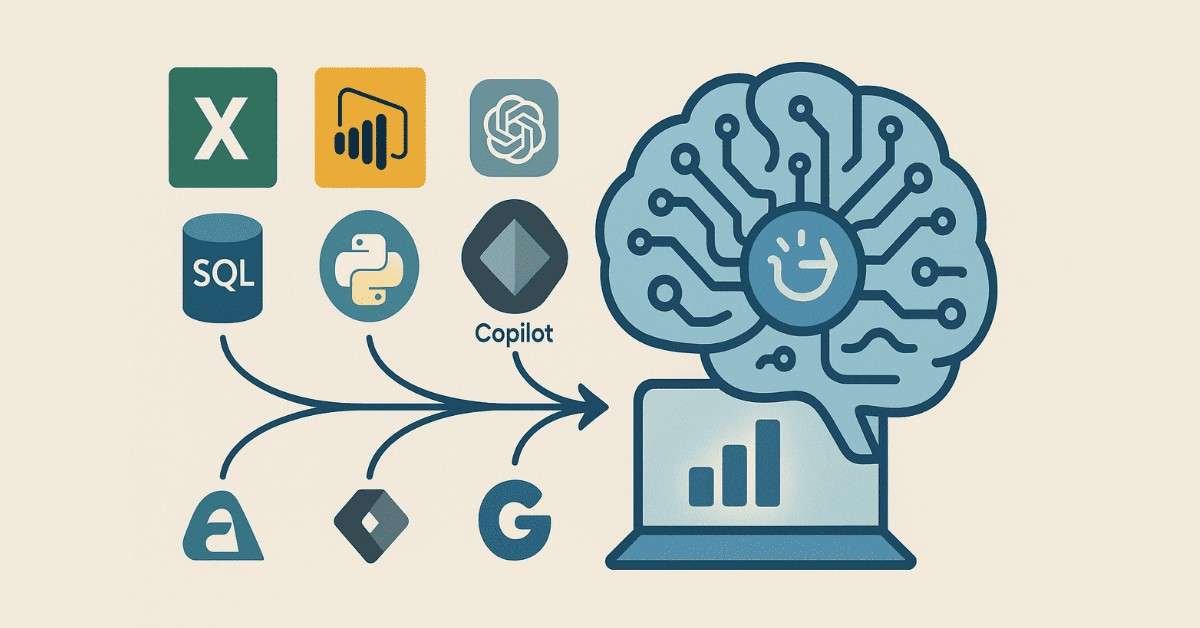
Starting your career in data analytics feels overwhelming when you see job postings asking for SQL, Python, Excel, Power BI, and now AI tools on top of everything else. But here’s the truth: thousands of students just like you have transformed from complete beginners to confident analysts in just three months. This roadmap breaks down exactly what you’ll learn each day, so you can track your progress and land your first data analyst role faster than you thought possible.
The job market for data analysts has exploded across Bangalore, Hyderabad, Pune, Mumbai, and Chennai, with companies desperately searching for professionals who can combine traditional analytics with modern AI tools. While most courses teach outdated methods, this AI-powered approach prepares you for what companies actually need in 2025.
🚀 Start your journey the right way!
Follow our Complete Career interview Guide and grow from beginner to job-ready.
1. How This 90-Days Roadmap Works ?
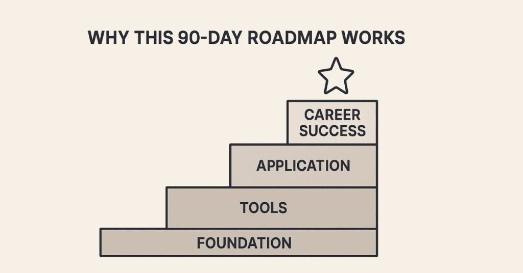
Most people fail at learning data analytics because they try to learn everything at once or jump between topics randomly. This structured approach builds your skills layer by layer, ensuring each concept strengthens the previous one. You’ll start with fundamental concepts and gradually move to advanced techniques, spending each day on focused, achievable goals that compound into expertise.
The secret ingredient that makes this different is AI integration throughout your learning journey. Instead of spending weeks stuck on complex formulas or queries, you’ll learn how to leverage ChatGPT, Copilot, and Gemini to work smarter from day one. This mirrors exactly how modern analysts work in top companies like Infosys, TCS, Accenture, and Capgemini.
2. Foundation Building (Days 1-30)
🤖 Learn faster with AI tools!
Explore our AI-Powered Learning Guides for ChatGPT, Copilot & Gemini.
Week 1: Understanding Data Analytics & AI Fundamentals
Day 1-2: Introduction to Data Analytics
Your journey begins by understanding what data actually means and why companies pay premium salaries for people who can make sense of it. You’ll learn about structured versus unstructured data, quantitative versus qualitative data, and see real examples of how businesses use data to make million-dollar decisions. The focus stays practical from minute one—you’ll see actual datasets from e-commerce, healthcare, and finance sectors.
Today’s analysts must think analytically and solve problems systematically rather than just run formulas. You’ll develop this mindset through simple exercises that train your brain to spot patterns and ask the right questions before diving into analysis. Understanding the components of data analytics—collection, processing, analysis, and visualization—gives you the framework everything else builds upon.
Day 3-5: AI Revolution in Data Analytics
These three days transform how you’ll approach every analysis for the rest of your career. You’ll understand the differences between AI, Machine Learning, Deep Learning, and Generative AI without getting lost in academic jargon. The course explains concepts using simple, real-world analogies that stick with you.
Learning about Large Language Models (LLMs) and how they’re trained helps you understand why ChatGPT can write SQL queries or explain complex statistical concepts. You’ll master prompt engineering fundamentals—the skill of asking AI tools the right questions to get perfect answers. Hands-on practice with ChatGPT, Microsoft Copilot, and Google Gemini shows you exactly how these tools speed up your work.
The most valuable lesson covers AI’s role in each stage of analytics: automated data collection, intelligent data cleansing, AI-assisted exploratory analysis, and smart visualization suggestions. You’ll see live demonstrations of tasks that used to take hours now completed in minutes. Understanding AI’s limitations and ethical considerations keeps you grounded and professional.
Day 6-7: Getting Started with Galaxy AI and Julius AI
Weekend practice sessions introduce you to specialized AI tools built specifically for data analysis. Galaxy AI helps you run rapid analysis and generate immediate insights without writing a single line of code. Julius AI takes this further by creating beautiful visualizations from your natural language requests.
You’ll work through sample datasets and watch your first insights appear on screen. This early success builds confidence before you dive into more technical tools. These platforms show you what’s possible, motivating you for the detailed learning ahead.
Week 2: Data Collection and Preprocessing
Day 8-10: Understanding Real-World Data
Raw data from real businesses arrives messy, incomplete, and full of errors—nothing like the clean datasets in textbooks. These three days expose you to actual characteristics of business data: missing values, duplicate entries, inconsistent formatting, and outliers that can destroy your analysis if not handled properly.
You’ll learn the entire data collection process from identifying sources to extracting information. Understanding different data sources—databases, APIs, web scraping, manual entry, and third-party providers—prepares you for any scenario you’ll face on the job. The ETL (Extract, Transform, Load) process becomes clear through visual diagrams and practical examples.
Batch processing versus real-time processing makes sense when you see how Netflix analyzes viewing patterns differently than Amazon tracks shopping cart additions. AI tools for automated data collection show you how modern companies gather information at scale.
Day 11-14: Data Cleansing and Transformation
Data cleaning takes up 60-70% of an analyst’s time in real jobs, which is why you’ll spend four full days mastering it. Handling missing data requires decision-making skills: do you delete rows, fill with averages, or use more sophisticated imputation techniques? Each approach has trade-offs you’ll learn to evaluate.
Identifying and treating outliers protects your analysis from distorted results. You’ll practice techniques for spotting these unusual values and deciding whether they’re errors or legitimate data points. Removing duplicates seems simple until you encounter near-duplicates that differ slightly—this course teaches you systematic approaches.
Data transformation through formatting, filtering, and aggregation prepares information for analysis. Microsoft Copilot integration accelerates these tasks dramatically. You’ll complete a real sales data case study, applying everything to clean messy transaction records. The satisfaction of transforming chaos into usable data hooks most students at this point.
📘 Need practice datasets & templates?
Access our Free Resource Library for hands-on tasks.
🚀 Start your journey the right way!
Follow our Complete Career interview Guide and become a data expert step by step.
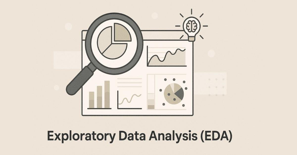
Week 3: Exploratory Data Analysis
Day 15-17: EDA Fundamentals
Exploratory Data Analysis (EDA) is where you develop your detective skills. Before running any fancy algorithms, analysts must understand their data’s basic structure, distributions, and relationships. These three days teach both graphical and non-graphical EDA techniques.
Understanding data types, file formats, and proper sampling techniques prevents common beginner mistakes. You’ll learn to quickly assess fill rates (how complete your data is), identify ranges and distributions, and spot patterns that suggest deeper insights. The difference between numerical and categorical data becomes obvious through hands-on exploration.
Contextual analysis helps you understand what the numbers actually mean for the business. A 10% increase might be fantastic for one metric but disastrous for another. Different graphical chart types—histograms, scatter plots, box plots, bar charts—each tell specific stories about your data.
Day 18-21: AI-Powered Exploratory Analysis
Modern EDA supercharges with AI assistance. Copilot can suggest which charts best reveal patterns in your specific dataset. You’ll practice exploring data conversationally, asking AI to highlight unusual patterns or summarize distributions.
Two major case studies cement your skills: analyzing supermarket sales data to identify top-performing products and time-based patterns, then examining New York housing prices to understand factors affecting real estate values. These realistic projects mirror actual business problems. You’ll present findings as you would to managers who need actionable insights.
Week 4: Statistical Foundations
Day 22-24: Descriptive Statistics
Statistics sounds intimidating but becomes intuitive when you see it as tools for summarizing data. Descriptive statistics—mean, median, mode—help you understand what’s typical in your dataset. Variance and standard deviation reveal how spread out your data is.
You’ll learn correlation versus covariance and why mixing them up leads to wrong conclusions. Understanding probability distributions helps you recognize patterns like normal distributions or skewed data. Random variables stop being abstract when you apply them to real scenarios like customer purchase amounts.
Day 25-27: Inferential Statistics
Inferential statistics lets you make predictions about large populations using smaller samples. Hypothesis testing teaches you to evaluate whether observed differences are real or just random chance. Statistical significance prevents you from making recommendations based on coincidences.
Understanding Type I errors (false positives) and Type II errors (false negatives) makes you a more careful analyst. Regression analysis, the foundation of predictive analytics, becomes clear through visual examples. You’ll use AI tools to run statistical tests and interpret results correctly.
Day 28-30: Applied Statistics Case Studies
Theory meets practice through two comprehensive case studies. The heart risk analysis project shows you how medical researchers use statistics to identify risk factors. The email campaign impact analysis demonstrates how marketing teams prove their campaigns actually worked.
These three days involve real calculations, interpretation challenges, and presentation of findings. Using Copilot for statistical analysis shows you how AI handles complex calculations while you focus on understanding and communicating results. This completes your first month with solid analytical foundations.
💡Confused about statistics?
Read our Step-by-Step How-to Guides for clarity on probability, regression & tests.
3. Technical Tools Mastery (Days 31-60)

Week 5: Excel Fundamentals with AI
Day 31-33: Excel Basics and Copilot Integration
Excel remains the most widely used analytics tool in businesses worldwide. These three days cover essential skills: inserting and deleting cells, rows, columns, and sheets; formatting and adjusting data for clarity; hiding unnecessary information; and using find, search, and replace functions efficiently.
Auto Fill and Flash Fill save hours on repetitive tasks. Understanding different paste options prevents formatting disasters. Data transpose switches rows to columns when needed. Setting up Copilot in Excel unlocks AI-powered editing and suggestions.
Day 34-37: Formulas and Functions
Functions transform Excel from a calculator into an analytical powerhouse. Text functions like LEFT, RIGHT, MID, and LEN extract specific portions of text. UPPER, LOWER, and PROPER standardize text formatting. REPLACE, SUBSTITUTE, TRIM, and CONCAT manipulate text data efficiently.
Logical functions are where Excel gets smart. IF statements let your spreadsheets make decisions. Nested IF handles complex scenarios. IFERROR and IFNA prevent ugly error messages. AND, OR, and NOT combine multiple conditions. SWITCH provides elegant alternatives to long nested IFs.
Math functions—SUM, PRODUCT, AVERAGE, SUMIF, ROUND, FLOOR, CEILING—handle numerical operations. Date-time functions like DATE, TODAY, NOW, DAY, MONTH, YEAR, and DAYS manage temporal data. Statistical functions including MEAN, MEDIAN, MODE, COUNT, STD, VARIANCE, QUARTILES, CORRELATION, and COVARIANCE run descriptive statistics directly.
Day 38-40: Advanced Excel Features
VLOOKUP and HLOOKUP search for data across tables—essential skills every analyst must master. UNIQUE, MATCH, and INDEX provide more flexible lookup options. ISBLANK, ISNUMBER, ISTEXT, and ISERROR help you validate and clean data.
Using AI to explain complex formulas accelerates your learning. Sorting by text, numbers, or colors organizes information. Filters help you focus on specific subsets of data. Copilot-based filtering uses natural language to slice data instantly.
Text to Columns splits combined data. Remove Duplicates cleans redundant entries. Data Validation prevents incorrect entries at the source. Conditional formatting highlights important patterns visually. Copilot-based conditional formatting applies complex rules through simple descriptions.
Week 6: Excel Analytics and Visualization
Day 41-43: Charts and Visualization
Understanding which chart type tells your story best separates good analysts from great ones. Line charts show trends over time. Bar and column charts compare categories. Pie charts display proportions. Scatter plots reveal relationships. You’ll explore various chart types and learn when each works best.
Chart formatting options—titles, labels, colors, legends—make your visuals professional. Data tables supplement charts with exact numbers. Poorly formatted charts confuse audiences while well-designed visuals communicate instantly.
Day 44-47: Pivot Tables and Dashboards
Pivot tables revolutionize how you analyze large datasets. These powerful tools let you summarize thousands of rows instantly, grouping and aggregating data dynamically. Pivot charts visualize pivot table summaries. AI-powered data summarization and aggregation through Copilot makes pivot table creation conversational.
Importing data through Get Data connects Excel to external sources. Connecting to databases and other systems brings real-time information into your analysis. Power Query transforms and cleans data before it enters Excel. Power Pivot handles millions of rows beyond Excel’s normal limits.
Interactive dashboard development combines multiple charts, slicers, and pivot tables into executive-ready reports. Using Copilot to analyze dashboard data and apply AI for automatic summaries creates truly intelligent reporting tools. Three comprehensive case studies—Employee Data Analysis, Student Performance Analysis, and Adidas Sales Data Analysis—give you portfolio-worthy projects.
🎓 Become job-ready with expert mentorship!
Join our AI-Powered Data Analytics Course with live projects.
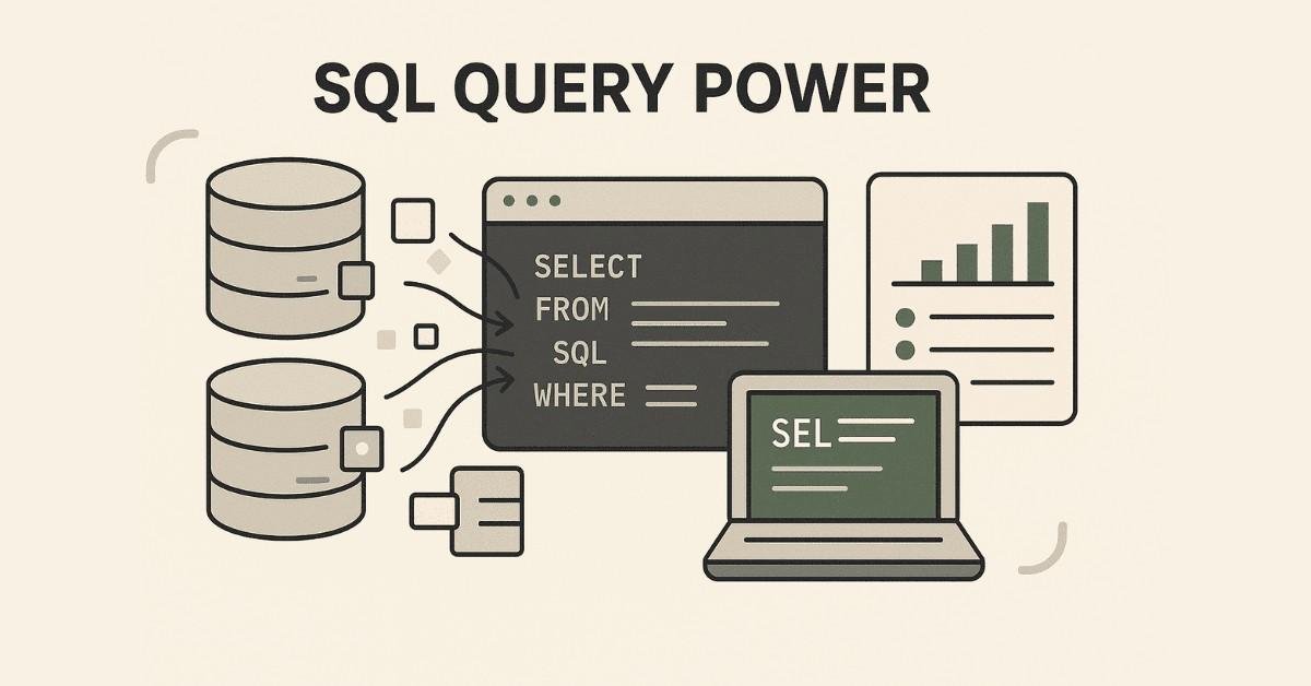
Week 7: SQL Fundamentals
Day 48-50: Database Basics and Data Definition
SQL powers nearly every data storage system in modern businesses. Understanding databases and their types provides context for why SQL dominates. SQL categories—DDL (Data Definition Language), DML (Data Manipulation Language), DQL (Data Query Language), and DCL (Data Control Language)—each serve different purposes.
Creating tables with proper data types and constraints ensures data quality from the start. ROWID and ROWNUM pseudocolumns help with data identification. DROP TABLE removes tables when needed. ALTER statements add, delete, or rename columns. TRUNCATE quickly empties tables.
Day 51-54: Data Manipulation and Querying
Loading data through INSERT statements and INSERT INTO SELECT copies information efficiently. UPDATE statements modify existing records simply or conditionally. DELETE removes unwanted rows. These core operations let you maintain databases professionally.
SELECT clauses retrieve data. Aliasing creates readable column names. Column concatenation combines fields. WHERE clauses filter results to exactly what you need. ORDER BY sorts output logically.
Arithmetic operators (+, -, *, /) perform calculations in queries. Logical operators (AND, OR, IN, LIKE, BETWEEN, NOT) create sophisticated filters. Conditional operators (=, >=, <=, !=, <>) compare values. Handling NULL values with IS NULL and COALESCE prevents query failures.
Week 8: Advanced SQL
Day 55-57: Functions and Aggregations
SQL functions process data powerfully. Numeric functions like FLOOR, CEIL, MOD, ROUND, TRUNC, and ABS manipulate numbers. String functions—UPPER, LOWER, CONCAT, LENGTH, TRIM, LPAD, RPAD, SUBSTR, INSTR, REPLACE—handle text operations. Date-time functions including TO_DATE, TO_CHAR, TRUNC, and SYSDATE manage temporal data.
Data aggregation using GROUP BY and HAVING clauses summarizes information meaningfully. Aggregate functions (COUNT, SUM, AVG, MIN, MAX) calculate statistics directly in queries. Regular expressions enable pattern matching for complex text searches. CASE statements implement conditional logic within queries.
Day 58-60: Complex Queries and AI Integration
Analytical functions (RANK, DENSE_RANK, ROW_NUMBER, LEAD, LAG, FIRST_VALUE, LAST_VALUE) perform sophisticated calculations. Joins—INNER, LEFT, RIGHT, FULL, and CROSS—combine data from multiple tables. Set operations (UNION, UNION ALL, INTERSECT, MINUS) merge or compare query results.
Nested queries, subqueries, and correlated queries solve complex business problems. EXISTS and NOT EXISTS clauses check for record existence efficiently. Common Table Expressions (CTEs) make complex queries readable. Creating indexes, views, and materialized views optimizes performance.
Sequences generate unique numbers. Procedures and packages encapsulate reusable logic. Triggers automate responses to database events. Practicing SQL in BigQuery exposes you to cloud-based analytics platforms. Using Gemini AI for SQL query generation and understanding accelerates your learning dramatically.
Four major case studies—HR Data Analysis, Customer Orders Data Analysis, Pizza Delivery, and BT Clothing—provide comprehensive practice. These projects belong in your portfolio and demonstrate job-ready skills.
4. Advanced Tools & Career Preparation (Days 61-90)

Week 9: Power BI Mastery
Day 61-63: Power Query and Data Modeling
Power BI has become the most in-demand visualization tool for analysts in 2025, especially in Microsoft-centric organizations. Understanding Power BI’s relationship with Excel helps you leverage existing skills. Power Query provides advanced data transformation capabilities beyond basic Excel operations.
Connecting to multiple data sources—files, databases, cloud platforms, and web APIs—gives you flexibility in real projects. Data profiling and quality assurance using Power Query ensures clean input before analysis begins. Transformation and preprocessing operations handle complex data cleaning systematically.
Working with numerical, text, and date-time operations prepares data properly. Pivoting and unpivoting tables restructures data layouts. Appending and merging tables combines information from multiple sources. Setting up data refresh schedules keeps dashboards current automatically.
Data modeling concepts—star schema and snowflake schema—optimize performance for large datasets. Understanding cardinality between tables prevents relationship errors. Creating and maintaining relationships connects your data logically. Filter directions control how selections flow through related tables.
Day 64-67: DAX and Advanced Calculations
DAX (Data Analysis Expressions) unlocks Power BI’s true analytical power. Understanding calculated columns versus DAX measures prevents common mistakes. Implicit measures work automatically while explicit measures give you control. Quick measures provide templates for common calculations.
Row context versus filter context determines how calculations evaluate. Aggregate functions (SUM, AVERAGE, COUNT, MIN, MAX) perform basic calculations. Iterator functions (SUMX, AVERAGEX) provide row-by-row computation power. Logical functions (IF, AND, OR, SWITCH) add conditional intelligence.
Text functions manipulate strings within measures. Filter functions (CALCULATE, FILTER, ALL) give you precise control over what data calculations use. Table functions create virtual tables for complex analysis. Time intelligence functions (TOTALYTD, SAMEPERIODLASTYEAR) make year-over-year comparisons effortless.
Using Copilot and ChatGPT to write and explain DAX formulas accelerates learning dramatically. These AI tools help you understand complex measures and debug errors quickly.
Day 68-70: Visualization and Publishing
Reporting and data visualization transforms analysis into business impact. Creating charts and formatting them professionally makes insights accessible. Understanding filter types—chart level, page level, and report level—controls interactivity appropriately.
Slicers provide user-friendly filtering interfaces. Hierarchies enable drill-up and drill-down exploration. Drill-through filters let users navigate from summary to detail seamlessly. Bookmarks save specific dashboard states for storytelling.
Q&A features allow natural language queries directly on dashboards. AI-powered insights summarization highlights key findings automatically. Publishing dashboards to Power BI service makes reports accessible organization-wide. User management and semantic model refresh ensure the right people see updated data.
The comprehensive Adventure Works case study ties everything together. This real business scenario requires applying data modeling, DAX calculations, and professional dashboard design.
Week 10: Tableau Fundamentals
Day 71-73: Tableau Basics and Data Connections
Tableau stands out for its exceptional visualization capabilities and flexibility with diverse data sources. Understanding Tableau’s product ecosystem—Desktop, Server, Online, and Public—clarifies deployment options. The distinction between dimensions and measures, and continuous versus discrete fields, forms your foundation.
Connecting to data sources including Excel, CSV files, databases, and cloud platforms mirrors real-world scenarios. Combining data through relationships, blending, joins, and unions provides flexibility for complex analyses. Understanding live connections versus extracts helps you balance real-time data needs with performance.
Data types, preprocessing, and customization ensure clean, properly structured data. Working with date-time and geographical fields enables temporal and spatial analysis. Exploring different visualization types—from simple bar charts to complex heat maps—expands your communication toolkit.
Day 74-76: Advanced Tableau Features
The Marks Card controls visualization properties like color, tooltip, text, detail, and size. Creating hierarchies and combined fields organizes related data logically. Grouping data simplifies complex categories. Sets and parameters add dynamic interactivity to dashboards.
Basic calculations extend Tableau’s built-in functionality. Level of Detail (LOD) expressions—FIXED, INCLUDE, and EXCLUDE—solve complex aggregation challenges. Table calculations and quick table calculations provide running totals, moving averages, and percent of total views.
Sorting and dual-axis charts create sophisticated comparisons. Understanding Tableau’s filter hierarchy—extract filters, data source filters, context filters, dimension filters, measure filters, and table calculation filters—gives you precise control. Actions create interactivity between dashboard elements.
Day 77-80: Tableau Projects and Storytelling
Exploratory analysis with Tableau reveals patterns quickly through its intuitive interface. Generating different chart types—line charts, bar graphs, scatter plots, heat maps, and geographical visualizations—matches analysis needs to appropriate visuals.
Creating comprehensive dashboards combines multiple visualizations into cohesive reports. Building stories sequences dashboards to guide audiences through insights narratively. Effective visualization design and techniques for drawing attention ensure your message lands.
Storytelling with data transforms numbers into narratives that drive action. Three major case studies—Superstore Sales Analysis, Bookshop Analysis, and Amazon Sales Dashboard Development—provide portfolio-quality work. These projects demonstrate your ability to handle real business problems from data connection through insight delivery.
📝 Build a strong portfolio!
Explore All Resources for Power BI, Tableau, SQL & Python.

Week 11: Python for Data Analytics
Day 81-83: Python Programming Foundations
Python has become essential for advanced analytics and automation. Introduction to Python programming establishes syntax and logic. Familiarizing yourself with Python notebooks—especially in Google Cloud—creates your development environment.
AI-assisted coding with ChatGPT and Gemini makes learning Python much faster than traditional methods. Code explanation using AI helps you understand complex scripts instantly. Understanding variables and basic data types (integers, floats, strings, booleans) builds your foundation.
Lists and their methods (append, extend, insert, remove) manage ordered collections. Tuples provide immutable sequences. Sets handle unique values. Dictionaries store key-value pairs for structured data. Control flow statements—IF-ELSE, WHILE, and FOR loops—add logic to your programs.
Nested IF-ELSE and loops handle complex scenarios. Functions encapsulate reusable code, and using AI to write functions accelerates development dramatically.
Day 84-87: Data Analysis Libraries
Libraries for data analysis—NumPy, Pandas, Matplotlib, and Seaborn—provide professional-grade tools. NumPy arrays handle numerical operations efficiently. Pandas Series and DataFrame operations become your primary data manipulation tools.
Reading various file types using Pandas—CSV, Excel, JSON, SQL databases—connects you to any data source. Data manipulation operations including adding, deleting, and renaming columns customize datasets. Indexing techniques provide precise data access.
Filtering rows and columns using loc and iloc selects specific subsets efficiently. Data cleansing, deduplication, and dealing with missing values prepares data properly. Descriptive statistics summarize datasets numerically. Data aggregation using group by creates meaningful summaries.
Pivoting data restructures information for analysis. Slicing, concatenation, merging, and joining operations combine datasets flexibly. Data visualization using Matplotlib and Seaborn creates publication-quality graphics. Generating charts with Pyplot covers all standard visualization types.
Day 88-90: Advanced Python and Projects
Visualization suggestions for datasets help you choose appropriate charts. Chart formatting options—labeling, markers, legends, subplots—create professional outputs. Applying line charts, bar charts, pie charts, scatter plots, and histograms matches visualization to message.
Exploratory analysis using Pandas reveals dataset characteristics systematically. Generating insights using AI prompts accelerates pattern discovery. Using Gemini to summarize outcomes of EDA creates concise reports. Code explanation using Gemini helps you understand and debug complex analysis.
Three comprehensive case studies cement your Python skills: Immigration Analysis examining migration patterns, Automobile Data Analysis exploring vehicle characteristics and pricing, and Employee Attrition Analysis predicting workforce turnover. These projects showcase advanced analytical capabilities employers value.
5. Big Data & Career Preparation(Day 91-95)
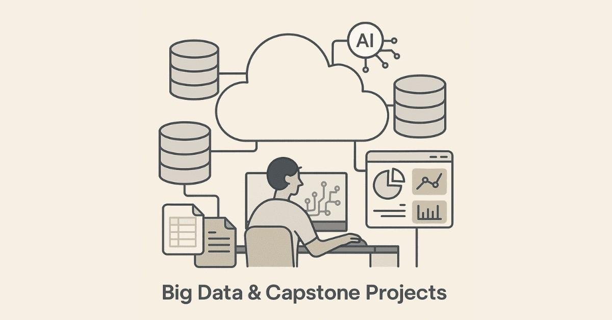
Day 91-92: Introduction to Big Data Analytics
Understanding Big Data and its characteristics—volume, velocity, variety, veracity, and value—prepares you for enterprise-scale analytics. Vertical versus horizontal scaling explains infrastructure approaches. Hadoop, HDFS, and MapReduce provide the foundation for distributed computing.
Hive and HiveQL enable SQL-like queries on massive datasets. Apache Spark components process data faster than traditional Hadoop. Spark SQL for data analysis combines familiar SQL syntax with big data power. Practicing Spark SQL using Databricks gives you hands-on cloud platform experience.
The Olympics Data Analysis case study demonstrates big data techniques on real historical sports data. This experience makes you conversant in technologies Fortune 500 companies use daily.
Day 93-95: Capstone Projects
Your final week focuses on comprehensive capstone projects that showcase everything you’ve learned. The Rides Data Analysis project examines transportation patterns using multiple analytical techniques. You’ll choose between Airbnb Data Analysis exploring accommodation trends or Telecom Customer Churn Analysis predicting subscriber attrition.
Additional classroom projects—IPL Data Analysis of cricket statistics and Brazilian E-commerce Analysis of online retail patterns—provide extra practice. These projects combine data cleaning, statistical analysis, visualization, and business recommendations. Completing them gives you portfolio pieces that demonstrate job-ready skills to hiring managers.
📘 Need Big Data practice?
Download Spark, Hadoop & Hive datasets for Path.
6. CAREER ACCELERATION Profile Optimization & Job Hunting Strategy
Building Your Professional Brand

Your LinkedIn profile becomes your digital resume and networking platform . Optimizing it properly dramatically increases recruiter visibility and job opportunities . Start with a professional headline that goes beyond “Data Analyst” to include your specializations like “AI-Powered Data Analyst | Power BI Expert | Python Analytics” .
Your summary should tell your transformation story—how you moved from beginner to skilled analyst in 90 days. Include specific tools mastered: Excel with AI, SQL, Power BI, Tableau, and Python. Quantify your project experience: “Analyzed datasets with 100K+ rows,” “Created 15+ interactive dashboards,” “Completed 8 major case studies”.
The experience section lists your course completion prominently. Frame it professionally: “Completed intensive AI-Powered Data Analytics program covering end-to-end analytics workflow from data collection through visualization and business recommendations”. Detail specific projects with business context, your analytical approach, tools used, and insights delivered.
Skills endorsements matter significantly for search visibility. List technical skills systematically: Data Analysis, SQL, Python, Power BI, Tableau, Excel, Statistics, Data Visualization, Machine Learning, AI Tools. Request endorsements from course instructors and project teammates.
Recommendations from mentors add credibility. A short testimonial about your analytical thinking, technical skills, and work quality strengthens your profile considerably. Share your capstone projects and case study results as LinkedIn posts with visualizations. This demonstrates expertise while building your professional network.
Resume Building Excellence
Your data analyst resume needs quantified achievements rather than duty lists. Structure it with a strong summary highlighting your unique combination of traditional analytics and AI tool proficiency. The technical skills section should prominently display: Programming Languages (Python, SQL), BI Tools (Power BI, Tableau), Spreadsheets (Excel with Copilot), AI Tools (ChatGPT, Gemini, Copilot), Statistics, and Data Visualization.
Projects section becomes crucial when transitioning into analytics. For each major case study completed, structure entries with: Project Title, Technologies Used, Problem Statement, Your Analytical Approach, Key Findings, and Business Impact. Use action verbs: “Analyzed,” “Identified,” “Optimized,” “Predicted,” “Visualized,” “Recommended”.
Quantify everything possible: “Processed and cleaned datasets containing 150,000+ records,” “Developed interactive Power BI dashboard with 12 visualizations,” “Identified cost-saving opportunities worth 15% reduction through Python analysis”. Even practice projects benefit from business framing and quantification.
🧭 Not sure what to do next?
Follow our Career to upgrade interview Guide your profile & skills.
Navigating Job Platforms
Multiple platforms host data analyst opportunities with different strengths. LinkedIn serves as both networking and job search platform. Set your profile to “Open to Work” with specific roles: Data Analyst, Business Analyst, Business Intelligence Analyst. Use LinkedIn’s job search filters for experience level, location preferences, and company size.
Naukri remains dominant in Indian job markets, especially for Bangalore, Hyderabad, Pune, and Chennai positions. Upload your optimized resume and set daily alerts for “Data Analyst” and “Business Intelligence” roles. Indeed aggregates listings from multiple sources. Apply filters for entry-level positions and recent postings.
Company career pages of top hirers—Infosys, TCS, Accenture, Capgemini, Wipro, Cognizant, IBM—often list openings before they appear on job boards. Check these weekly and apply directly. AngelList and Cutshort focus on startup opportunities where you might find faster-paced learning environments.
Referrals dramatically increase interview chances. Connect with Frontlines Edutech alumni working at target companies. Attend virtual analytics meetups and webinars to expand your network. Join data analytics groups on LinkedIn and participate in discussions to increase visibility.
Interview Preparation Essentials
Data analyst interviews assess technical knowledge, problem-solving ability, and communication skills. Technical questions cover SQL queries, Excel functions, statistical concepts, and visualization best practices. Prepare to write SQL JOIN queries, aggregate functions, and window functions on whiteboards or coding platforms.
Excel technical tests might ask you to clean messy data, create pivot tables, apply VLOOKUP functions, and build basic dashboards. Statistics questions test your understanding of mean versus median, correlation versus causation, hypothesis testing, and when to use different statistical tests.
Case study interviews present business problems requiring structured analytical thinking. Practice the framework: Clarify the problem, identify relevant data, propose analytical approach, discuss potential findings, and recommend actions. Communication matters as much as technical accuracy.
Behavioral questions assess teamwork, handling ambiguity, learning from mistakes, and managing deadlines. Prepare STAR method responses (Situation, Task, Action, Result) using your capstone projects as examples. Questions like “Describe a time you found an unexpected insight in data” or “How do you prioritize multiple analytical requests” appear frequently.
👉 Want Comprehensive Interview Preparation? Frontlines Edutech provides dedicated interview guidance covering 200+ technical questions, mock interviews with industry experts, and behavioral interview coaching. Our placement team connects you directly with hiring managers at top companies.
🎓 Become a certified Data Analyst!
Join our AI-Powered Mastery Course with 1:1 mentorship.
Final Projects Presentation
Your capstone project presentations demonstrate your complete analytical workflow. Structure presentations for non-technical audiences: Business Context, Data Overview, Analytical Approach, Key Findings, Visualizations, Recommendations, and Next Steps. Practice explaining technical choices in business terms.
Your dashboard should tell a story without requiring verbal explanation. Design for your audience—executives need high-level summaries with drill-down options while operational teams need detailed metrics. Include clear titles, labeled axes, legends, and annotations highlighting important patterns.
Record your presentation and request feedback from mentors. Refine based on clarity, pacing, and impact. Upload polished presentations to your LinkedIn profile and portfolio website. These become conversation starters in networking and interviews.
Why Frontlines Edutech's AI-Powered Data Analytics Course
Real Success, Real Careers
Over 3,000 students have transformed their careers through Frontlines Edutech’s comprehensive training programs. The AI-Powered Data Analytics course stands apart by integrating cutting-edge AI tools throughout the curriculum rather than treating them as afterthoughts. You’ll learn exactly how modern analysts work in 2025—combining traditional technical skills with AI acceleration.
Industry-expert instructors bring real-world experience from top companies. They understand current hiring requirements and teach accordingly. Daily assignments ensure consistent practice and skill development. Resume building, LinkedIn profile optimization, and interview guidance prepare you completely for job search.
Complete Learning Support
From-scratch-to-master-level training means no prior experience required. The course welcomes non-IT students and provides special support for those without technical backgrounds. On-demand video access lets you learn at your pace while live Q&A sessions clarify doubts immediately.
Course completion certificates validate your skills to employers. Downloadable resources including datasets, code templates, and cheat sheets support continued learning. Placement updates connect you with hiring opportunities as they emerge. The Frontlines Edutech community provides ongoing support even after course completion.
Affordable, Transparent, Results-Driven
Quality education shouldn’t require enormous debt. Frontlines Edutech maintains affordable pricing while delivering industry-standard training. Transparent communication about course content, expectations, and outcomes builds trust. The results-driven approach focuses on employment outcomes rather than just course completion.
Companies like Infosys, TCS, Accenture, Capgemini, Wipro, Cognizant, IBM, and KPMG actively hire Frontlines Edutech graduates. Top demand cities—Bangalore, Hyderabad, Pune, Mumbai, Chennai, Gurgaon, and Noida—offer abundant opportunities for trained analysts. Key sectors including technology, data science, artificial intelligence, media, entertainment, and startups desperately need qualified professionals.
7. Your Next Steps
This 90-day roadmap provides the clearest path from beginner to job-ready data analyst in 2025. Following this structured approach builds skills systematically while AI integration ensures you learn modern techniques employers actually need. The combination of Excel, SQL, Power BI, Tableau, Python, and Big Data exposure creates a comprehensive skill set that stands out in competitive job markets.
Every day of this roadmap serves a purpose in your transformation journey. Early weeks build foundations through data concepts and AI tools. Middle weeks develop technical proficiency across essential platforms. Final weeks apply everything through comprehensive projects while preparing you for successful job search.
The analytics field continues growing rapidly as businesses recognize data’s strategic value. Companies pay premium salaries for analysts who combine technical skills with business understanding and communication abilities. This course develops all three through hands-on projects, case studies, and presentation requirements.
Your success depends on consistent daily effort over these 90 days. Students who complete assignments, practice with real datasets, and engage with course materials land jobs significantly faster than those who rush through content. The roadmap provides structure—your commitment provides momentum.
Ready to Begin Your Journey? Contact Frontlines Edutech today at +91-83330 77727 or media.frontlines@gmail.com. Visit www.frontlinesedutech.com to learn more about enrollment, upcoming batches, and success stories from graduates now working at top companies. Your 90-day transformation from beginner to employed data analyst starts with a single decision—choosing to invest in your future through proven, comprehensive training.
The demand for data analysts has never been higher, and AI-powered skills make you even more valuable. Don’t let another month pass wondering if you can break into this exciting field. This roadmap proves the path exists—now take the first step and enroll in the AI-Powered Data Analytics course at Frontlines Edutech.
Follow Frontlines Edutech on LinkedIn to stay updated on analytics trends, job opportunities, and success stories from your future peer group. Join the community of learners building trust and careers through hands-on, practical education designed for real-world success.