
How to Use Excel for Data Analysis
Table of Contents
Excel becomes much more useful when you stop treating it as a place to store numbers and start using it to answer questions.
With Excel for data analysis, a learner can clean raw records, calculate business metrics, compare categories, summarise hundreds or thousands of rows, and turn the findings into charts or reports. It is particularly useful for beginners because the data remains visible while the analysis is being performed.
A sales sheet, for example, can answer much more than “How much did we sell?” It can help identify which region performed well, which product generated more revenue, whether discounts affected profit, or which month showed an unusual change.
Quick Answer: How Is Excel Used for Data Analysis?
A practical Excel analysis usually follows a simple sequence:
Organise the data → clean it → calculate useful metrics → summarise patterns → visualise results → check the findings.
Different Excel features support different parts of that workflow. Formulas handle calculations, filters help investigate records, PivotTables create summaries, and charts make patterns easier to communicate.
The important skill is not knowing every Excel feature. It is knowing which feature helps answer the current analytical question.
Start Your Data Analytics Journey
Learn Excel, SQL, Power BI, Python & AI with practical projects.
👉 Join Now
Start with a Well-Organised Dataset
Good analysis begins before the first formula is written.
A dataset should ideally have one clear header row, with each column representing one type of information and each row representing one record.
A sales dataset might contain:
Order Date | Customer | City | Product | Quantity | Revenue | Cost
Avoid mixing report titles, blank rows, merged cells, notes, and raw records inside the same table. Microsoft also recommends clean, tabular data with clear, unique column headers for features such as Analyze Data.
Dates should be stored consistently as dates, numbers as numeric values, and categories should use consistent names.
For example, if one city appears as Hyderabad, HYD, and hyderabad, the analysis may treat them as different categories unless they are cleaned first.
Clean the Data Before Looking for Insights
Messy data can produce a polished-looking report with the wrong conclusion.
Begin by checking the fields that matter to your question. Look for blank cells, repeated records, unusual values, inconsistent spellings, and incorrect number or date formats.
Excel’s filtering tools are useful for inspecting categories and locating unusual records. Duplicate records can also be reviewed using filtering, conditional formatting, or the Remove Duplicates feature.
Microsoft notes an important difference: filtering unique values temporarily hides duplicates, whereas Remove Duplicates permanently deletes repeated values from the selected range.
For that reason, do not remove a record merely because it appears twice. First determine whether it is genuinely duplicated. Two purchases made by the same customer may be perfectly valid.
Cleaning is not simply an Excel operation; it requires understanding what each row represents.
Use Formulas to Create Useful Business Metrics
Formulas become valuable when they answer a specific question.
Basic functions such as SUM, AVERAGE, MIN, MAX, and COUNT help describe a dataset. Conditional functions such as SUMIF, SUMIFS, COUNTIF, and COUNTIFS are useful when calculations depend on categories or conditions.
Imagine a marketing sheet containing campaign name, leads, conversions, and spend. Instead of only reporting total spend, you could calculate:
Conversion Rate = Conversions / Leads
That metric provides more context than the raw conversion count alone.
Logical functions such as IF can classify results, while lookup functions can bring related information from another table.
However, formulas should not be added simply because they are available. A smaller set of well-understood calculations is more useful than a workbook filled with complicated formulas that nobody can explain.
Use Sorting and Filtering to Investigate the Dataset
Before building a summary, it is often useful to explore individual records.
Filters can help answer questions such as:
Which orders came from Telangana?
Which transactions exceeded a certain amount?
Which products had negative profit?
Which customers purchased during a particular month?
Sorting can reveal the highest or lowest values quickly.
This stage is useful because it keeps the analyst close to the underlying records. If a PivotTable later shows an unexpected result, filtering the source data can help investigate why.
Use PivotTables to Move from Rows to Patterns
Once the dataset contains many records, reading rows one by one is no longer practical.
This is where PivotTables become especially useful.
Microsoft describes a PivotTable as a tool for calculating, summarising, and analysing data so that comparisons, patterns, and trends can be identified.
Suppose a retail file contains 20,000 transactions. A PivotTable could quickly summarise:
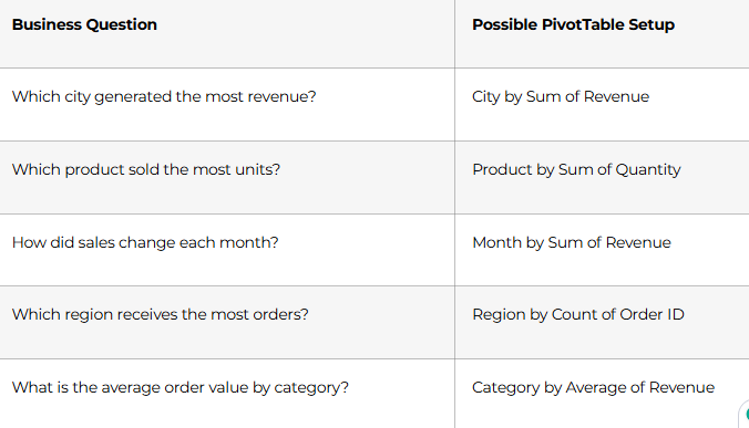
PivotTables support summary calculations such as Sum, Count, and Average.
The real value is not the PivotTable itself. It is the ability to change the view quickly and test different questions without rebuilding the entire report.
Use Charts to Communicate the Finding
A table may contain the answer, but a well-chosen chart can make the pattern easier to see.
Column or bar charts work well when comparing categories. Line charts are generally useful for trends over time. Other chart types can be appropriate depending on the question and structure of the data.
Excel allows charts to be created from selected worksheet data and offers recommended chart options based on that data.
The chart should support the analysis rather than decorate it.
If monthly revenue dropped sharply in June, the chart should make that change easy to notice. The next step is then to investigate the reason behind it.
A Practical Excel Data Analysis Example
Consider a sales file containing order date, city, product, quantity, discount, revenue, and profit.
A beginner might immediately create a sales chart.
A stronger analysis starts with questions.
First, check whether important columns contain missing values or inconsistent categories. Then calculate basic metrics such as total revenue, total profit, and order count.
Next, create a PivotTable showing revenue and profit by city.
Suppose Hyderabad has the highest revenue but a noticeably weaker profit margin than another city.
Now the analysis becomes more interesting.
Filter Hyderabad transactions and compare product categories, discounts, and costs. You may discover that one category generates strong sales volume but receives unusually high discounts.
At that point, Excel has helped move the analysis from a simple statement—
“Hyderabad has the highest sales.”
—to a more useful observation—
“Hyderabad generates strong revenue, but profitability deserves further investigation because one high-volume category carries larger discounts.”
The second statement gives a decision-maker something worth examining.
How Should Analysts Validate Excel Results?
A formula returning a number does not automatically mean the number is correct.
Validation should be part of the analysis.
Check whether totals remain consistent when data is grouped differently. Compare a PivotTable result with a simple formula where practical. Review filters before interpreting visible rows. Check whether percentages use the correct denominator.
Be especially careful when formulas are copied down large ranges. Relative references, missing rows, or inconsistent formulas can quietly change results.
If an important business conclusion depends on one number, verify that number independently before presenting it.
Common Excel Analysis Mistakes
One common mistake is analysing before cleaning. Another is building charts before deciding what question needs to be answered.
Beginners also sometimes create too many formulas manually when a PivotTable would provide a clearer summary.
Another issue is excessive formatting. A dashboard with many colours, charts, and labels may look impressive but still fail to explain anything useful.
Finally, avoid assuming Excel should handle every analytics problem. As datasets and data relationships become more complex, SQL, Power BI, Python, or other tools may become more appropriate.
Excel is one part of an analytics toolkit, not the entire toolkit.
A Practical Excel Learning Path for Data Analysts
Begin with tables, sorting, filtering, cell references, and basic calculations. Then learn conditional formulas, lookup functions, and practical cleaning techniques.
Once those foundations are comfortable, move into PivotTables, PivotCharts, conditional formatting, and dashboard-style reporting.
After Excel, expand toward SQL for database analysis and Power BI for richer data modelling and interactive reporting.
For Telugu-speaking learners who want to study these skills within a wider analytics pathway, FLM’s Data Analytics Course in Telugu currently includes Excel formulas, lookup functions, conditional formatting, PivotTables, PivotCharts, and dashboard development alongside SQL, Power BI, Python, and statistics.
FLM Perspective: Use Excel as a Question-to-Insight Tool
A useful framework for beginners is:
Question → Prepare → Calculate → Compare → Visualise → Verify
Start with a business question. Prepare the relevant data. Calculate only the metrics that help answer the question. Compare categories or periods. Visualise the important pattern. Finally, verify the result before turning it into a recommendation.
This keeps Excel data analysis focused on reasoning rather than simply learning more spreadsheet features.
Conclusion
Excel is useful for data analysis because it allows beginners to see the complete analytical process in one place—from raw rows to calculated metrics, summaries, and charts.
Strong Excel analytics techniques begin with clean data, appropriate formulas, thoughtful filtering, PivotTables, and clear visualisation. The goal is not to become someone who knows hundreds of formulas. It is to become someone who can take a dataset, ask a useful question, and reach a result that can be explained and checked.
Once that foundation is strong, SQL, Power BI, Python, and AI-assisted analytics become easier to add to the workflow.
Frequently Asked Questions
Is Excel good for data analysis?
Yes. Excel supports data preparation, formulas, filtering, PivotTables, charts, and reporting, making it useful for many beginner and business-analysis tasks.
Which Excel features should data analysts learn first?
Start with tables, sorting, filtering, basic formulas, conditional formulas, lookups, PivotTables, and charts.
Why are PivotTables useful?
PivotTables allow analysts to summarise and compare large sets of worksheet records without manually creating every calculation.
Can Excel clean data?
Yes. Excel provides filtering, text and formula tools, conditional formatting, duplicate handling, and other features that can support data preparation.
Which charts should beginners learn?
Column, bar, and line charts cover many common comparison and trend questions. The appropriate chart depends on the information being communicated.
Is Excel enough to become a data analyst?
Excel provides a strong foundation, but analysts often benefit from additional skills such as SQL, Power BI, statistics, and Python depending on the role and data environment.
Can AI help with Excel analysis?
AI-assisted Excel features can support questions, formulas, summaries, and exploration, but availability varies by Excel version and subscription. The analyst should still review important results.
What should I learn after Excel?
SQL and Power BI are practical next steps for learners who want to work with databases, larger data models, and interactive reporting.
Ready to Become a Data Analyst
Build real-world skills and prepare for your analytics career.
👉 Join Our Data Analytics Program